Pretty does not mean efficient. That’s why design is not a set of high-quality pictures, fonts and trendy colors. First of all, design is the tool that helps you to achieve your goals. If you need design or re-design of your site in the closest time – read our tips how to create a task for a designer to get an effective and working site.
“We need a good site” or “We need a nice site” – you can see these request in design brief very often. Can you say with 100% accuracy what site is better – is that mashable, aliexpress or awwards?
The concept of “good†is very subjective and can lead you to a bit misunderstanding, so final results can really surprise you. We would like to offer you the following concept: the great website reach the goals and needs of the end user from the point of functionality and creating the necessary emotions.
There are basic rules how to create a task for a designer to get a great website:
– Tell him who the user of the site is, what he should do there, why, what impressions or emotions he should take. Let the designer assort and apply HIS tools.
– Try to avoid judgment call as much as you can. Tell about the main task of you site in details, tell how it should work. And stop talking about the ways of achieving it.
– Show the examples of those sites you like most of all for their style, details, mood.
What websites aims are on the top and what you should pay your attention in brief to?
.
Landing page
Site task: to attract the visitor and lead him to the only objective act on the page: to make an order, to register email and get bonus, to log in service, to book a call. The whole design and well-worked creative has one and only task – to make a user get to know news about product or service and act according your plan.
Special attention to: Who is YOUR user? What is the main act should be done by the user? What can make him to do this?
Design brief example: “ We are touristic site. Travelers will be able to book hotels and tours through our engine and there will be an API from another company to book the airfareâ€.
*The main task of such a site is to move people to search a tour. That is why the search form of tours/hotels should be clear even to casual users. This is the most important, responsible and interesting part of work with site design. But you should remember that super creativity by means of exotic forms or mechanism of work may only prevent user from understanding its usage.
Site example:
 .
Trendy site
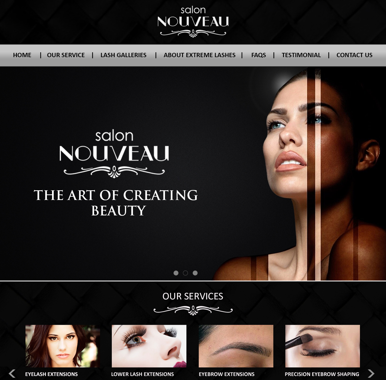
Site task: show the best sides of your company by means of visual dressing, make right impression, surprise,amaze user, make him think about us, think that we are reliable/respectable/eco-oriented/innnovative and so on. What clients turn to trendy sites most often: boutique hotels, advice agencies and legal services, photographers and marriage agencies.
Special attention to: Â What should user feel about your site? What exactly he should think about you and why? Which of you strong sides you want to highlight?
Design brief example: We need our website to attract our unique type of customer: worldly, well traveled, anxious to explore. We want our client understand that he can get the highest level of service from us, we are in the hotel Top-3 nominated for Welcoming Service. We would like the new design to be sleek, modern, clean, simple, and innovative. Â The site must look user friendly and appealing to the eyes.
Site example:
.
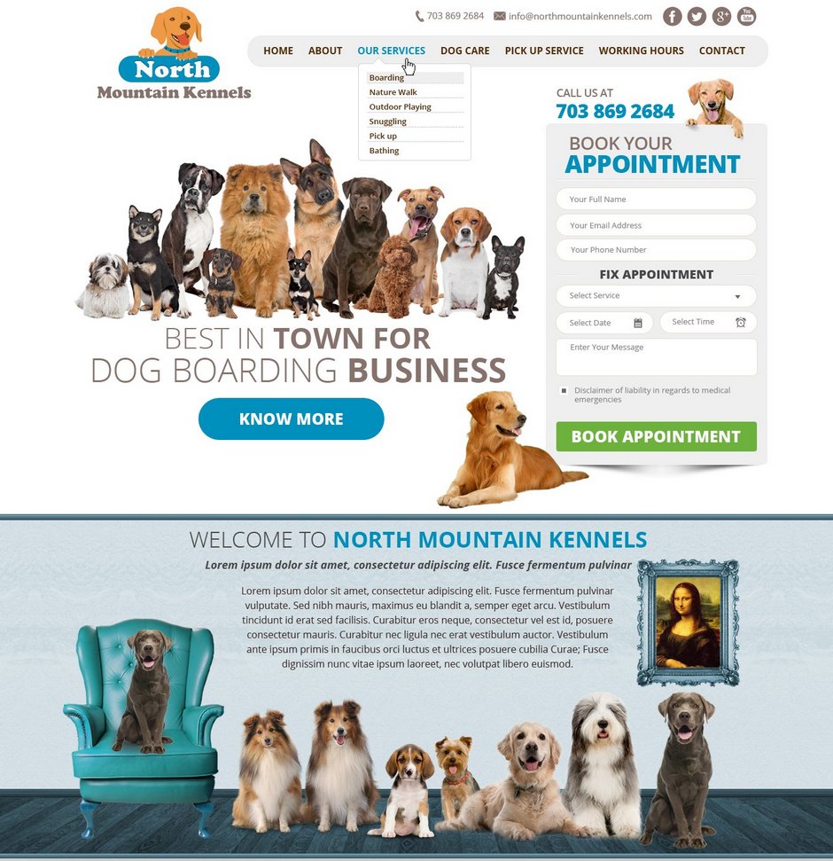
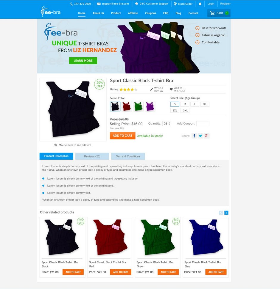
Web-store/ecommerce site
Site task: give user a tool for choosing and ordering goods and services; realise marketing strategies: promotions, price breaks, personalized offers, etc to advance average ticket or amount of repeat orders. The main task of design is to help client in using site, not distract, make site mostly easy and user-friendly.
Special attention to: Â Who is YOUR user? How many categories / types of products will you sell? What kind of information except products category is the most necessary for a client and where he can see it? Do you have a flagman product that needs more attention? How to make the order process mostly easy for final user?
Design brief example: We are the web-store of clothes for business women. With a help of our site woman can find necessary product in 5 clicks and buy it online.We seek a clean, modern design that showcases our advantages. The main page of our site should have: search line with tips, navigation menu in terms of main sections: business dresses, suits, trousers, formal dresses, shoes, accessories, promotions. You can see the subsection of particular section when you mouse over it (business dress – winter/summer/autumn/spring). Under the navigation menu should be units for every section where you can see some examples of goods and bottoms to go inside the section. It should be user-friendly and easy for the user to choose the section, to go into it and to make a purchase.
When you assess all the variants of design, pay your attention to: ease, logic and regularity of site navigation, option of quick orientation of user on the page. A good site navigation is like a GPS that helps user find the relevant content out of your website. Graphics should be easy and non-distracting and fonts should be easily readable. Â
Site example:
That is not a final version of the list of necessary sites for you of course.Sometimes you need design for enterprise collaborative portal or for local content site, blog or mass media. You can read informative tips about these kinds of design in our next article.
And now please, feel free to come to our chat or send your letters for [email protected] with your design tasks. We are always happy to help you in writting a clear brief to get the website you want!