Business cards are used for your brand’s recognition. They tell people about your company much more than you can even imagine. Due to being creative and original, business cards represent the way your company operates on the market, not to mention the fact they show how much you appreciate your clients. Therefore, DesignContest decided to show you the best examples of business cards and explain why you should want to have similar ones. All of them were created for our entries and prove themselves to be masterpieces indeed. Moreover, all of them serve a great example for vital business cards’ elements, capable of endorsing the company and increasing the brand’s approval.
Echo Business Cards
The entry was launched by Echo, a strategic consulting agency and was aimed at getting a business card that will satisfy the needs of both company owners and clients. A winning business card itself is restricted and contains only those elements that will be appealing to clients for sure. Firstly, the logo is placed in such way that it is quite visible and yet doesn’t distract clients from the supporting information. Secondly, it uses a color combination in such way that all the attention is directed to the most significant information that should be noticed: people and their contacts, which makes these business cards not only beautiful but also highly useful. They are a great example of a perfect composition that every business card should have.

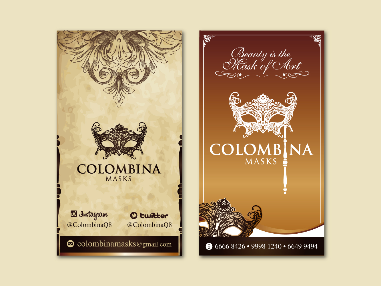
Colombina Masks
Italy, Venice, gondolas, impressive dresses, carnivals and mystery masks. Sophisticated and amazing, these business cards look as if they were mystical Tarot cards that can predict your destiny. In a way, they can: instead of destiny, they lure you into buying the masks these business cards advertise. The designer predicted every single reaction of those who see these business cards for the first, second and even the third time, for each and every glance you give these business cards mesmerizes you even more. Their fonts make a stunning combination with the depicted images and quirks, which makes the impression far more beneficial. These business cards are the greatest example of a comprehensive idea released inside.

Mars Hill Paint Co.
The mission of this company is adding colors into people’s lives. This mission is successfully implemented and shown with the help of these business cards. Black polished business cards are sprinkled with a tiny splash of color palettes. It actually shows how colors can make your life vivid and expressive. This is one more awesome example of what your business card should contain: a meaning, a fascinating story hidden behind.

Lionsmark Investments Group, LLC
The following example of business cards expresses determination and elegance all rolled into one. Not only did the designer thought about making typography refined and stylish, he also thought over a catchy element (a logo) placed in the way it would totally be noticed. A logo, centered on the business card, shows the company’s confidence and assurance. Taking into account that Lionsmark’s logo is a lion, it also symbolizes the company that rules the world.

Avant Partnets
These business cards look smooth and smart. Using only three colors, they succeed in creating an overwhelming impression of being fashionable and yet serious. Therefore, they are an awesome example of how a perfect and original color combination can affect clients. Black, golden and pink don’t need any bright objects or unnecessary details: they are capable of presenting the company in the best manner possible. The logo, placed with the help of these strong colors, doesn’t look like a trademark. On the contrary, it fits perfectly into the entire composition and is only highlighted by the brilliant colors chosen by the designer.

If your business cards contain these five elements, they will be recognized and admired. Can you think of any other element that is significant for business cards designing? If yes, share your thoughts with DesignContest.


