Fashion changes faster than weather in London. So, why should you follow those changes? Why should you be aware of them? Graphic design is all about making your product appealing to both your current and future clients. Thus, you need to keep up with the graphic design trends if you don’t wanna be a black sheep in the world of graphic design.
That’s why DesignCotnest has prepared 6 biggest logo design trends for 2018 for you. We simply want to make you ready for big changes.
1. Shadow breaks
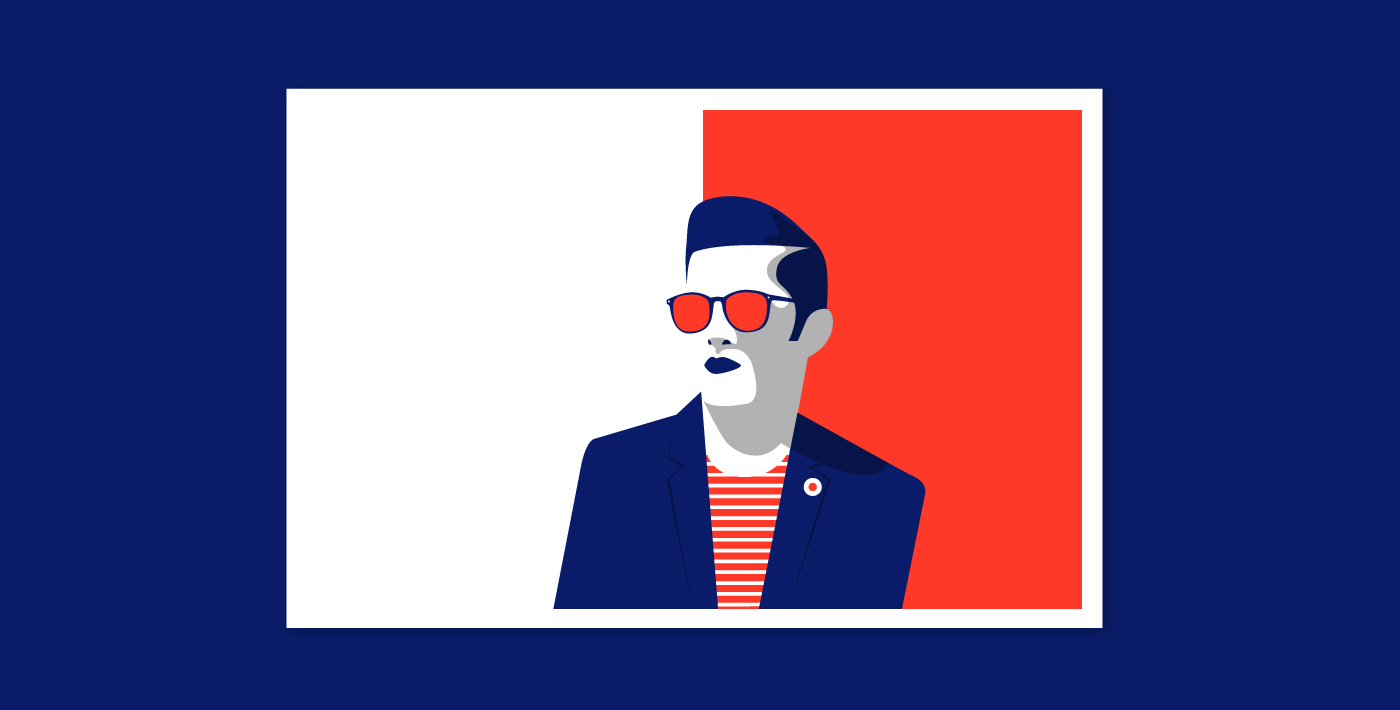
Shadow breaks seem to be very unusual for a logo design, don’t they? They can make your logo deeper by giving it a natural-looking 3D effect. This way, you transfer it to the other dimension, adding a different perspective and changing the perception. Logo designs that are created with the help of shadow breaks alter the face of a modern graphic design. Soon enough, flat will no longer be much in demand. Thus, seize the day and choose the shadow breaks trend for your new logo design in 2018. This way, you can be sure your new logo will be in trend for many years.
2. Animated logos
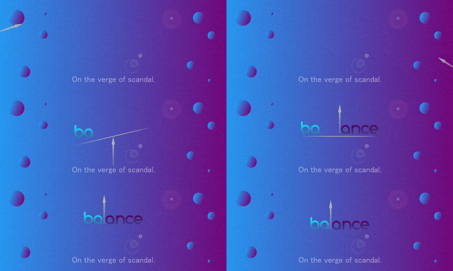
If animation has conquered the world of web design, why cannot animated logos win the world of graphic design? Sure, they can. What’s more, they are successfully doing that in the upcoming 2018. The number of animated logo designs will make you dizzy. The main benefit is that any logo can be turned into a catchy animation. Which means that even your current logo can be successfully redesigned and can meet the main requirements of logo design trends for 2018.
Animated logo designs raise your users’ engagement on your website. They make them stay online a bit longer just to follow the animation. That’s why any animated part of your website is great but when it comes to a logo design, it will be perfect, taking into account the latest logo design trends.
3. Fading logo design
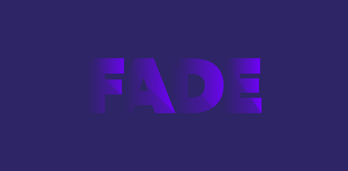
Fading effects used for a logo design creation are highly in trend for 2018 as well. They are calm and peaceful, and yet they leave you in the anticipation of something. Fading logo design looks great on any surface, in any size. This trend will help your logo to be more recognizable. If you pay more attention to this logo design trend implementation, you’ll be able to come up with a few brilliant solutions, for fading logos leave a large space for your imagination. For instance, you may choose an unusual surface for your logo to be placed on (e.g. a wooden menu or a steel sign), or use some special effects that will highlight the logo and vice versa. When it comes to this logo design trend for 2018, everything is up to your imagination.
4. Logo design with characters
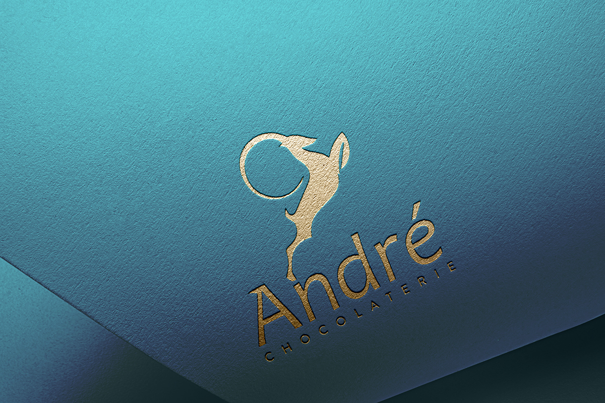
Animals, plants, people, fairy-tale characters… If your brand has its own character, it’s high time you placed it on your logo design. The reasons are different. Firstly, characters make your brand trustworthy, engaging, and lovable. Secondly, if you have a proper marketing strategy, your characters’ story can be interesting to follow and easy to recognize. Storytelling is the eternal trend in design; characters are a logical continuation of this trend.
You should also remember that a character used on your logo design should become a part of your company, a part of your brand. It should be more like a family member to your large successful brand. Logos with people on them are superb. They have a human touch and, if designed correctly, people begin to associate themselves with a character depicted on that logo, which is already a success: if they think they have something in common with these characters, they will want to buy the product these characters present.
5. Rising colors
Bright, bold, addictive, or calm, soothing, and serene? 2018 offers plenty of opportunities for you to seize, taking into account the experiments you may carry out with the colors used for your logo design. If 2017 was more about bright colors in a logo design, 2018 allows bold decisions. You may combine bright and soothing colors, you may stick only to bold or to serene color decisions. The main thing is the effect caused upon your clients.
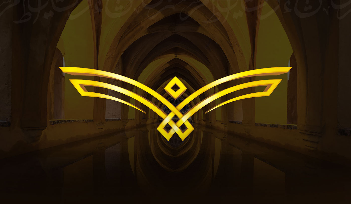
Logos that consist only of two colors that are also fitted into a superb color scheme correctly are a real win-win for both designers and their clients. Firstly, these logos are much easier to create than, let’s say, multicolored ones. Secondly, these logos look much better and well-thought than those that contain a rivet of colors inside. Thirdly, two-colored logos are more profitable for the clients because it’s much easier for them to stick to a two-colored office scheme.
6. Airy logo designs
Light logo designs with wings, feathers, and everything that can make you sail up into the clouds will become nothing but relevant in the upcoming 2018. This logo trend will turn your design into a metaphor. Thus, your logo will be capable of telling a lot about your brand, using a complicated language of symbols, hints, and signs.

Launch a logo design contest on DesignContest and we’ll make sure your logo design will be trendy, fashionable, and beautiful.

