Hi, guys! How have you been?
We hope that 2017 is treating you well!
While normal people try to get back on track after holidays, designers are looking into future to grab the main web design trends of 2017.
Let us show you what will rock in 2017 according to our team:
1.Cinemagraphs
If you don’t know what a Cinematograph is, it’s time to fresh your knowledge of hot trends. Cinematograph is a still photograph with minor movements. It can give visitor an illusion of watching a video clip.
Cinemagraphs are more interesting than static images, and at the same time their creation requires less time and resources. It’s better to use a gif than a pointless pretty video clip, where nothing about company, service or brand is explained.
2.Juicy Infographics
Users become less patient. They want information, and they want it now! Long gone the time of lengthy introductions. Furthermore, each year the attention span of an average user gets shorter.
Today, designer’s main goal is to keep user’s attention and make them interact with content (even with boring data). Especially, with boring data!
Present information in easy-to-comprehend way, make it animated and colorful. Grab users’ attention with details and clarity!
3.Bye-bye, Hamburger!
For the last couple of years, experts were talking about moving away from hamburger menus. Therefore, it’s not news that hamburger menus will go away in 2017. Yay! Finally!
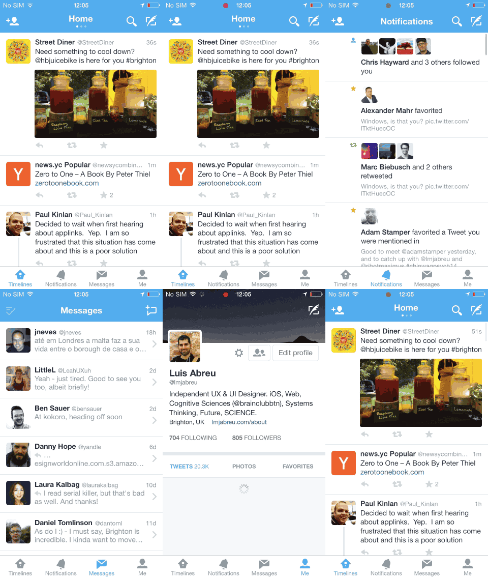
The problem with 3 horizontal lines is that user cannot intuitively recognize the navigation. Each year web gets more crowded with youth and forward-thinking seniors, who become confused by the hamburger menu icon. Check out how Twitter’s interface looks so simple, when all elements of navigation are clearly visible.

4.Frames
Instead of stretching a webpage, today it’s pretty popular to put it in a frame. Apart from giving a clean look, it leaves additional space, which can be used for navigation or other necessary content.
5.More emoji
User is more likely to interact with your content if it does not require a lot of steps (efforts).
Today, the most widespread reaction is the like. However, it’s time to change that and add more reactions!
6.Mobile First
Mobile share of web traffic grows each year; in 2016 it has reached 56%. Mobile First is no longer an experiment, it’s a necessity. Be ready to design lots and lots of similar, but oh-so-convenient websites that would look perfect on mobile screens.
Â
7.Microinteractions
Websites start to incorporate small detailed features to attract users. 2017 is going to welcome us with fabulous microinterations, similar to Twitter’s heart-button. Isn’t it beautiful? You just want to continue pressing on it.
8.Bigger CTAs
Designers create art for Behance and Dribble, all other projects (with money involved) are heavily influenced by marketing strategists that need brighter interfaces and bigger CTAs.
Wait to see bigger, juicier, colorful CTA-blocks this year.
9.Nostalgia for the 80s
Stranger Things… Twin Peaks renewal… 80s are making a comeback. And not only in fashion or TV industry, but also in the web design. We all missed pixels, 8bit sounds and TV interferences. Be hip and use neon colors, glitches and pixeled graphics.
10.Greenery
Did you check the new Pantone color of the year? Right, it’s Greenery 15-0343! Listen to their piece of advice and make your website look fresh.
11.New approach to wireframing
No matter how marvelous your website design is, a key task is to make your client fall in love with it. Or, at least, saw it with your eyes.
Static frames can no longer success here. You will have to apply all your creativity and art of presentation to make clients understand all awesomeness, instead of imaging them and having unrealistic expectations that cannot be fulfilled.
That’s it for 2017!
But do not argue a client that wants a background video. And do not add emoji and pixel elements, when client seeks a clear and minimalistic e-commerce. Apply trends wisely, or do not apply them at all. They are more likely to change in a year 😉


