This summer, graphic design trends have been undergoing significant changes. It is highly possible that those trends that existed before soon will be gone. They are making way for completely new tendencies that are twice more dazzling, expressive and daring. DesignContest is eager to introduce these tendencies to you!
Vivider and brighter
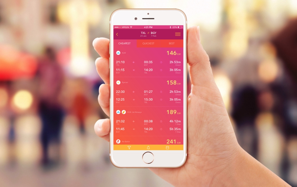
Summer loves rich and vibrant colors that breath with vital power. This summer does its best to contrast these intense colors with those washy ones that were used in graphic design before. The choice of faded and pale colors that are so commonly implemented in graphic design is easily explained by the desire to show people that the minimalistic, flat and user-friendly future they saw in sci-films is already here. The idea itself was great and did work (as we see by the example of Apple). However, this idea got spoiled after hundreds of companies started copycatting Apple’s  initial idea. So, in terms of colors, summer 2017 suggests us stepping aside from the concept we’re all used to and diving into new bright and catchy color decisions.
However, it still doesn’t mean you should long for making your website or mobile app as sparkling as you can – it will only lead to a tiresome design. Instead, follow the examples of Instagram or EasyFly. These companies have added warm colors to their graphic design concepts in moderation, preserving their initial beauty but making the design softer and more appealing to people’s eyes.
Real photos
Taking into account the fact that graphic design needs to be real, the need in real-life photos of the highest quality is no surprise. This need has even become overwhelming, especially this summer.
If you are working with marketing, you have come across this photo once or twice.
You might have even used this photo on your own. Why not? It’s bright, has a high quality and neutral in its essence. It leaves nothing more to be desired. Except for authenticity. You are not the only one who used this photo, for your competitors have used it as well. Therefore, the uniqueness gets erased and the content you provide is no longer highly original. So, the next trend in graphic design of this summer includes photos created by you. Perhaps, you have a person in your team who dreamt of becoming a photographer in the childhood. Why not to give this person a chance? The result will surprise your clients and you: the best ideas are always kept nearby.
Hand-drawn graphics
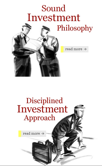
Graphic design has become more humane. Thus, hand-drawn graphics make your design not only extremely unique and creative but also closer to people. Especially if you manage to design some characters that will represent just your brand. A stunning example, in this case, is Smith Salley Website. They created a few hand-drawn characters that accompany the website’s visitors on every page, riveting their attention to the things that are worth noticing. It makes this website interesting and fun and the basic rule is: if you succeed in entertaining your client, you succeeded in winning his trust as well.
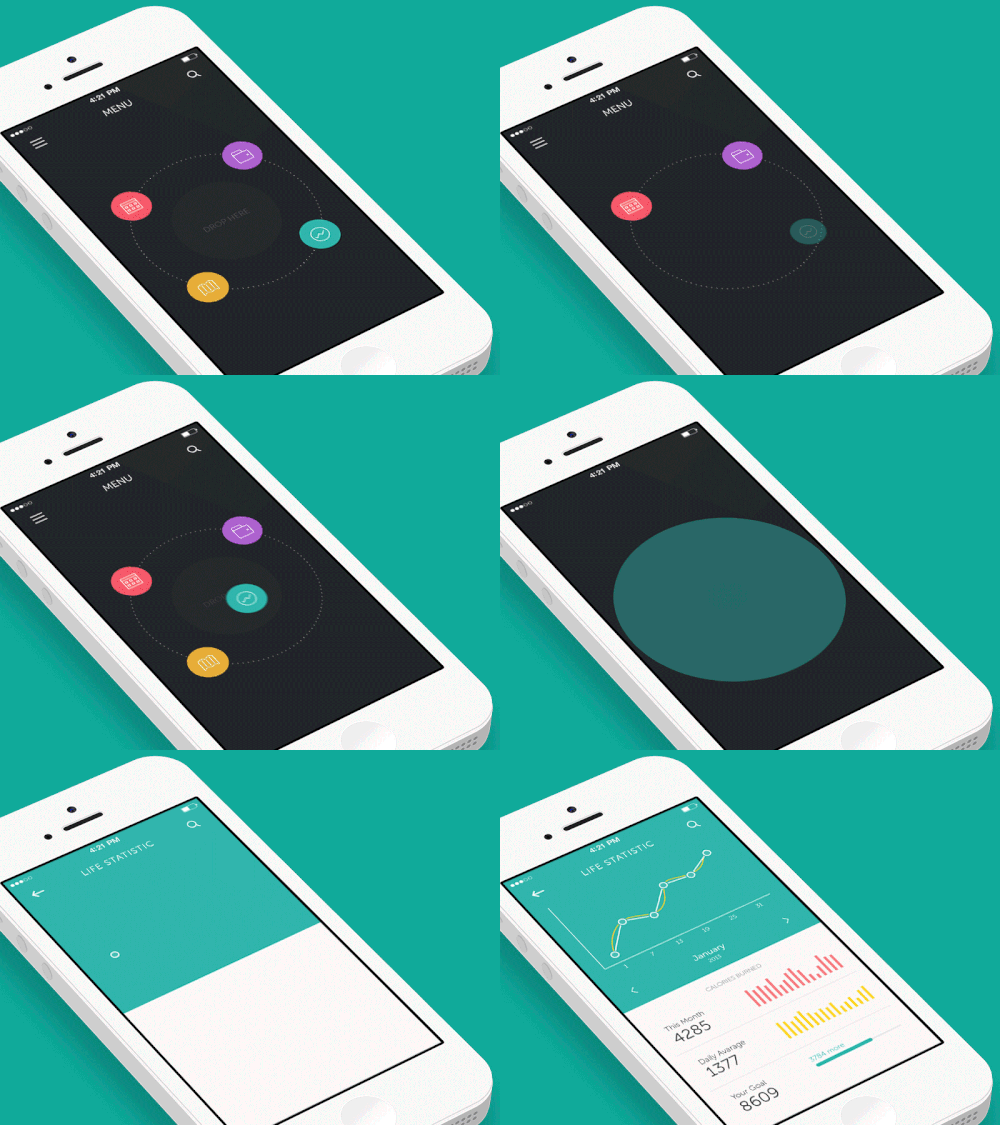
Using GIF
Everybody loves GIF-files. Or almost everybody. Well, most people love GIF-files, and “most†is already a considerable number of your potential clients. GIF-files are great helpers in online conversations when you need to express your emotions and cannot do it using a single text. What’s more, they don’t need any special applications, have a small size and can be attached to any message. Which makes GIFs even more perfect in terms of graphic design. They make a communication alive and interesting and increase your chances to succeed.
Duotone
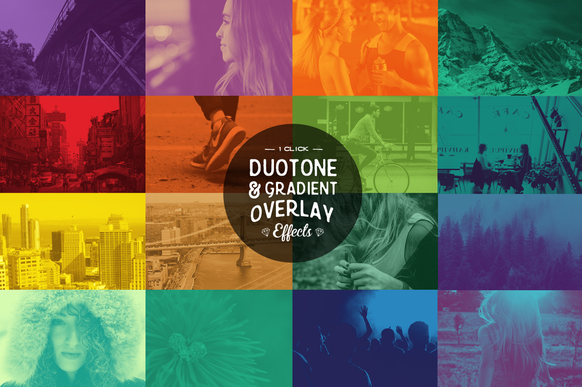
Duotone is a simple combination of two colors in one image. As a rule, these colors are very bright or contrast. In order to create a gorgeous duotone, designers need to make a bit more efforts but the result will be totally worth those efforts. Only a well-qualified and experienced designer can create a truly great duotone. Still, it doesn’t mean you shouldn’t try, even if you’re not sure in your abilities. Practice does make perfect.
To sum up
A moving force of graphic design this summer is its uprising against excessive purity, whiteness, and softness. The result is going to be vivid, innovative and beautiful. However, most of these innovations will be implemented by such IT titans as Google, Apple, and Instagram- those, who have enough money and talent to test lots of new ideas and understand which ones will be able to bring the best results. Which is why we’ll get only the best of their hints.


