In recent years Cannabidiol (or CBD) has been appearing everywhere and has been touted as having numerous health benefits. Unlike THC, which has a notable psychoactive effect, CBD often produces more of a calming and soothing response from people and animals. CBD, originally derived from the cannabis plant, can appear in many forms, from tinctures to oils and creams or even in edibles like chocolate! Many start-ups and small businesses have been established for the sole purpose of marketing and selling CBD products. And of course, the demand for CBD logos have skyrocketed as seen in the many logo conteststhat have started on theDesignContest platform.
As a result, CBD businesses are relying on brand new logos that reflect the character of their businesses. In this article, we are going to take a look at the top 10 CBD Logo Designs that have captured the attention of our design community; the end customer.
So, without further ado, let’s begin.
CBD Pure
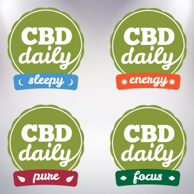
The above logo was designed for CBD Pure, a lifestyle brand that focuses on bringing the benefits of CBD to the everyday consumer. The logo that has been created is simple, clean, and made for appealing to health-conscious customers.
The logo has been divided into four subtypes that represent the four varieties of the product available. The basic design is a circular green batch, representative of the natural source of the product. Within the badge, inscribed in white, is written CBD Daily in a slightly cursive font.
At the base of the logo are four distinct panels that each represent the different product lines. The SLEEPY variant is represented by a blue panel with two crescent moons, signifying night-time.
The ENERGY variant is in vibrant orange with images of the sun; this naturally translates to the energy of the sun that permeates all beings on earth.
The PURE Variety is in Magenta with leaf imagery that represents the purity of natural CBD. And finally, the FOCUS line is represented in a darker shade of green, with eyelike patterns in white.
CBDguru
The logo for CBDguru is intuitive and stylish at the same time. Using the contrasting colors of red and green on white and black backgrounds to good effect, this logo creates an immaculate representation of the brand. The dewdrop pattern (perhaps reflective of a drop of CBD) only enhances the appeal of the logo. With solid colors and professional fonts, this logo is one that is sure to remain stuck in the minds of the target consumers.
Secret Smoke
Utilizing black and white to good effect, the logo for Secret Smoke blends substance with elegance in a perfectly sublime manner. The contrasting colors, together with the smoke-through-the keyhole design element perfectly symbolizes the name of the business. Further, the solid colors lend a characterto the organization and its sound business ethics.
Swamp Rabbit
The Swamp Rabbit Hemp Co. logo aptly displays the name of the business together with the additional tagline that speaks to its region of focus. The yellow background serves to bring the rabbit-in-black to life. The sprinting rabbit symbolizes the vigor at which the company is running towards its goal. And if you look closely enough you can’t miss the hemp leaves that make up the ears of this beloved bunny.
3G Farma
The 3G Farma logo combines white, black and green to great effect, and the results are there for all to see. The hexagonal motif testifies to the organic origins of the product, as do the green leaves that shoot out of the pattern. The green leaf motif is again repeated in the A of the word Farma and highlights the point that all products created by this business are sourced from nature.
Moiese Farm & Ranch
Again, a homage to black and white, the Moise Farm And Ranch logo defines the business in a short and succinct statement. The Hairy Highlander head, flanked by hemp leaves, clearly displays the two products that this business deals in. The logo is simple, clear and leaves no scope for ambiguity.
CannaWhey
CannaWhey is an interesting cannabis product which blends CBD with whey protein in order to create a unique recovery supplement! Black and green seem to be the favorites of the season. Once again harking back to the basic colors, the CannaWhey Logo blends green and white on a black backdrop. Notice the green of CANNA, and you can see the hemp growing directly in the field. Perfect for showcasing the natural origins of the product.
VapeDegree
The VapeDegree logo takes the metallic route; the entire logo has a steely tinge, and is crowned by five metallic weed leaves representing CBD, which itself occupies the place of pride to the top right of the company logo. And at the background…black again. The entire logo exudes a technical feel that goes perfectly with the company’s business of e-cigarettes.
imPRESSive Solventless Extracts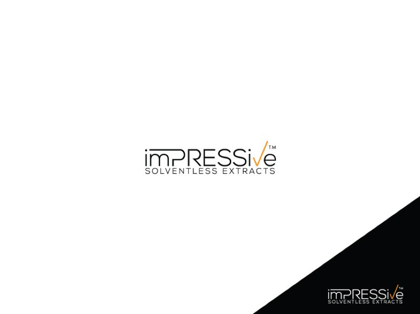
A startup that serves the medical marijuana market, imPRESSive’s logo is, to say the least, pretty impressive. Set against a white backdrop, the stylized black lettering is only improved by the tick-mark shaped V in orange. The logo proclaims the identity of the company in minimalist tones. And the lower right corner with reversed color schemes is also a nice touch.
CBDology.eu
Yet another winner in black, the CBDology.eu logo looks stunningly vibrant in white and green against a black background. The crowning leaf representing cannabis creates a nice contrast. CBDology focuses on oils & vape liquids, and this logo is a quintessential representation for cannabis products.
So here we are, at the end of our lengthy exposition on the top ten CBD logos that are making the waves in the market currently. And as far as trends are anything to go by, black seems to be the dominating hue among all designs. And the leaf motif is a recurrent presence among the top logos of the day as well. But enough about our choices…do you have any stunning logos in mind that we missed? If Yes, then be sure to let us know in the comments section below.

