Finally! Our children’s logo survey is over and we are delighted to share the results with you today. We have spoken to mothers from several European countries, USA, Canada and Australia.
Mothers have a direct impact on what their kids use and consume including baby food, books, toys and cosmetics. Children are so impressionate, they remember every detail. They should be surrounded with beautiful goods of the highest quality and the best design. We were curious to see what kind of logo can encourage the consumption of children’s goods such as food and drinks, clothes and toys, baby care goods etc. We hope you are as fascinated by the results as we are.
More than 80% of respondents remember the logos of children’s products and can name more than 5 product brands that they trust. That is a great incentive to design a logo that would be memorable and encouraging.
First of all we asked moms to name the logos of famous brands that they consider to be the most efficient and successful. Number one choice was Pampers. Then Nickelodeon, HiPP, Nestle and Kinder logos, all of which have proven to be popular as well.
What should a good logo for kid’s product contain?
![]() Â Logos with animals turned out to be the most preferable among mothers. 59% of all respondents voted for them. It is a great way to teach the child to identify different animals.
 Logos with animals turned out to be the most preferable among mothers. 59% of all respondents voted for them. It is a great way to teach the child to identify different animals.
 ![]()  Images with kids take second place (53%).
 Images with kids take second place (53%).
 ![]()  The third place belongs to simple geometrical shapes such as circles, triangles, hearts and other shapes that are commonly recognizable.
 The third place belongs to simple geometrical shapes such as circles, triangles, hearts and other shapes that are commonly recognizable.
 ![]()  Abstract shapes turned out to be the most inefficient for children’s logos as they are rather difficult to comprehend for a younger audience. Such logos are not very memorable for the parents as well.
 Abstract shapes turned out to be the most inefficient for children’s logos as they are rather difficult to comprehend for a younger audience. Such logos are not very memorable for the parents as well.
We have also found out what logo designs are the most memorable for mothers:
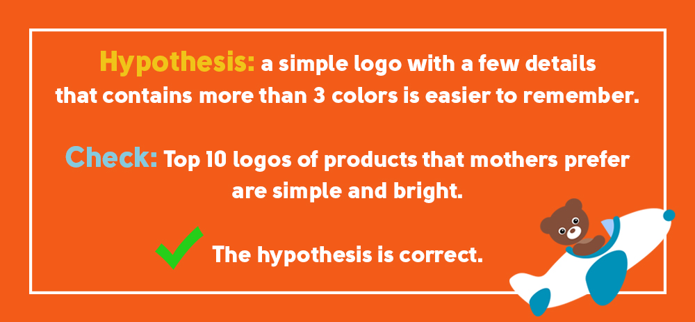
 ![]()  70% of mothers voted for a simple logo with no extra details, characters or elements;
 70% of mothers voted for a simple logo with no extra details, characters or elements;
 ![]()  More than 60% of respondents in Russia and almost 95% of moms in the USA, Canada and Europe choose bright, multicolored logos. Therefore, if you are creating a graphic design for children’s clothing items, toys and cosmetics, make it more vivid!
 More than 60% of respondents in Russia and almost 95% of moms in the USA, Canada and Europe choose bright, multicolored logos. Therefore, if you are creating a graphic design for children’s clothing items, toys and cosmetics, make it more vivid!
 ![]()  Efficient logos should contain both symbols and text to be memorable for 65% of mothers;
 Efficient logos should contain both symbols and text to be memorable for 65% of mothers;
 ![]()  Over 60% of mothers think that the logos on children’s producucts should contain cartoon characters because they are more fun for the little ones.
 Over 60% of mothers think that the logos on children’s producucts should contain cartoon characters because they are more fun for the little ones.
Serious, sophisticated logos are a taboo for these kinds of products. Only 5% of respondents voted for them. So unrein your imagination!
We also noticed that moms prefer thematic logos. If we are talking about a food company, a children’s café or sweets, it would be better for a logo to contain a food image. This helps mothers to categorize the products and make up their minds quickly.
If you are determined to design a great logo for children’s products, pay attention to yellow, green, orange and red colors. According to survey results these colors are the most suitable for the logos on children’s products. Purple and blue were not very popular during the survey. We have asked to rate each color from 1 to 5:
Yellow – 4,2
Green – 4,1
Orange – 4,1
Red – 3,2
Blue – 3,1
Purple – 2,1
We have also asked our respondents about other corporate identity items that are important for them.
Most important:
  ![]()  Clear and user-friendly website.
 Clear and user-friendly website.
  ![]()  Unique logo that is easy to remember and identify with the product.
 Unique logo that is easy to remember and identify with the product.
  ![]()  Ergonomic product packaging.
 Ergonomic product packaging.
  ![]() A character that can be associated with the product (think Nesquik Bunny).
A character that can be associated with the product (think Nesquik Bunny).
Less important:
  ![]()  Business cards of managers with telephone numbers and address of the store.
 Business cards of managers with telephone numbers and address of the store.
  ![]()   The uniforms of the company’s employees.
  The uniforms of the company’s employees.
The three things that make a product memorable are website, logo and packaging. A professional designer will help you create a truly outstanding design. You just need to describe your target audience, business activity and primary requirements for your desired design.
When you see bright colors in logos it’s sort of like a shock to our brains, we are used to seeing neutral colors colors like black or blue but when we see a vibrant color our minds remember this because it’s out of the normal.
This survey that was conducted proves that mothers remember logos that obviously stand out from the rest, the ones that use bright colors multiple colors and that use fun characters such as animals. Companies should be sure to keep this is mind when trying to market their products to mothers.
