Today we have another special designer giving us an interesting interview. Meet our great website designer VladTodirut who creates amazing designs not only for DesignContest contests but for DesignContest website. Yes! Our designer profile page has been designed exactly by him! 🙂
I have looked through your portfolio. Website design is your passion, isnt’ it?
Yes, webdesign is what I love the most from all the design categories.
Webdesign is more than just a pretty picture, it also has to be functional and to make sense to users, so it’s always a challenge to do a good UX/UI job, and that’s what I like the most about it, the challenge, the necessity of always having to push your boundaries, to create something even more entertaining, even more user-friendly, as the customers are always asking for something cutting edge.
I guess website designing is the most complicated category to deal with. Where do you usually find inspiration?
Well I wouldn’t really say that webdesign is the most complicated category, it’s just the one where you have the most elements to work with, but, other than that, all categories have their challenges. I think that logo design is the most complicated, since it requires you to synthesize the entire philosophy in a single, simple and memorable image. I have tremendous respect for logo designers.
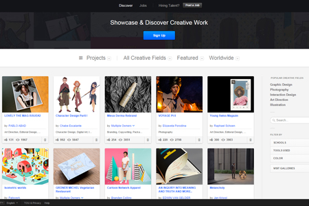
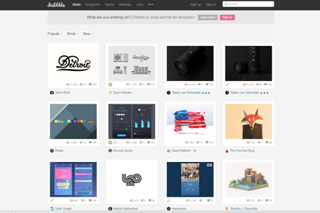
As far as inspiration goes, i find my inspiration on behance and dribble mostly.
Have you always been doing websites? What about other categories? Logos, banners, businescards?
I started out with print actually, for a few years. Then slowly transitioned into logo and then stopped at webdesign. I still do a lot of print, stationary and t-shirts, but I prefer doing webdesign for the reasons stated above.
Name your pros and cons of working as a freelancer?
Freelancing means you have more free time and you work on your own schedule. On the other hand, your are trading in 1 boss for 10, so it’s not all that glamorous as it sounds. Tricky part with freelancing is to keep a schedule, pretend you are going in the “office“, otherwise you just get lazy and start working less, and thus missing deadlines. And while binge-watching on a series or playing on the newest, coolest app on your phone is quite awesome, not getting a paycheck is not at all something I would look forward to.
For anybody considering doing freelance, I would recommend reading bidsketch website, a lot of Rubens Gomez’s topics are mostly about clients and freelance, so it was a really big help for me, when I took the leap. Because it is a leap, and you need to be quite prepared for what’s coming, and to have a strategy that allows you to keep a decent livelihood.
And working in office?
Working in the office is better for your social skills and your creativity, nothing beats a collective brainstorming session. You also have just 1 boss (and a few CS people) to answer to. But if you’re not the 9 to 18 kind of person, then it will slowly eat at you.
It depends a lot on how you get along with everybody. Going to the office to meet nice people and work is nice, but when you get to the point where it becomes mechanical and you dread waking up in the morning to go through the same routine, day in day out, you need to take a deep breath and ask yourself if you’re where you want to be in life.
Have you ever had a project you wanted to quit because of hard client?
I get this a lot unfortunately, many clients think they know what it’s best for their company, and what UX/UI is, and often times they are wrong. The moment I get a client that doesn’t trust my experience and skills, that’s when I know I have to get out. Otherwise I end up doing “slave†work for them and the end product isn’t usable. No matter the payment you get for the time you use on such clients, it’s simply not worth it, for either of the parties, if by the end of your efforts you have nothing to be proud of.
As for me dealing with it, I always try to be honest and polite. Although at times you may feel that the many emails you just received asking you to do 5 contradicting modifications on a site is reason enough to tell the client off, it is, for me, quite important to keep calm and take difference of opinion as just that and not as a personal attack. Clients take it a lot better if you just tell them “I’m sorry, but it seems like I am not the right designer for you, thank you for your time and effort in providing feedbackâ€, rather than “F***, I know better, go find yourself another designer!*
Is your design activity connected with the business activity of the company you design a website for? For example, will you get more please designning a website for a pet care company or financial company?
Anything but financial companies please (smiling) Those are the hardest to work with, mostly because they have a “board†of directors that make the call on the design. It’s hard to get many people to agree on something, and each person has a different idea about what content they want on the front page and how they want that specific content to be presented. I prefer to work with products. Actually. I worked for 4 years for a few of the Heineken beers, and I really like to work with bringing the products to life in a website.
You are DesignContest long-liver. You’ve been a member since 2010. Do you remember your first contest and your first win? What was the feeling?
Yeah… long time (smiling) I think my first contest was for ForexBlog or something like that, it was a logo contest that obviously didn’t go that well. First webdesign I won on DC was for heatart.com (still standing), and it was the greatest feeling, thats when I started to realize this might be a good way to earn some money, while doing something that comes naturally to me and that makes me feel like I’m pursuing a hobby, not just working.
You are also a special designer for DesignContest. You’ve designed designer public profile for our website. Was this task hard for you? Have you done a lot of changes before declaring a final design?
Yes, I do have a long history in designing for DC ( also comment sections and other small parts ). The designer profile was a difficult task to wrap my head around, lots of elements to include there, and users also had to have the option to personalize it to some extent.
But it was a very welcome challenge, changes weren’t so many or so big since my first draft, mostly variations and trying out different things. It also helped that Sergey and Oleks are people that I enjoy working with.
Will you recommend some online sources for website designers who are beginners?
That’s a tricky one because there are a lot of resources out there. Just make sure you know what webdesign is, and stay up to speed with any new technology and guidelines that occur.
Looking for inspiration is always important, so keep dribbble and behance close.
Best resource for me was (and still is) smashingmagazine website.
   Â
  
What would you advise DesignContest newbies?
Just take your time, don’t rush to submit your entry. After you are done with your design take a step back and look at it again, with fresh eyes. If you think something isn’t alright, then it most probably isn’t, so trust your instinct and make sure YOU like it before submitting.
I find that it always helps if you explain the reasoning for how you did things, and what are the pros of your entry. But don’t write a book about it, clients won’t read those.
One of the most important piece of advice would be, in my book, to be polite, both to clients and to fellow designers. We all want the same thing, better and nicer webpages. So as long as we’re all on the same page, might as well act like a team (smiling)


