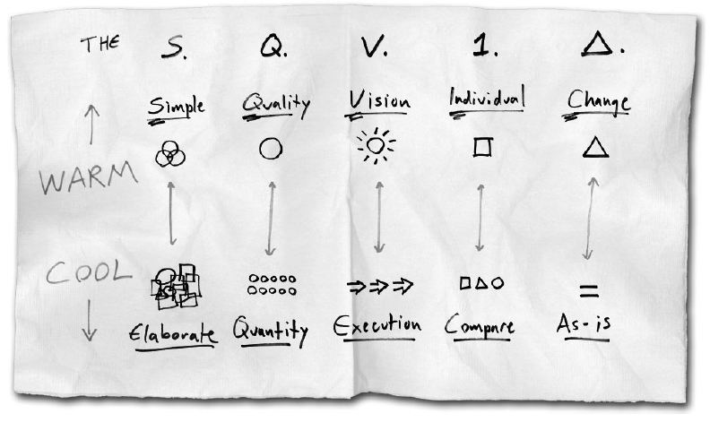
Sometimes, the best solutions are the simplest and the most obvious ones. In terms of web design, “obvious†refers to the phenomenon of visualization. The best way to communicate with your client and to explain your ideas is hidden in The Back Of The Napkin. Except for being a stunning metaphor, The Back Of The Napkin is also a book written by Dan Roam. It is devoted to the problem of visualization and selling ideas with pictures and gives a reasonable solution in the form of SQVID – a practical tool of applied imagination.
The SQVID is an extremely easy and yet brilliant technique that will allow you to win your clients’ admiration by showing them your idea. The keyword, in this case, is “showing†– you transfer your idea into your clients’ imagination and allow them to see it the way you do. So, what is SQVID all about?
S is for Simple
Your client is like a 5-year-old kid. He isn’t an expert in terms of web design as you are, that’s why using long scary words while explaining your opinion will only put him off. Try to tell a 5-year-old kid that eating lots of sweets is really bad for him because they contain too much glucose that erases the level of sugar in his blood. I hardly doubt he will stop eating sweets because of the foggy reason you gave. Also, don’t forget that simple concepts are the winning ones. The clearer your design is, the more chances it has to survive and win.
Q is for Quality
The most crucial thing is your design’s quality, not the number of design entries. If you concentrate on one design entry and keep developing it, your chances to bring it to the highest level of perfection are much higher than in the case you create lots of design samples of a poor quality. Your efforts won’t be left unnoticed and will be really appreciated and evaluated.
V is for Vision
The most important part of making your client understand the future look of the design you have in mind is concealed in the step of this sample’s actual visualizing. Your client isn’t interested in the way you do it, so don’t show him the changes step by step (e.g. “You see, I made one letter red, do you like it more than those others that are golden?†– that’s totally wrong! Show the client two samples – one design with red and one with golden letters – this is what visualization is all about. Don’t make your clients guess – better show them your design in practice).
I is for Individual
Your design should be better than anything else. Don’t make the client compare it with other samples he has. Provide him with an understanding that your design is really worth his attention and a golden medal. Emphasize its individuality and uniqueness. The phrases like “Oh, you see, this logo is better because it is round, while all the others are square-shaped†won’t do. Your client has to notice this difference himself, all you need to do is to point it out in terms of an actual visualization.
D is for Change
A bit strange, isn’t it? Changes don’t start with D. However, they are still significant for the SQVID tool and are the final stage of the applied imagination process. If your client asks you to change something in the design you have, do it, but do it wise. Don’t provide those changes in a careless way, just for the sake of doing them. You cannot fool your clients and mess with them by doing the changes in an inaccurate way.
To sum Up
SQVID tool stands for a visual thinking and helps you to take your vague idea to your client’s specific understanding and implement it further in life. By drawing pictures, you make sure that other people grasp the concept you’re talking about and can see it with their own eyes.
Have you ever tried to use the SQVID technique? Did you succeed? Share your experience with DesignContest!


![What Is Essential In Valentine’s Day Landing Page [Infographics]?](https://dc-prod-blog.sfo2.digitaloceanspaces.com/uploads/2016/01/valentines-day-landing-pages-featured.jpg)
