A logo design is what makes your brand widely recognized. It is a magical tool that presents your brand and differs it from your competitors. You may have a great business strategy, make proper Lean Canvas, and still have no idea on how the “face†of your company, your logo, will look like. On the other hand, you may have plenty of ideas on your future logo design and still not know how to make those ideas work. Both are huge problems that need to be addressed. So, how can you design a logo for your brand that will meet all the requirements? Let’s take a look at it step-by-step.
1. Logo design for your target audience
First, think of your target audience, for it is the most significant part of your business. You have to meet your audience’s requirements and build a brand logo based purely on their needs. For example, your website is aimed precisely at small business owners in Great Britain and Ireland and you choose some pink smile to represent it. Which simply won’t work.
Why? Because you failed your audience’s expectations and they simply won’t trust your website with their business.
What is the solution? According to this example, you should choose the colors that will interact with the mentality of these countries. Moreover, if we’re speaking about small business owners, it would be better to choose a simple but creative logo design in a minimalistic or similar style.
2. Your logo design: what for?
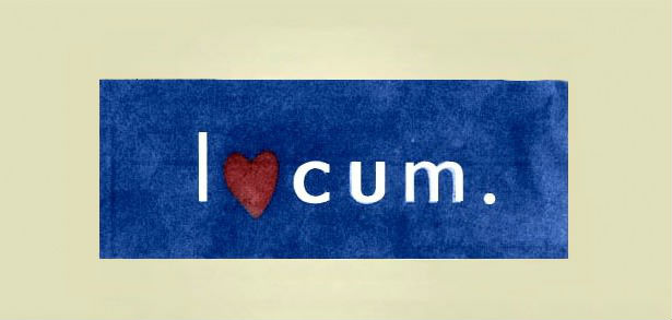
Your second and probably the most important decision is to come up with the aim of your logo. Sure, it must be easily recognized and, in the future, simple to promote, but what else? Do you want to entertain your visitors to gain their full attention? Try to be funny but not ridiculous. Everything must be in moderation, especially when it comes to your brand’s logo as the first thing your clients see in you. Think twice before making any decision. Your aim is not to make your clients laugh but to provide them with the best service you can. For example, a Swedish paper company Locum wanted to impress its visitors with an outstanding logo. They succeeded in it but the number of clients got considerably shortened. And here is why:
What is the solution? I’m not quite sure what the company tried to prove. Neither are the company’s clients. That’s why you have to be extremely careful and think of your clients’ reaction to your future logo. It should be both daring and appropriate. Otherwise, it would be a complete disaster, like with Swedish Locum.
3. Get improved
Keep improving yourself and never stop analyzing. Take a look at your competitors’ logos. Yours has to stand out, be remarkable, and have a significant hint of novelty. Imagine that you have two major competitors, Brand 1 and Brand 2. Brand 1 has a white dot in a green circle, Brand 2 has one 3D yellow pyramid with letter B on the top. Thus, if you choose green or yellow shades, they will be associated with your competitors and not with you as a brand new company on the market.
What is the solution? Pick a color different from those two. Under no circumstances can you choose the same figures. Thinking in a different way can help you strengthen your brand on the market and distinguish yourself from others. This is crucial for any new brand. Remember, you’re not a copycat, you’re an independent and trustworthy brand. Also, don’t forget you have to follow your company’s color scheme: your new logo has to correspond with your office design.
4. Don’t forget about trends
Next, follow the newest trends. You don’t want to be old-fashioned when it comes to a logo design for this is what your brand’s awareness mostly depends on. To create your brand logo, use the latest technologies available. You may try to do it on your own if you’re sure in the future result and willing to take a risk. However, if you’re not friendly with Photoshop and other programs that help you design something interesting and clever, the result might be unpredictable and even hideous.
What is the solution? Ask professionals to help you – it’s the best option you have that can save you from a complete disaster. It might be a bit more expensive but, as they say, buy the best and you only cry once. Web designers are those who can come up with the greatest ideas for your logo design that will interact with your brand’s concept and will meet all the requirements you set. If you want to get more fabulous ideas, make the designers compete, as DesignContest actually suggests. In this case, you get a variety of logos of the highest quality. The only thing you will need is to choose the one you like the most.
5. Anticipate the results
Finally, devote your attention to the whole picture itself. For it to work and bring the benefits you need, your logo has to be harmonious and easy to read. If you use some colors that don’t match, they will distract your clients and all the nice impressions will fade away. Moreover, if your visitors cannot read what is written on your logo, they will simply pass by. That’s why your logo doesn’t only have to be new and catchy, but also pleasant to look at.
What is the solution? If you have already chosen a proper color palette, think of the font on your logo and make it interact with your entire idea. Also, make the text visible and clear to understand. Last but not least, you have to think whether to include the name of your company on the logo, just the first letter, or leave the logo without any text. Sometimes the simpler your logo is, the better it will be perceived.


