With the instantaneity of the digital age, many of us have strayed away from the basics. If you’ve been to an art school and studied graphic design, the elements and principles or design is the first topic that is drilled into your head. It’s a vocabulary set shared by al designers; the building blocks to creating art work. What if you haven’t gone to art school or taken graphic design courses?
Relax, you’re still a designer 🙂
Designers rely on their aesthetics instinct to produce masterpieces but sometimes it’s good go to back and polish up old knowledge, even if you already know it. A good designer knows the fundamental principles and elements of design, a great designer implements them.
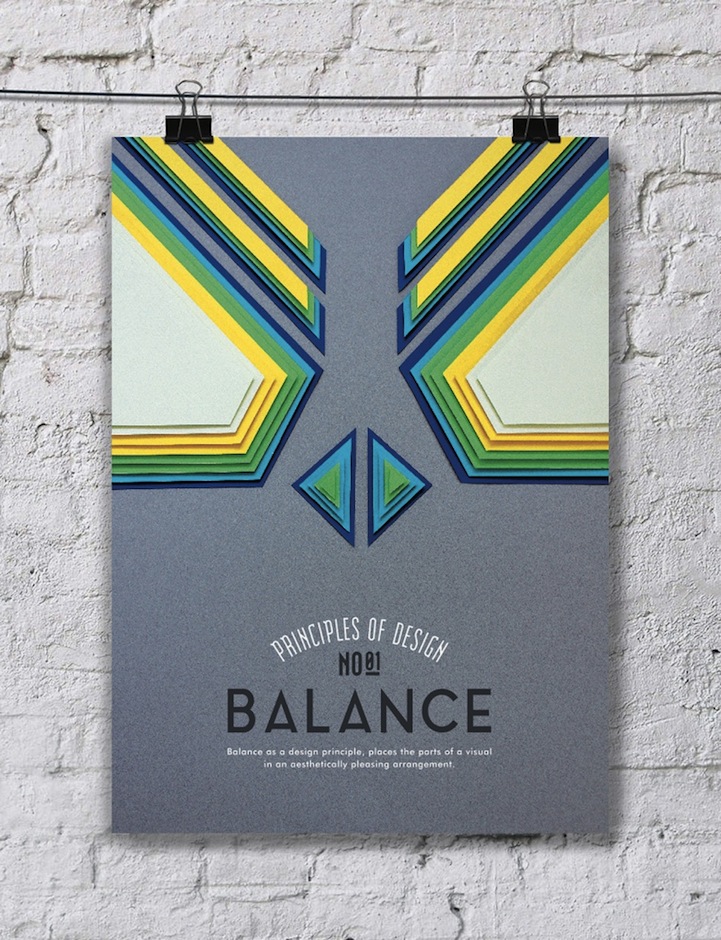
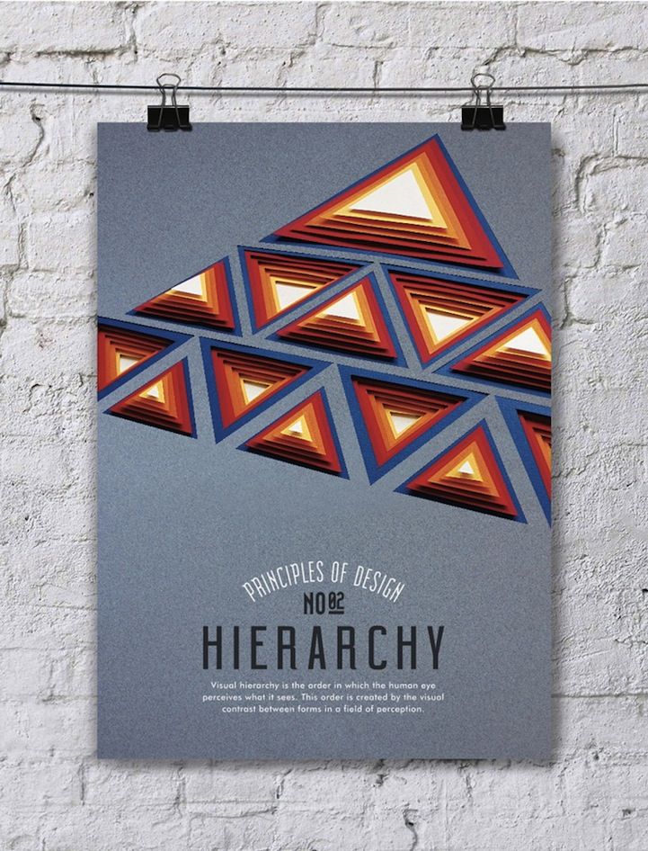
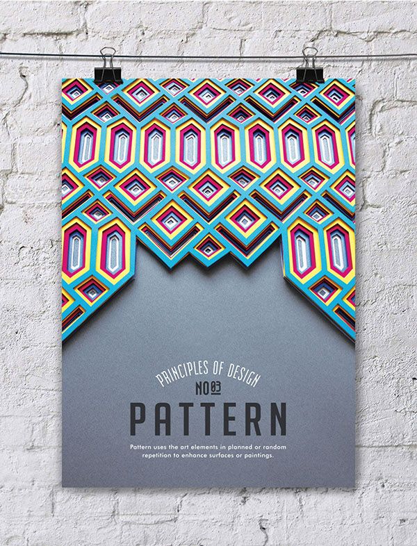
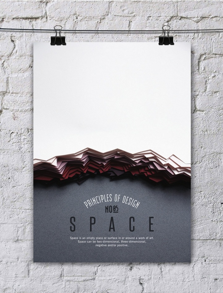
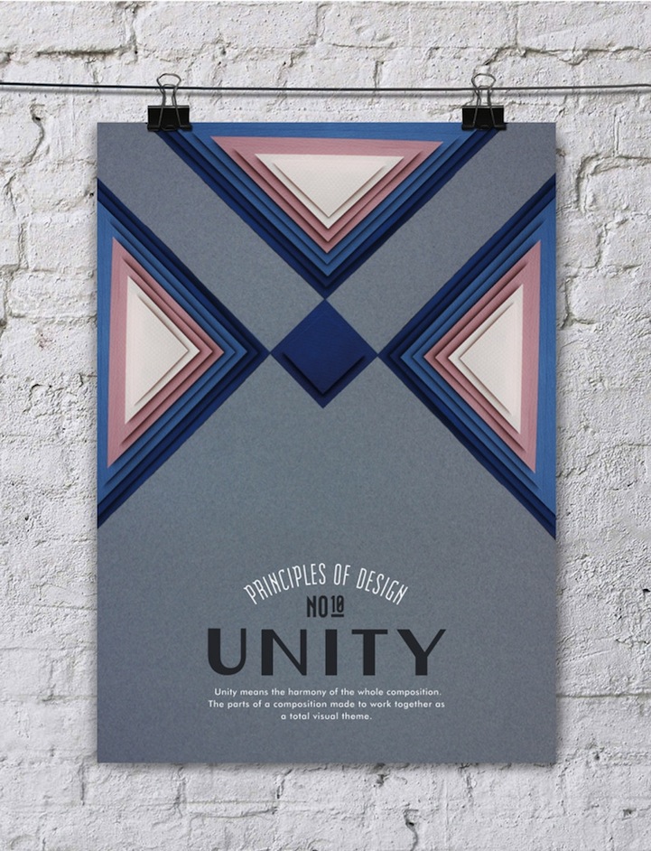
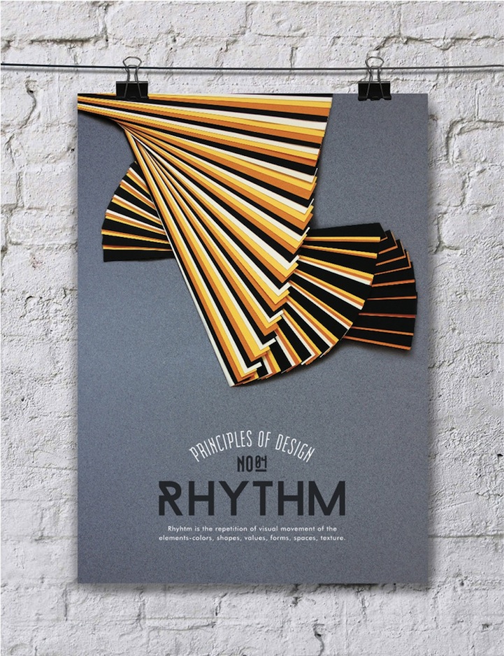
Efil Türk, a Turkish graphic designer, has created a series of posters to visually communicate the ideas behind the 10 principles of design. Each geometric paper composition consists of shapes, forms and textures that illustrate how artists should incorporate the elements of design in their work. The posters cover the 10 core values and typography to explain the expectations of each one.
Rather than listing the basics for you, here’s a creative approach to explaining the fundamentals.Â
The Principles of Design
1. Balance
“Balance as a design principle, places the parts of a visual in an aesthetically pleasing arrangement.”
2. Hierarchy
“Visual hierarchy is the order in which the human eye perceives what it sees. This order is created by the visual contrast between forms in a field of perception.”
3. Pattern
“Pattern uses the art elements in planned or random repetition to enhance surfaces or paintings.”
4. Rhythm
“Rhythm is the repetition of visual movement of the elements-colors, shapes, values, forms, spaces, texture.”
5. Space
“Space is an empty place or surface in or around a work of art. Space can be two-dimensional, three-dimensional, negative and/or positive.”
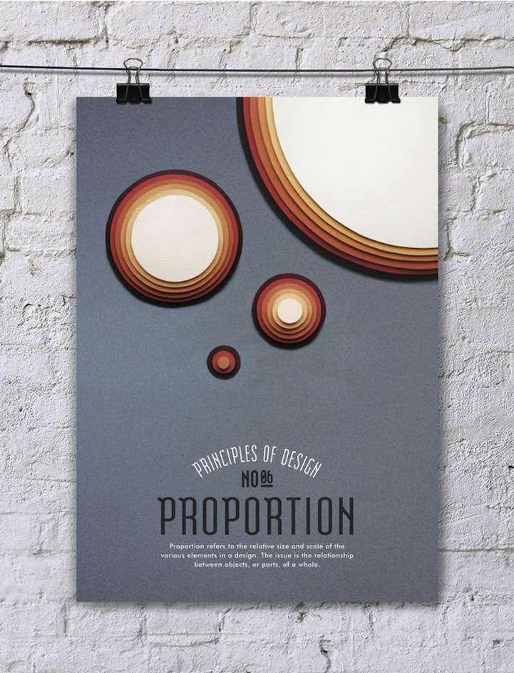
6. Proportion
“Proportion refers to the relative size and scale of the various elements in a design. The issue is the relationship between objects, or parts, of a whole.”
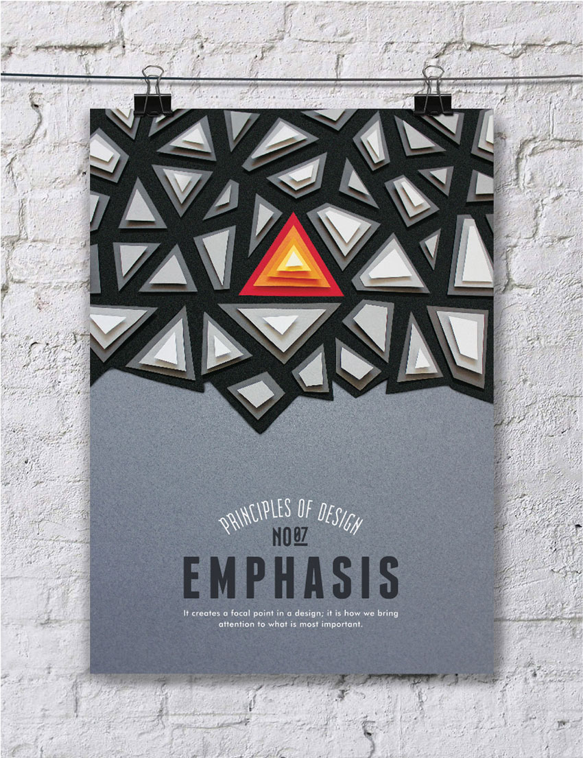
7. Emphasis
“It creates a focal point in a design; it is how we bring attention to what is most important.”
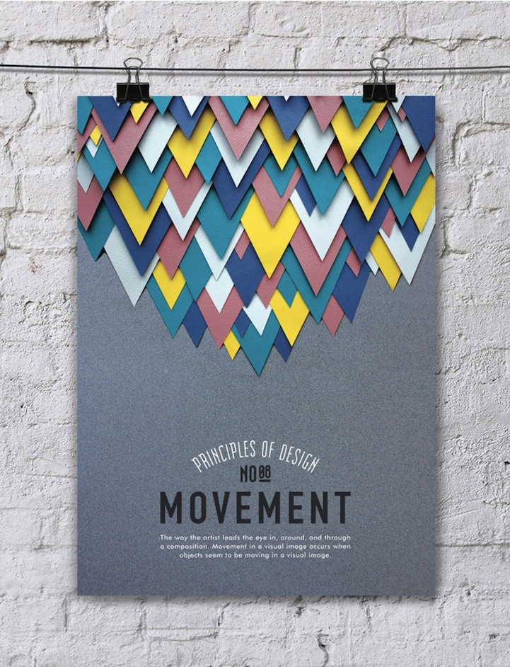
8. Movement
“The way the artist leads the eye in, around, and through a composition. Movement in a visual image occurs when objects seem to be moving in a visual image.”
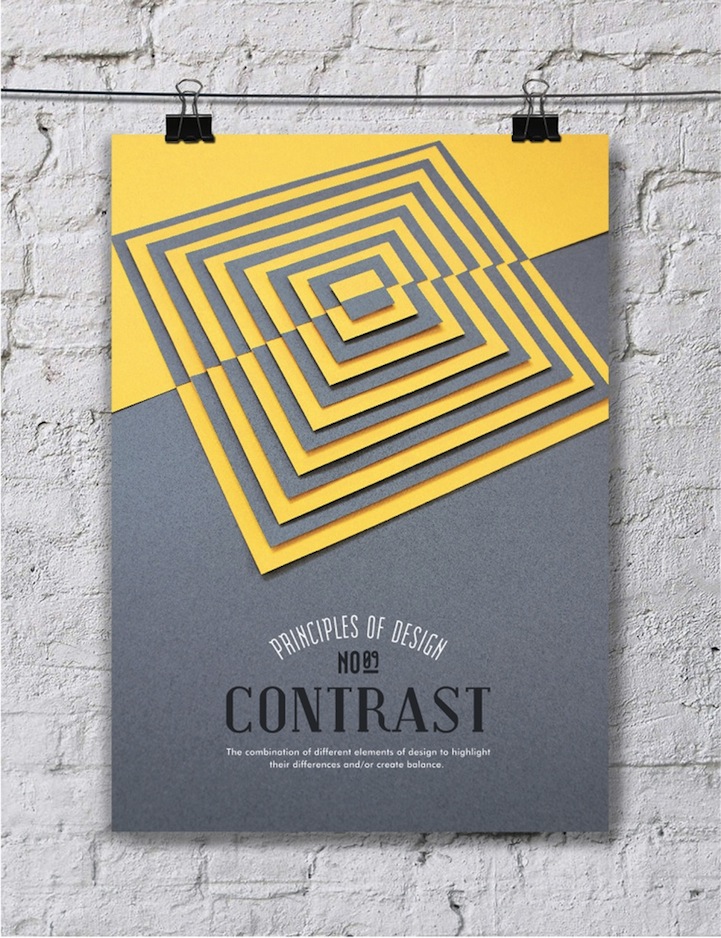
9. Contrast
“The combination of different elements of design to highlight their differences and/or create balance.”
10. Unity
“Unity means the harmony of the whole composition. The pats of a composition made to work together as a total visual theme.”
Efil Türk illustrates his take on the basic elements and principles. For you, as a designer, there are many free online lessons on the basic theory:
50 Free Lessons in Graphic Design Theory
Graphic design is about communication, not decoration. As you’re designing away, ask yourself how you’re implementing these elements to help deliver your message. How do the elements of your design affect the mood of the piece and how does it relate to the product or the message. These principles and elements apply to everything from artwork, to photos, to composition, layout and typography.Â
If you’d like to learn more, leave your thoughts and comments in the comments section below.Â

