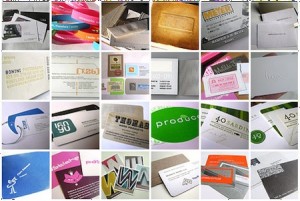
 You may want to lose them, but no matter how you slice it, knowing how to design a quality business card is always an important skill. “Why do we still need to know how to make those old things?†you may be asking. “Surely everyone is using Internet-based media like LinkedIn these days!†You’re right: There’s a definite trend as far as marketing moving to the web. However, there will always be a demand for instantly gratifying billboards that fit into a pocket and can be produced on a minute’s notice during a conversation.
We’re talking about business cards, there, in case you didn’t notice.
With that in mind, we’ve been keeping up with the current trends in business card design on the off chance that you haven’t been. We’re even willing to share our finds, so check below for our thoughts on what’s trendy, cool, and all around engaging in modern business card design.
- Die-Cut All The Things!: First off the bat, we’ve noticed that a lot of companies are now demanding die-cut designs. Die-cutting a business card provides an easy way to stand out from the competition, as well as flesh-out an otherwise stagnant and often static piece of cardboard. Using die-cut elements in your cards also provides them with an engaging texture that creates a pleasing feeling in the holder’s mind: That sounds like Hippie BS, but believe us, the better the card experience, the more likely a receiver is to remember putting it in their wallet.
- Photographs Are In: This used to be a tremendous taboo, but it seems more and more designers these days are now using photographs in their business cards. We aren’t just talking about a pleasant fall scene, or a nice shot of the local lake, too: We’ve been seeing a lot of head shots and profiles in business cards. Now, we might not be a fan of this (tacky) trend, but that doesn’t mean there aren’t some cool designs being produced that incorporate this more personal of elements. If you’re client wants it, don’t dissuade them: They’re right on the money for modern design trends.
- Put It Up: We’ve also been seeing a large emphasis on printing business cards in a vertical direction, rather than the traditional horizontal spread. We think this is a fabulous way to reinvent the wheel, so to speak, and if you want to look trendy but unpretentious, formatting a card to run up instead of sideways is a brilliant way to do so.


