If web design demands a lot of concentration, creativity, and ambitions in order to win the audience, logo design won’t survive without being also fresh and spicy. This unbelievable zest is added to logo designs by the main web design trends; geometry and catchy colors are two of the latest ones that can and should be combined.
Animalistic logos
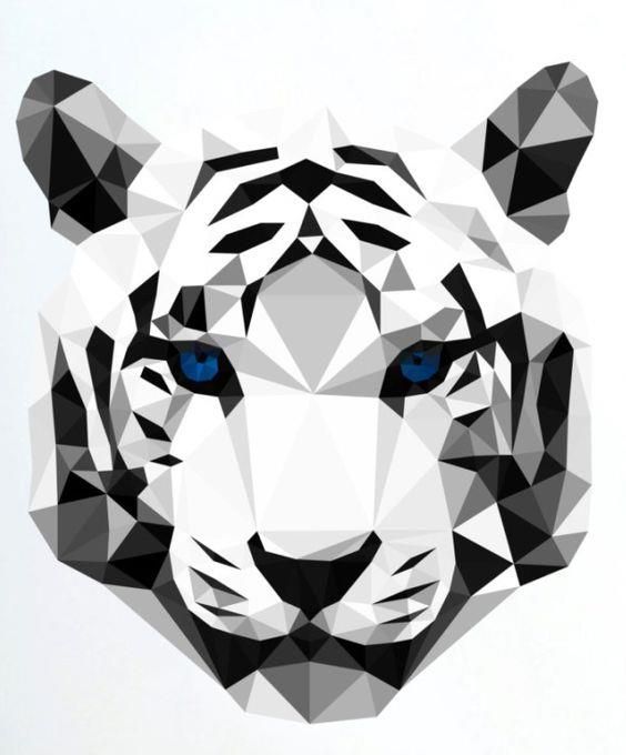
Mesmerizing and irresistible, animalistic geometry cannot leave you indifferent. Especially if you see a predator with such hypnotizing eyes like those below. Due to its shape and shades, everyone sees something different if look closely at this logo: some see two hands, some notice a mask or even a wolf: depends on your imagination which will certainly be boosted with the help of such graphic design creations.
Real estate logos
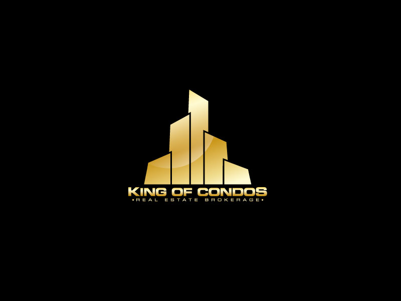
Real estate logos are mostly designed in a minimalistic style, using some animalistic or floral patterns. Which is why the logo created for a real estate brokerage King of Condos is certainly worth your attention. Designed on the freelance marketplace DesignContest, it uses a black background and golden geometrical figures that remind you of skyscrapers. What’s more fascinating, other entries tried to depict the logo similar to Disney or Metro Goldwyn Mayer but the winning logo looks more like a megapolis or bars of gold. If you look at the logo for several minutes, you’ll notice some hidden objects in it, e.g. the Full Moon or the Sun depends on the angle and, once again, your imagination.
Circled logos
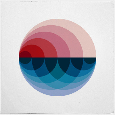
Burning sunsets, calm dawns, quiet twilights, deep nights and even more are depicted in one single logo of a round shape. Waves, ocean, and cries of seagulls are combined in one geometrical figure due to the colors it’s painted with.
Another magnificent example of a round logo is the one that combines photography with pink and red shades. Which is why there even can be a feeling as if the sea depicted on the logo was rolling on the wind.

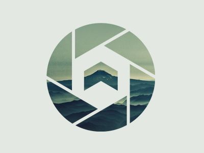
One more example of round logos is crucial to pay attention to because it uses different geometrical shapes along with a circle they are implemented in. The shades used for this logo look calm and peaceful; they cause a sentimental feeling of nostalgia and sadness.
Rhombic logos
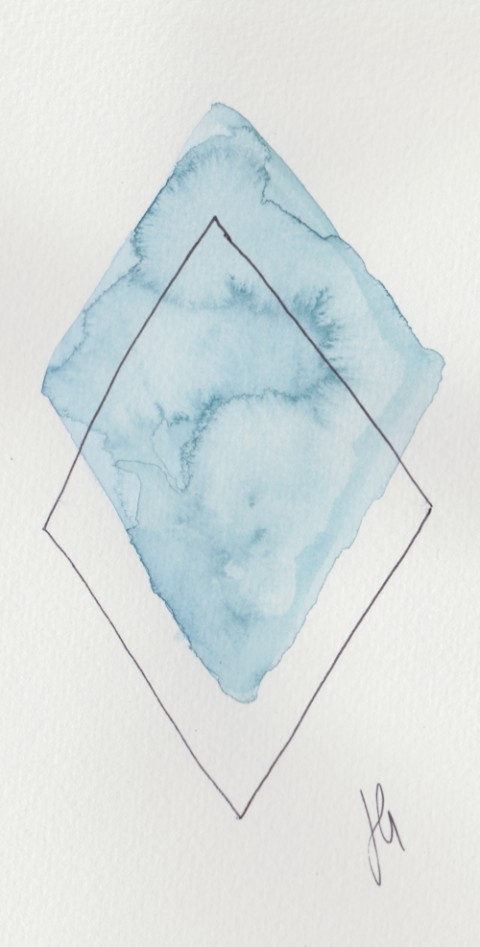
Rhomb is also called a diamond; in the case of a logo design, it looks like a real gem. Foggy shades along with a double shape, the logo looks mysterious and makes you notice some additional details you have never thought about.
Bottom Line
Geometry brings things closer to perfection. Thanks to the variety of options this design trend suggests, there is a rather good possibility that it will also reach the top in the upcoming year 2018. Launch a logo design contest on DesignContest and we’ll make sure your logo design is trendy, beautiful, and perfect.

