Summer is a perfect time for music festivals: people camp in tents and listen to their favorite music outside of crowded, noisy cities. Festival goers enjoy this unique atmosphere of good company and amazing sound plus side activities. But how do those events gather so much people at one place?
One of the ways to promote a musical festival is a poster. Music festival poster aims at attracting attention of targeted audience: rock festivals, indie music festival, EDM festivals – they all have different poster concepts. Creating poster for such musical event challenges your creativity. Poster is bold, eye-catchy and neat. Whether poster is successful or not depends on how you balance headlines, images, lineup, sponsor logos etc. If you have managed to achieve that – your poster is a total killer!
The essentials you should cover before sitting down to designing – is what this event is about and who is going to attend it. Afterwards, it’s your job to create the suitable mood and emotions by using colors, fonts and graphics which would match the theme of the festival.
Here are 10 steps on how to create an outstanding poster for music festival:
1. Choose appropriate color
Remember that the amount of attention your poster is going to attract relies upon the color theme you choose. Colors create the mood and make people take a double-look. Colors should be appropriate for the event i.e. subtle pastels for indie, darkish for rock and metal or vivid ones for EDM.
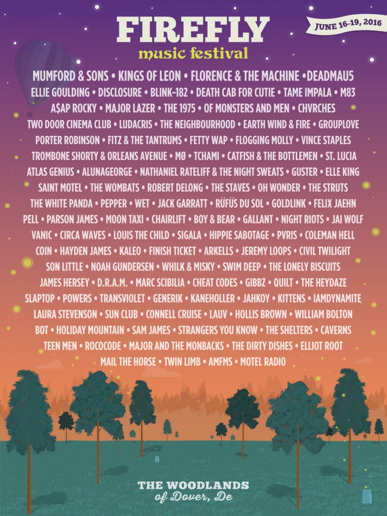
Take a look at the poster for the Firefly music festival that took place a couple of weeks ago in Woodlands of Dover, Delaware.
The designer has chosen warm colors that remind us of sunset with light peach turning to violently bluish shade. We associate it with homey indie sound of “Mumford & Sonsâ€, “Kings of Leonâ€, “Death Cab For Cutie†etc.
If you have trouble deciding on what goes with what – check out this “100 brilliant Color Combinations and How to Apply Them to Your Designâ€
Next important thing is 2. Typography
You can tell so much about the event by using fonts only. Sometimes it is better to turn to handwritten font to create the anticipation for relaxing and homey atmosphere.
When you are selecting fonts you will need at least two – for the main headline and another one for the body copy. However, you may experiment as you want.
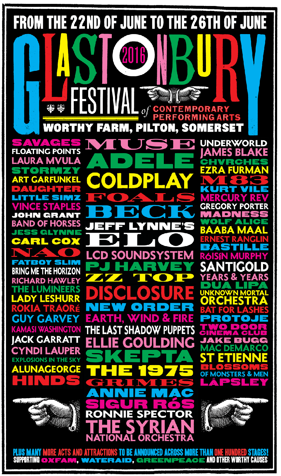
Your poster should be easy to read, so it is best to rank information in order of importance. If you have a lot of information to fit in, as in case of a music festival poster, let your type guide you. Split the info into small groups and decide on the size and font for each.
4. Less is more
Try not to overload the image with unnecessary words, illustrations etc. just for the sake of adding more. Keep it simple.
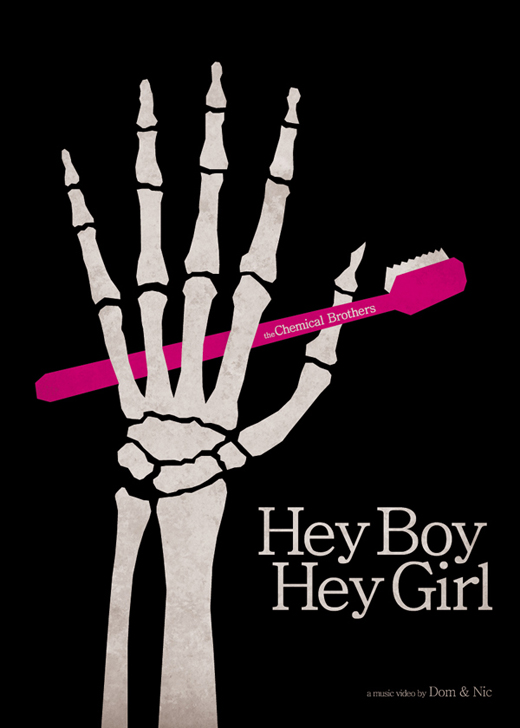
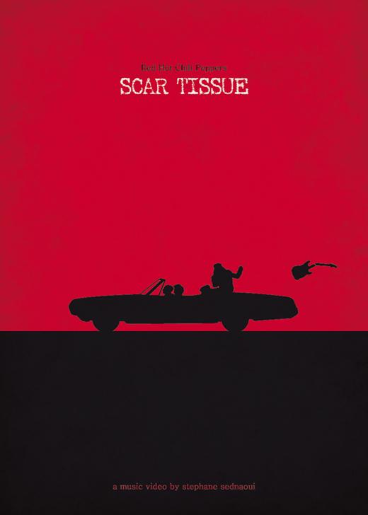
What do you think about this minimalistic music posters by Federico Mancosu
5. Focus
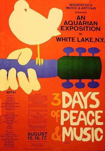
Create an image that will be an eye-catcher. Like in the poster for Woodstock Music Festival, where playing guitar and dove represent the whole idea of peace and music.
6. Balance the composition
So you have decided upon final image, illustrations fonts etc. Now put them up together like a mosaic. You are the one who decides poster will be read and understood. Pay special attention to how graphics works with words.
7. Use creative illustrations
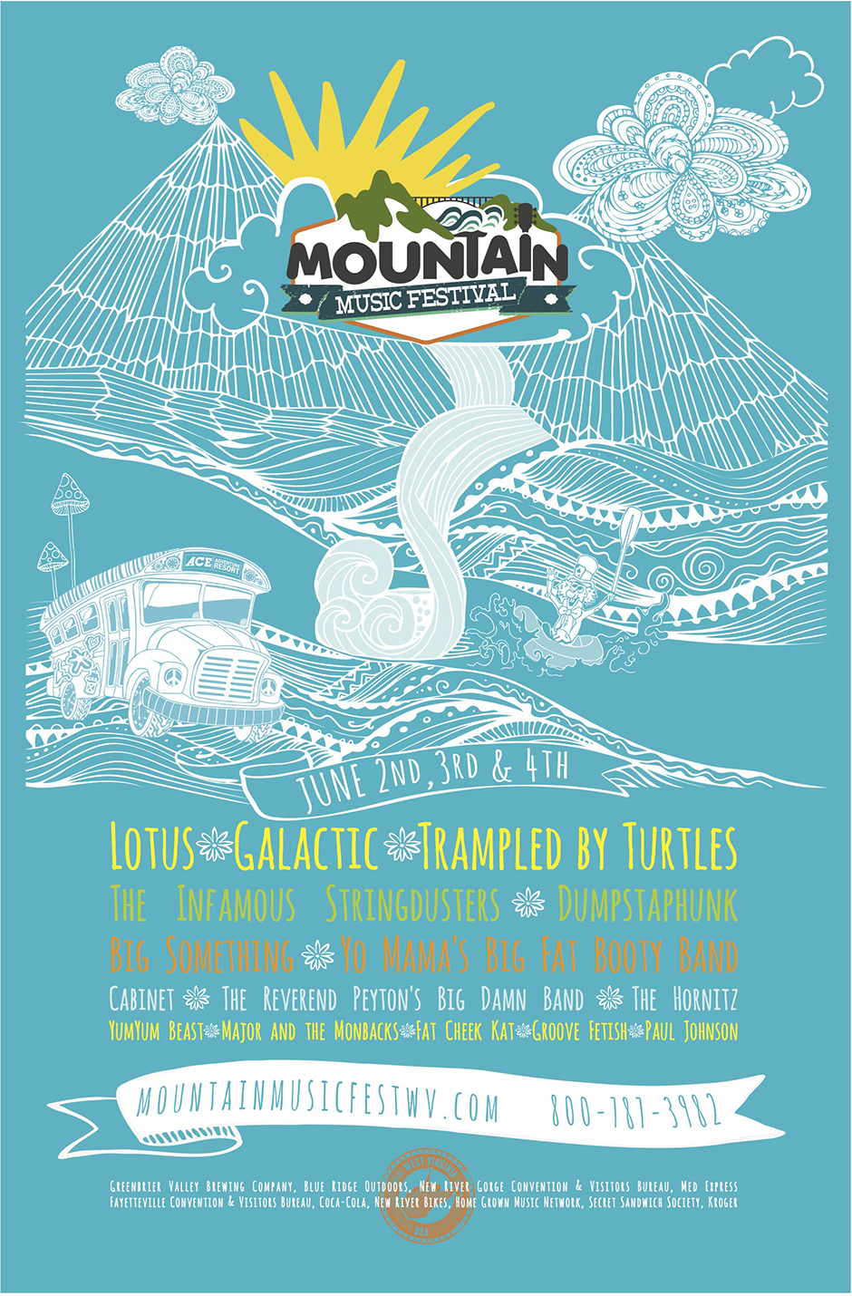
Sometimes using photo as a background just won’t do. If that is your case – create your own image, like they did for Mountain music festival.
8. Uniqueness
Using odd font, drawing illustrations from the scratch – this will make the poster noticeable and memorable.
9. Format and size
Pay attention to the poster size. Ask the client about it prior to actually designing it. Maybe instead it is supposed to be horizontal. Maybe you can experiment with it.
10. Design for your audience
Always orient on WHO will see the poster. Make sure that design suits their likes, some wide known “stereotypes†and habits.
Don’t forget to enjoy the whole process! Here you may use the brightest and weirdest ideas you ever had!
