There has been a lot of talk about the latest trends in web design: what trends to follow, what’s outdated, what’s there to stay and so on. Here are our predictions on what trends matter and will remain in 2017. The majority of actively incorporated trends that launched 2015 and 2016 are going to stay with us in the next year (i.e. flat design, parallax effects) so don’t wait for an eye-opener… at least in the first half of the year.
User Experience
Today everything is about the one and mighty USER. You website should be easy and useful. Thinking about your prospective USER is the main tendency that’s going to last. User Experience (UX) – that’s what matters in modern web industry.
It’s not news for anyone that the share of mobile traffic continues to grow and that today web developers take into account adaptiveness of a website. However, even that is not enough. A website has to be fast, smart and attract new visitors. Heavy websites filled with content, constant preloads, and Java elements give way to simple and fast ones.
Remember, that the user has come to your website for something, and wasting time is not on their list.
Smart navigation
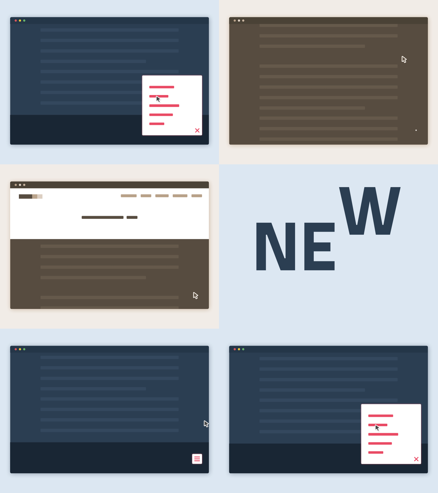
Lots of you have come to hate the so-called “hamburger†menu, but it was only an awkward step towards making a better navigation. Now it’s time for smart navigation, when a certain user behavior is studies and anticipated. To be precise, smart navigation will show up exactly when and where the user needs it, without distracting them from the content.
by Gabrielle Mellera for CodyHouse.co
Modularity
No one likes to read these terribly long blocks of text… The first trick would be separating the whole text into smaller paragraphs.
I do this all the time as you can see.
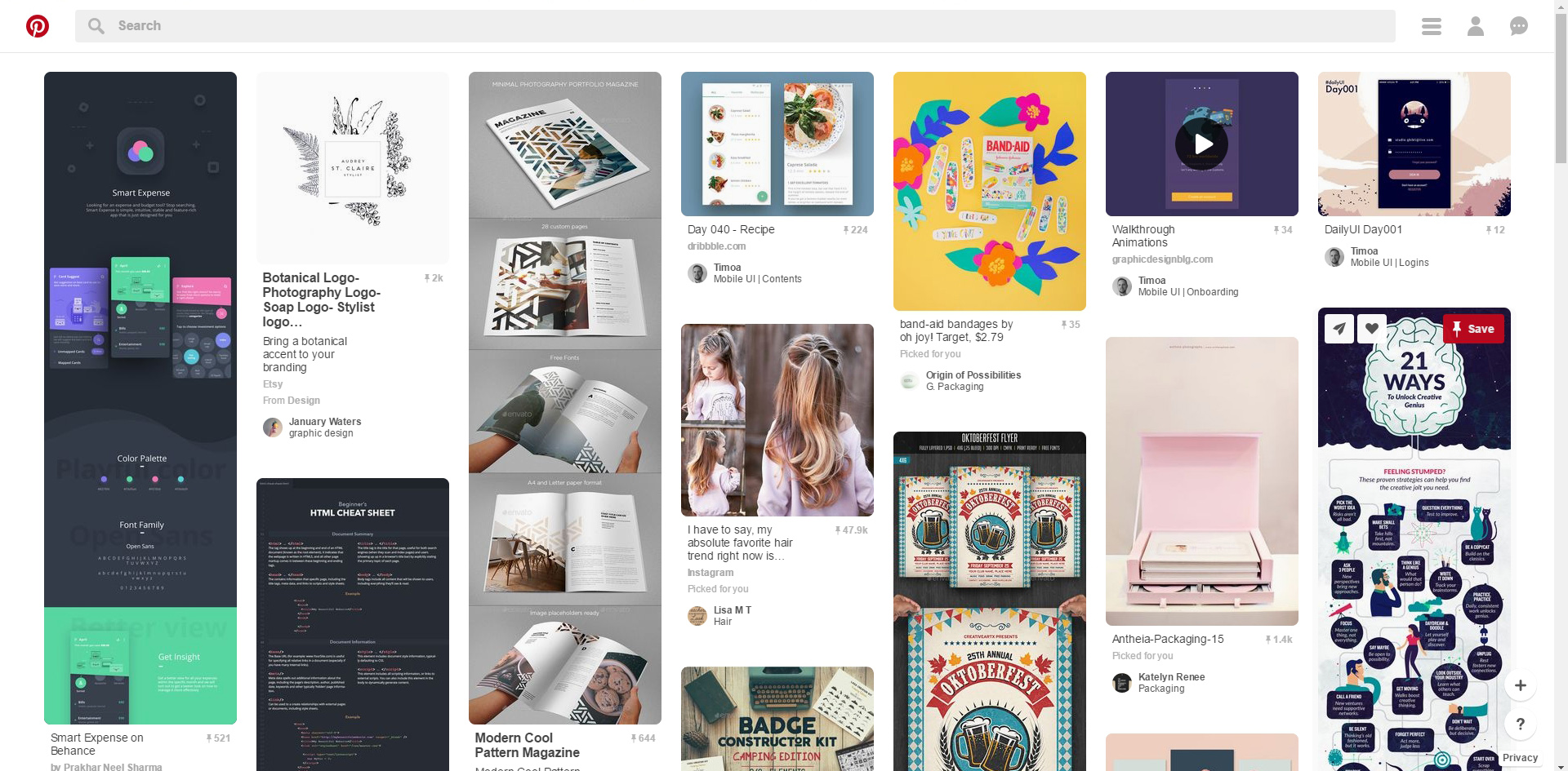
This issue is easily solved with the help of web design and module layouts, which turn a webpage into a block-like structure. But it does not mean that you will end up with a boring-looking website. Nope, actually the opposite, the structure of your website may be similar to a newspaper or a flashy magazine.
Take a look at Pinterest’s layout – it’s actually pretty useful:
Material
Material design, which is also known as realistic design, has appeared in early 2013. However, its implementation became possible only after the expansion of high resolution screens even on mobile devices.
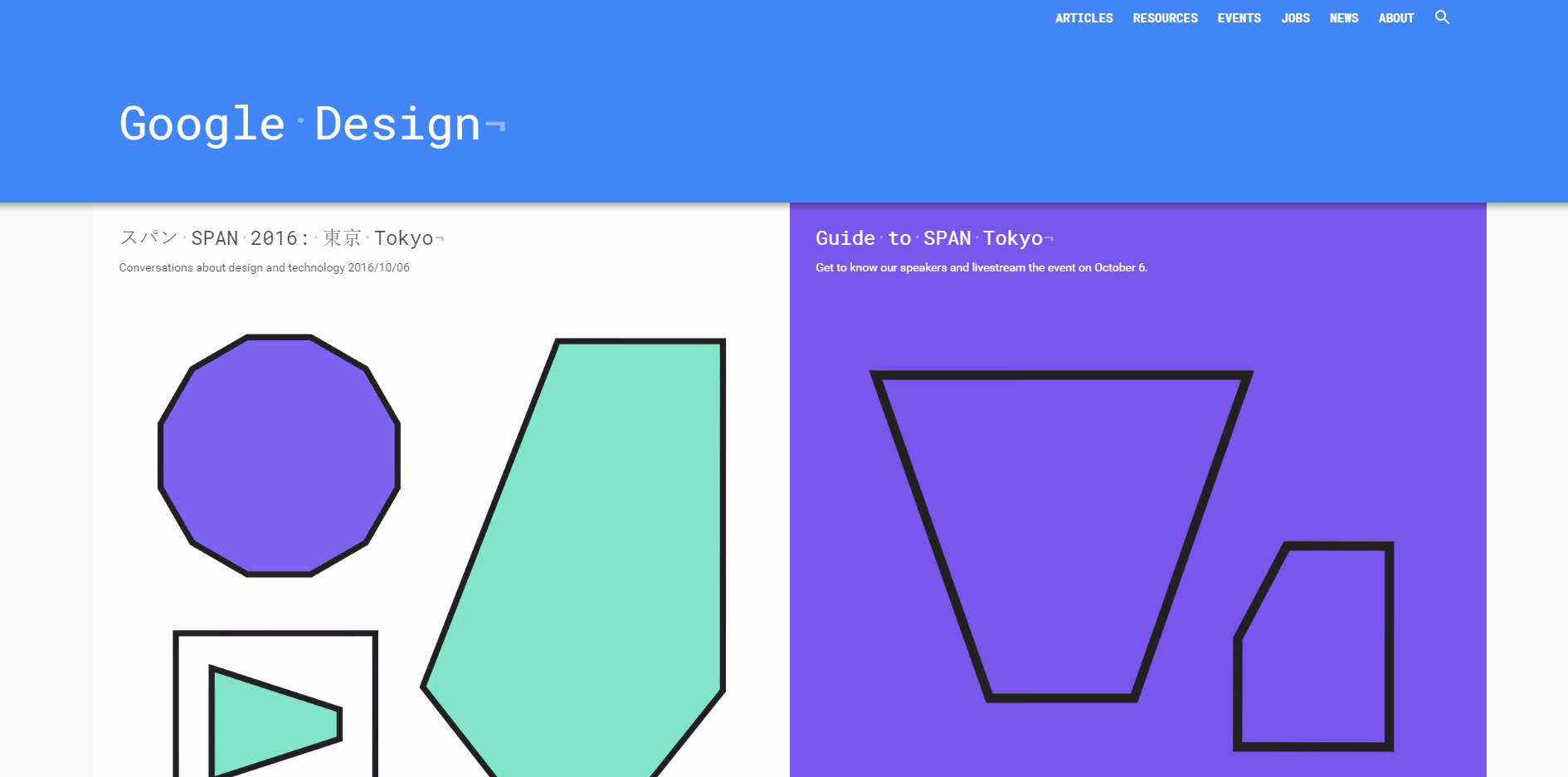
The use of material design became a trend in websites and applications in 2016m – the year of dominance of realistic imagery. Material design means more liberal use of grid-based layouts, responsive animation and transition, without excluding such depth effects as lightning and shadows.
Flat
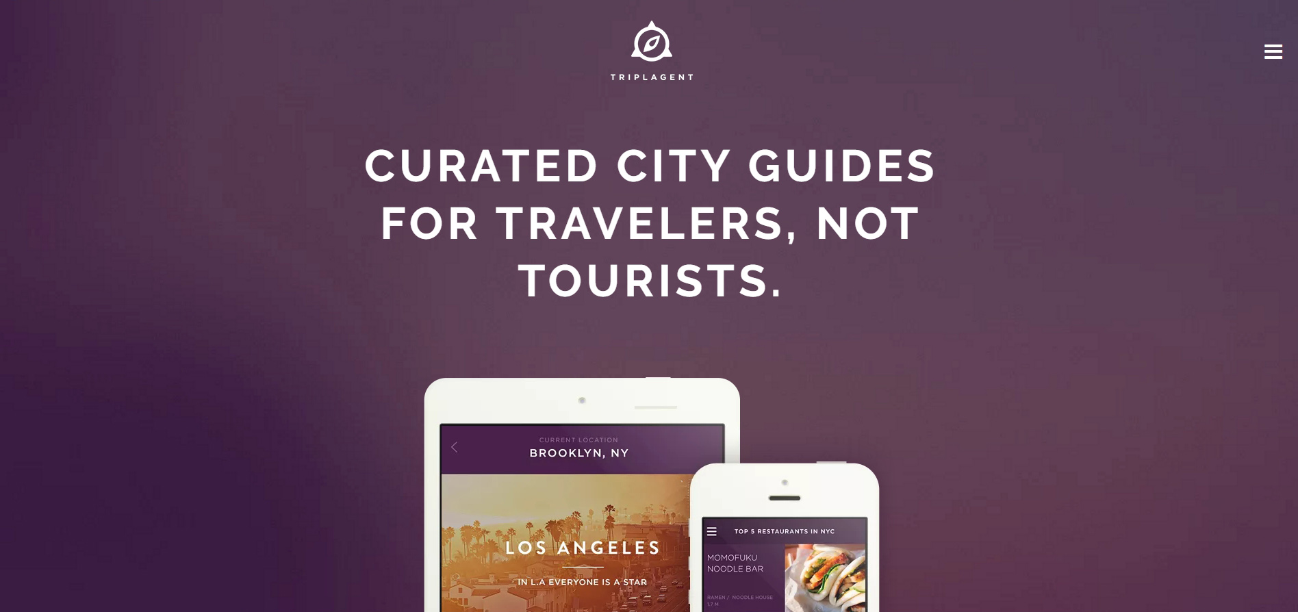
Even if Material design has fixed some usability problems of Flat design, we are not saying goodbye to Flat. Together with world known brands we see Flat become a leading web design trend. It makes people embrace that “less is moreâ€.
Furthermore, flat is less heavy and makes pages load much faster.
Visual storytelling
You all have probably heard about storytelling in constructing the content map of the future website. The next big step is VISUAL storytelling. Visual content always works better than a simple piece of text – it makes your story more attractive and alive.
Here are a few facts:
– More than 45% of internet users view at least one video per month;
– Every day approximately 100 millions of people watch one video or more;
– 64% of people are more likely to make a purchase after watching a video;
– 80% of viewers remember a commercial for 30 days after seeing it;
– 92% of mobile users share videos they have seen online with others;
– Humans perceive and process visual elements 60 thousand times faster than reading words.
Summing up:
Innovations in web design will continue to focus on making a user’s life easier. There will be no complicated navigation, no tacky stock images, no heavy webpages. Flat and Material design shall unite in order to maximize a website’s performance and overall appearance.


