Robert Plutchik, a famous scientist who dealt with the study of emotions and psychotherapy processes, came up with a wheel of emotions people experience the most. These 8 primary emotions drive people’s attitude towards everything they face in their life. Therefore, these 8 emotions are put into the basis of the emotional web design.
Fear
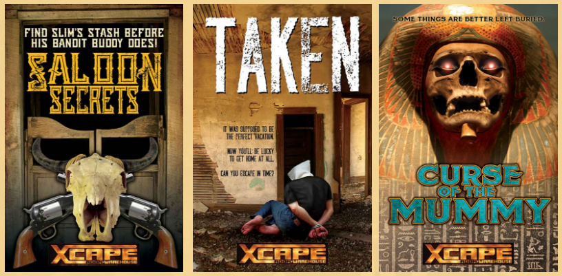
Fear is considered to be the most powerful emotion that is responsible for most of people’s reckless actions. Design, applied to fear, causes an immediate reaction. Surprisingly, this sort of emotions can be effective not only in terms of designing horror books’ covers or posters for scary movies. Implemented into other unexpected spheres of web design, it looks intriguing and is hard to forget. For instance, one of the most popular cases when web design is mixed with fear is shown in creative posters for escape rooms. The more frightening your poster looks, the more people will want to enter the room it is designed for. Emphasize on spooky things and don’t forget about the element of mystery and your design will be a winning one.
Anger and Disgust
Do you remember things that make you angry or even furious? I bet you do. Do you like those things? Certainly, you don’t. Can you leave those things without any attention when you face them? The answer is “noâ€. Sometimes design is not only about the things you like, admire or even love; sometimes design is about riveting attention. What can capture your attention more than things you are furious about? Making your target audience angry at something and build your web design around this object will compliment the fact that what you’re depicting is really noteworthy. In this case, landing pages will be the best option to call upon anger, the emotion that makes people act.
Sadness
Web design that awakes sadness doesn’t necessarily have to cause negative effects. It should be associated with nostalgia and sentimentality in order to win the market. Sometimes sorrowful and melancholic photos you use for your travel website’s background can inspire people to grab their backpack and set off to a wonderful journey organized by your company. The main idea about using sadness in your website’s design is to introduce a correct color scheme. Making everything grey and dull isn’t a way out: you need to add some bright sparkles that will serve as a glimpse of hope and gain all the attention.
Joy
The website you are designing may be filled with joy and happiness if you put three certain things together: colors, typography and icons. Funny, light and catchy elements will guarantee that your users will be in a cheerful and amiable mood and, therefore, will make a deal with you much faster. What’s more, there is even a special notion used in marketing: a joy marketing, directed at boosting sales due to this pleasant emotion. People want to experience more joy in their lives; joy marketing, used in web design, can satisfy their need.
Surprise
Web design that uses elements of surprise makes sure the clients will come back to the company. Again and again. Even though we live in the era of new mesmerizing technologies, it’s become much more difficult to amaze us. People are always looking for new unexpected feelings; surprise provides them with those feelings. It also reflects how creative and challenging the company is, which is why it will be surely remembered.
Trust
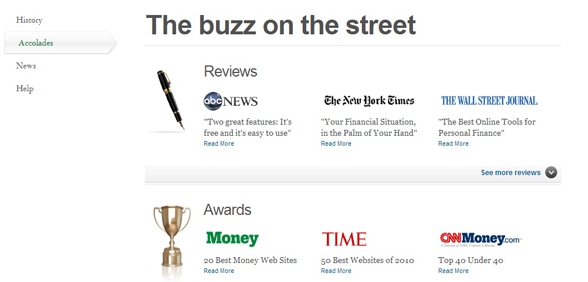
What you need to appeal to if you want your clients to make a deal with you is trust. The more credible the company appears to be, the more new clients will be attracted to it. If you succeed in persuading the clients the company is worth their trust, they will more likely buy the company’s products or use its services. Thus, never forget about trust when creating a web site. It can come from the company’s endorsement (if the company decides to use some celebrities to get promoted) or simply from people’s testimonies. The way you do it doesn’t matter but the result will be worth your efforts.
Anticipation
Anticipation has two ways it can be used in web design. Firstly, you can predict the clients’ wishes and, therefore, show how much your clients mean for you and how highly they are appreciated. For instance, if you’re designing a book website, you can add recommendations of books your clients may actually like or authors that are similar to the clients’ preferences. Secondly, you may make your clients anticipate what is going to be next. This is connected with the element of surprise and allows you to astonish and strike the website’s users by the creative ideas you implement into the website’s design. There’s no denying the fact people are curious and this curiosity may be used in web design to attract their attention: amazing logos, trigger words, stunning images and a wonderful content will be of a great help in this case.
Emotions in web design are extremely beneficial when you want to increase the clients’ engagement. Have you ever designed anything aiming at a particular emotion? Share your experience with DesignContest!

