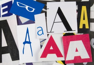
 We already gave you five free fonts for you to use in your projects, but that doesn’t mean we’re done with typography just yet: Thanks to the internet, there’s always another typeset waiting to be discovered, and we have the next batch baked and ready for you to use. Check out these five extra fonts that will add some much needed spice to your next design.
This radically cool font has a spray-paint edge to it that evokes thoughts of the urban Pacific, with its wavy lines and broken edges. The font has a Grindhouse look to it that’s both modern and very city-oriented, providing a hard edge to any projects that require a bit of a punch-up.
Perforama is a font that evokes the good old days of Russian cinema, with its slanted, painted-on looks and slightly faded vintage style. This font absolutely screams sidebar, and genuinely would make a great typeset for contextual navigation. The set also makes an excellent header, or feature font in an advertisement. The font looks classy and commanding, even making it perfect for a hip business card.
This one isn’t quite a handwritten font, but its curvy edges and big, fat middles make it one heck of a retro font. Lobster evokes thoughts of summer and fun activities near the beach, making it ideal for a sunny advertisement or a site with a laid-back, easy-going appearance.
Absinthe Typeface
This one looks as if it stepped straight out of a Tim Burton wet dream, right down to the Edgar Allen Poe illustration. Absinthe’s strong lines and curvy, Victorian-esque curls make it both creepy, regal, and totally dark. The typeset is still very sharp, though, making it easily readable and perfect for almost any part of a design. Absinthe goes well with a Gothic motif, or any projects with a slightly darkened countenance.
I know, I know: This one looks like the GAP logo. But even so, Dalle is still a fantastically bold and regal font that says a lot with its hard edges and long, towering lines. Like the GAP logo, Dalle can really bring out the exclusivity in a design. However, the font is very heavy, so use it sparingly as a punch-up, rather than a mainstay of your pages.


