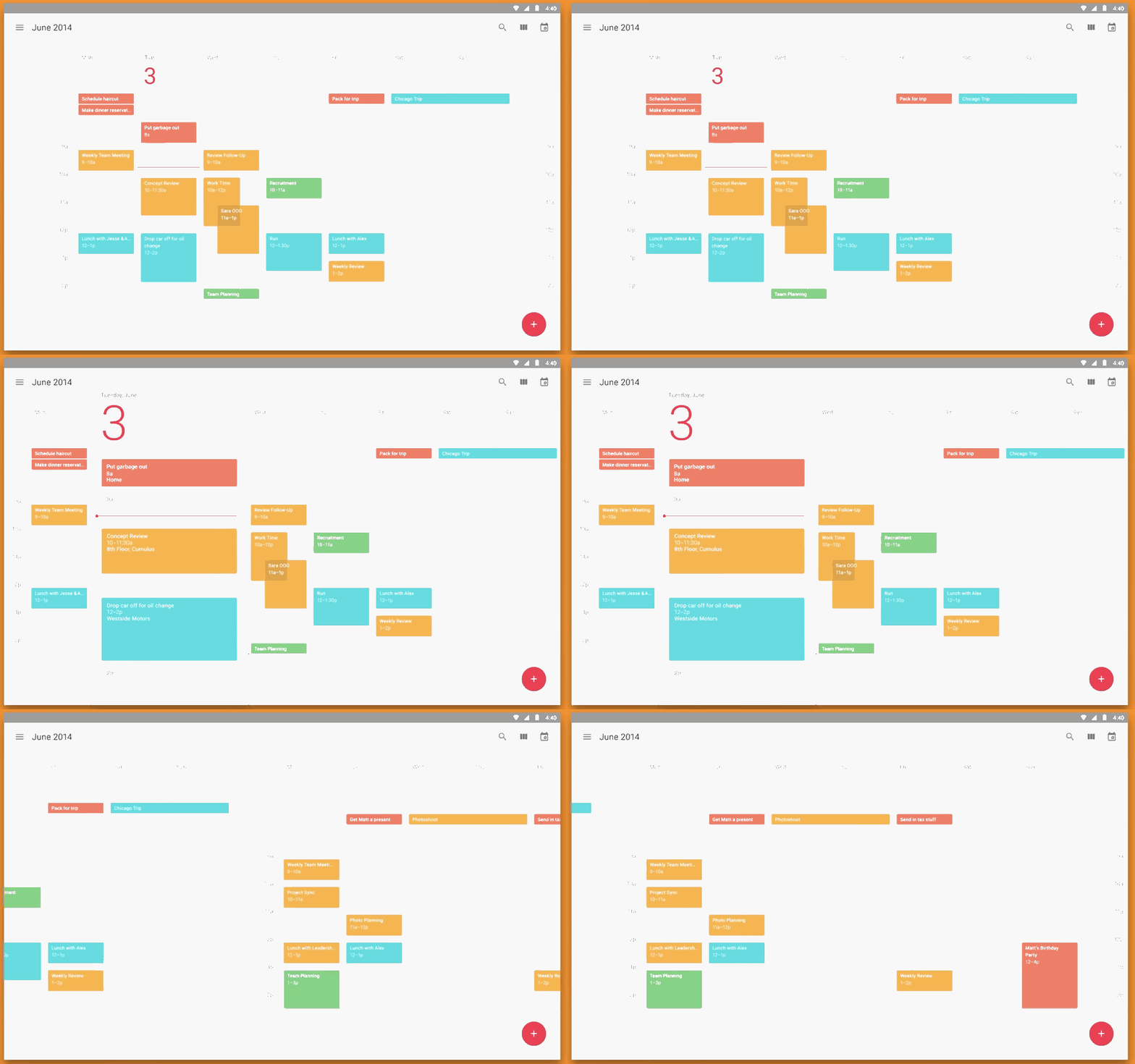
Still question yourself what approach is better? Flat or Skeuo? Or maybe both? Fresh up your knowledge about those design trends and decide for yourself:
Flat design, also known as 2D interface design, is a design trend that delivers maximum usability by using minimum design elements (limited color pallets, minimum icons and images):
Pros of Flat:
– Cleaner UX (content without distracting elements);
– Aesthetic (careful consideration of objects’ hierarchy, colors etc.);
– Loads faster;
– Responsive.
Cons of Flat:
– Total absence of 3d design elements (drop shadows, gradients, textures etc.) often confuses users;
– May be overly minimalistic;
– Colors and shapes are critical for successful design.

Skeuomorphism or realism design is about making apps resemble their real-life prototypes (notes, calculator, reader etc.) Skeuo elements include the shattering sound of a camera when we take pictures, page-turning movement in iBook etc.  Â
Pros of Skeuo:
– Quickly conveys the massage;
– “Familiar†to both: user and designer.
Cons of Skeuo:
– Numerous textural elements become distractive;
– Larger files take forever to download and render;Â
– Website content ends up unnoticed;
– Keeping to real-life objects restricts design progress.
Frankly speaking, all those realistic Skeuo elements do not add much to design, and sometimes even overburden it. In addition, abusing visual textures may turn a website into a tasteless kitsch. But despite everything, those familiar elements make it easier for people to interact with websites.
It’s the same with Flat. If a designer goes overboard, it’ll seriously influence the usability of a website. Users rely on simple cues as gradient or drop shadows to know clickable from non-clickable. Therefore, their absence will confuse users and take up more of their time.
However, there are no clear Flat without Skueo. Our everyday gadgets prove this point, like the ‘call’ icon with a phone or weather app with sun and clouds. While it is important to emphasize and communicate the message without any extra unnecessary design elements; when it’s done – some skeuomorphic design may be added, within reasonable limits, to draw attention to website sections.
All-in-all, there are benefits to Flat and Skeuo equally. Incorporating a fair share of both can deliver a clean and user-friendly experience.


