There are many reasons that cause visitors to leave your website: a huge amount of ads, auto-playing videos, big loading time, etc. Sometimes the drop in attendance is caused by these reasons, but sometimes it’s the redesign that scares visitors away.
To avoid spending money on unsuccessful website design, you have to know what is bad for the visitors. In this article we’ve listed the most common design problems that lead to drop in attendance.
1. Design Is Inappropriate
Your website design doesn’t have to follow latest design trends, but it still has to look modern, to be clear and good-looking. It might seem obvious, but at the same time, it can be hard to achieve.
Visitors usually dislike:
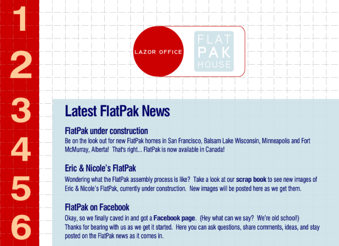
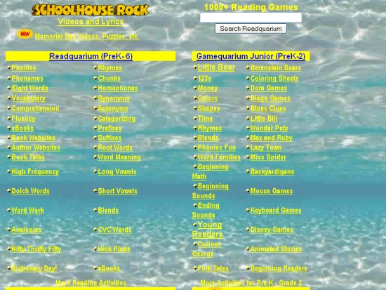
– old-looking designs (do not confuse them with vintage). If your website looks like it was made in the ‘90s, for example, you should order a redesign immediately;
– very decorative designs. Sure, a designer can help a website to look modern and to add some special features, but it’s important not to overdo it: if there’s too many features or colors or effects, the visitors will get confused and will leave your website immediately;
– too minimalistic designs. Indeed, less can be better than more, but only if it doesn’t affect navigation. When visitors have troubles finding everything they need because of the lack of buttons and links, it can harm your business.
2. Navigation Is Poor
If the visitors open your website and don’t know what to do there, this means the navigation is very poor. Sometimes there are too many links, boxes, banners and CTA buttons, and sometimes there are not enough of them. However, not only the number of links and features defines poor navigation. Sometimes the positioning, the color and the size of website elements can confuse visitors too: for example, when the “add to cart†button doesn’t stand out or the shopping cart icon is positioned in an unusual place.
Visitors are the same as us: we also get confused when see a door that opens differently or has a very unusual doorknob, for example. If you receive a website redesign and have troubles finding something there (or your friends or relatives have these troubles), this means that the changes should be made.
3. Content Is Difficult To Read
Website design isn’t only about images and colors. It’s important not to forget about the readability. If it’s hard to read all or some information on your website, this will affect your business too (and we’re talking not only about headlines, links, descriptions, etc., but even about less important texts).
When you order a website redesign, pay a lot of attention to things like font’s type, size and color as well as the background (its color and structure). They matter a lot because they strongly affect the readability.
And, of course, don’t forget to check out successful website designs as they would help you to distinguish good designs from bad.


