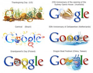
 Whether or not Google remains your favorite search engine, one inarguable truth remains for the internet mega-corporation: they’ve got some great graphics. Displayed brilliantly through manipulations of their own well known search engine logo, Google has succeeded in incorporating aesthetically pleasing elements into an otherwise bland (or at least not-overly-impressive) logo. However, it’s not just a random assortment of graphics that have resulted from Google’s decision to occasionally mix-up the look of its home page. Through careful consideration of several factors, Google’s graphics have been successfully received by a pleased audience.
Relevance: No logo design is without significance of some degree; each logo is designed for a specific holiday or commemoration of the life of an important individual. Because of the intentionality with which each logo is crafted, users of the Google search engine more greatly appreciate the corporation’s creative alternative logos. Should Google have decided to use random designs on random days, the logos might have been less appreciated even if they were just as cleverly artistically developed.
Intrigue: Not only are Google’s designs purposeful in their significance, but most of them holds a certain element of intrigue for many viewers. The reason? Google’s choice to celebrate less well known events and holidays much of the time. Take for example the July 12, 2011 Google logo commemorating the 450th anniversary of St. Basil’s Cathedral, or the July 7, 2011 logo honoring the birthday of Miroslav Krleza of Croatia. Thanks to Google’s creative logos, these lesser known events and individuals have now experienced more fame, and through continued recognition of such people and holidays, Google’s logos will continue to intrigue, delight, and educate users of the search engine.
Artistic: Perhaps the greatest contributor to these little logos being such a “hit†with the general public is the sheer brilliance of the artistic genius that creates them. The fully and cleverly incorporated Google logo into each and every design leaves viewers saying “Aha!†each and every time a new graphic is featured. Whether it’s turning the “g†into a tree stump (as in the July 1 design) or the “l†into the Statue of Liberty (as in the July 4 design), each logo is such a wonderfully creative piece of art that it can be appreciated by all audiences, regardless of the detail or complexity level of the graphics.
Global: Celebrating holidays, birthdays, and anniversaries all over the globe, Google’s graphics appeal comes partly because all the designs keep in mind a truly “world wide web†audience. Drawing together audiences from ever inhabited continent and informing them about the celebrations of others, Google’s designs are more than just pretty little pictures.
See here for an archive of Google’s past creative logos.


