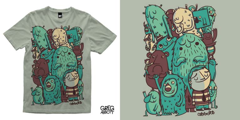
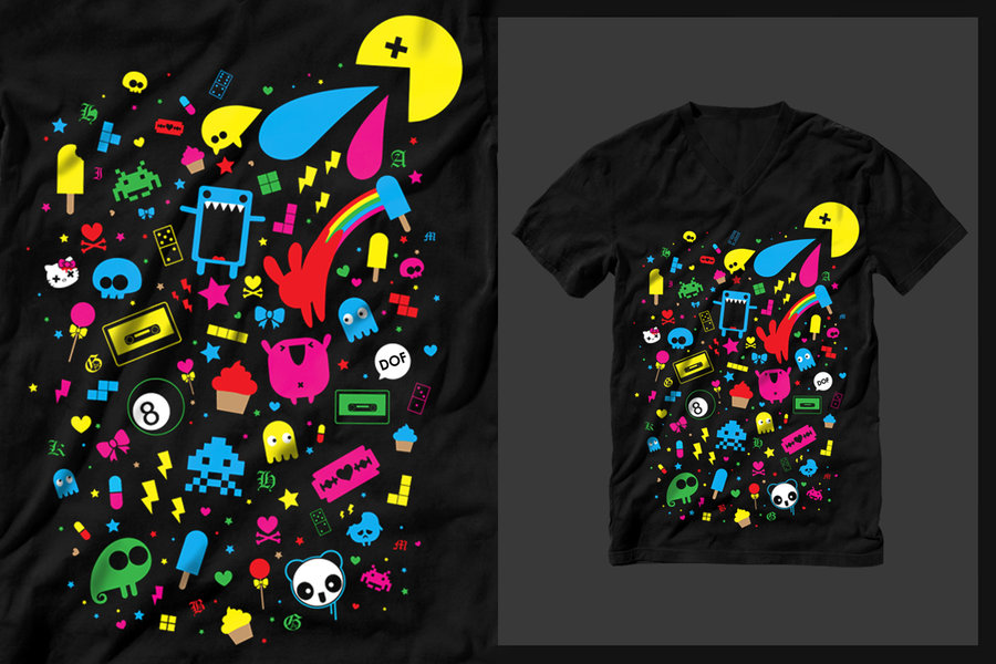
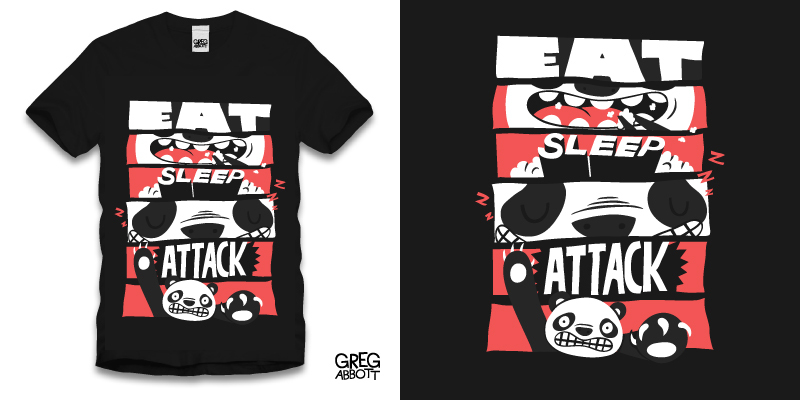
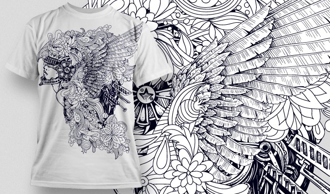
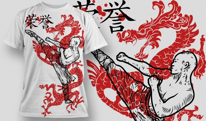
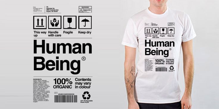
Many designers love creating images for T-shirts: doing this allows them to unleash their creativity, to be fun, to create complex images and, what’s most important, to have enough space to do so. Unlike logos and banners that are quite limited by size, T-shirt designs can be bigger, brighter and less formal.
Of course, the process itself isn’t easy. Usually you are limited by a certain task and you have to create a T-shirt most people would like to wear, according to that task. If you read the brief and find yourself facing a creative block, don’t panic: we have some tips that can help you.
1. Brainstorm A Lot
Whatever you’re designing, you have to make it original. One of the bad things about T-shirt designs is that there are too many of them, so it’s easy to duplicate someone else’s concept (intentionally or not). To avoid doing so, do good research, search for similar concepts and tasks and try to develop something outstanding. Be open to other options and think about every detail of your project: be it color palette, composition, theme, etc.
2. Use Pop Culture Images
When you’re designing a T-shirt, you are free to use some images from pop culture – like action, game or cartoon heroes, characters from comic books, etc. Of course, I don’t encourage you to plagiarize the images of them: you should draw or design them by yourself, but you’re still able to make references to them.
3. Don’t Be Afraid To Be Funny
When you’re doing logo design, you have to think about the image of the company, its main characteristics, etc. This design is challenging, but rarely creative.
On the contrary, T-shirt design allows you to be funny and creative. You are free to use jokes in your design, to even add some black humor (if this doesn’t contradict your task) and to enjoy yourself.
4. Add Details But Remain Simple
What’s good about T-shirt design is that you are able to create really detailed designs: their size is big, so the details won’t blur and merge. That allows you to create something complex and amazing, but at the same time you shouldn’t overdo it. Complex images do impress, but it’s harder to remember them if they are too detailed. On the contrary, more simple and original image can attract attention too and be remembered more easily.
5. Play with Color
A T-shirt can be bright and have a lot of contrasts – it’s a good things as such images usually attract attention (and are more interesting to make for some designers). However, you have to remember that the process of choosing colors for a T-shirt is more complex than the one for logos, for example. While logo may or may not be used with different backgrounds, most of the T-shirts are usually printed in various colors, so you have to be sure that a chosen color palette would look good on differently colored T-shirts.
6. Do The Preprint Preparation
It’s important to ensure that your T-shirt design will look good in any size. To do so, I recommend creating the design in its actual size and doing it in CMYK color profile (which is traditionally considered the best one for printing). Â
If you are making a text T-shirt or using some text in the design, you have to convert it to outlines before printing: other way it can be automatically replaced to other similar or standard font (this usually happens when a font you’ve used isn’t installed on the print studio’s PC).
I hope that this can help you to create an amazing T-shirt design!

