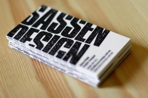
 So you’ve spent hours and hours perfecting your new business card design, and now you want to show it off: Whether you’re displaying your work to other designers, potential clients, or just friends and family, you’ll want to ensure your business card photographs are of the highest quality. Sadly, shooting a business card set is not nearly as easy as you might like. There are a few things you’ll want to keep in mind when doing so. Thankfully, we’ve compiled all of the important bits below.
If you’re preparing to shoot your latest business card design for promotional photo use, be sure to incorporate the following tips during your session!
- Pick a Decent Background: When shooting your business card, don’t settle for your coffee-stained workbench as a background. Not only does it look unprofessional, but settling for a background without the proper color scheme or texture robs your design of all the effort you’ve put in. Instead, find a background that exemplifies the design itself, or compliments the theme, metaphor, or subject matter. Have you designed a card that looks like a plate? Shoot it at a diner. Make a card that’s die-cut to be a tree? Go outside and snap it in the grass. The possibilities are endless!
- Tilt it Like it’s Dutch: Don’t shoot your cards in the cliché way—face down while resting on a flat surface. It’s boring, and does nothing to promote your creative persona. Instead, experiment with different variations of tilt. If you can, prop your card up against a matching background. Likewise, bend down, over, and backward trying to get the perfect angle. Any extra bit you can travel will pay off in the end result.
- Focus, Luke, Use The Focus! Worry a lot about the focus of your photograph. It’s the simplest thing you can do, but yet also the most effective. Think about which part of the card you’d most like to emphasize. Where is the important information or design element located? Once you’ve got it locked down, shoot with that point in mind. Likewise, don’t hesitate to blur the edges or the background with your focus. The card is the most important element, and a lot of cool effects can be created by rubbing out some of the background. It’s all small steps that lead to a much bigger—and prettier—picture.


