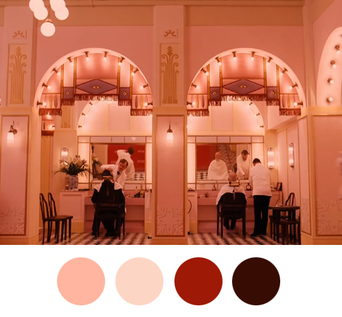
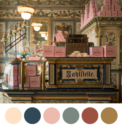
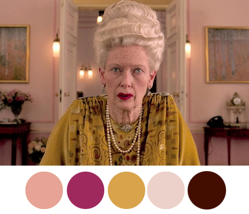
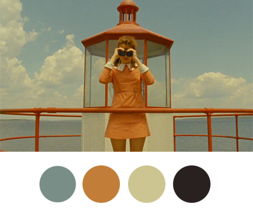
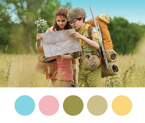
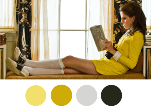
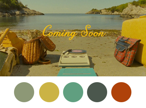
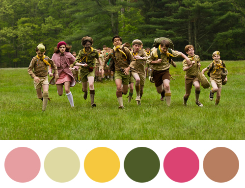
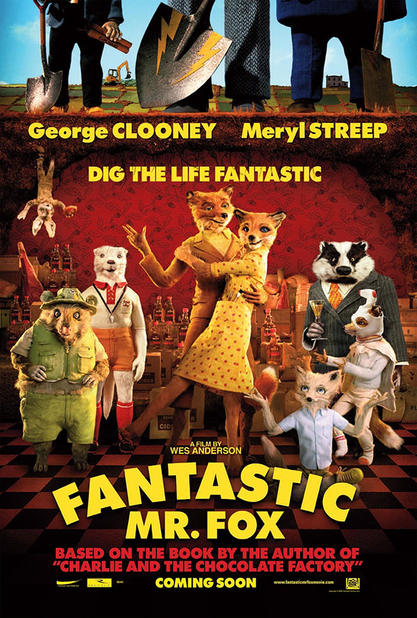
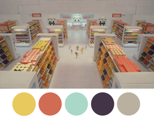
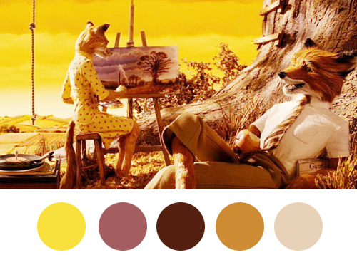
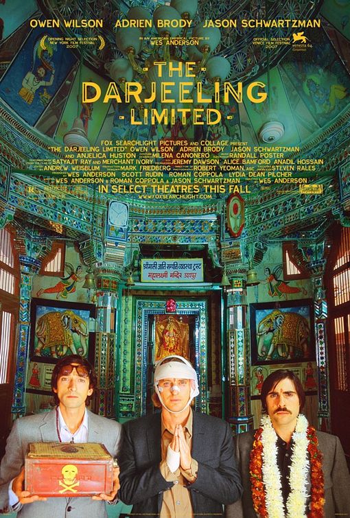
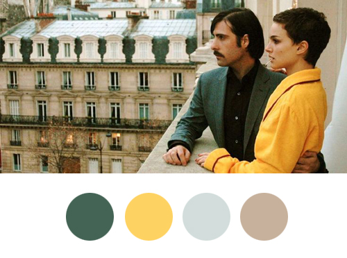
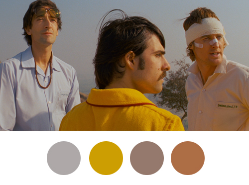
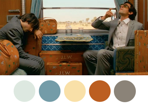
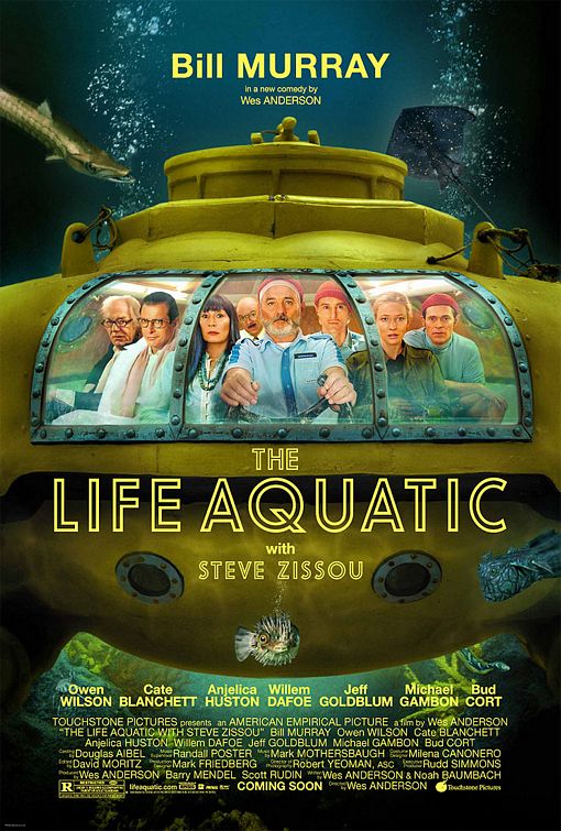
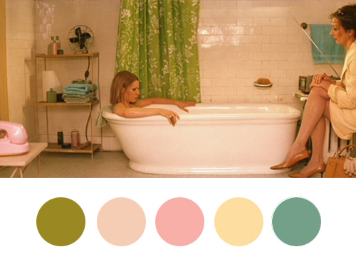
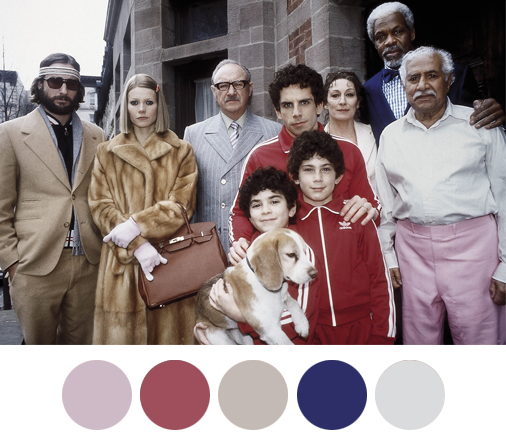
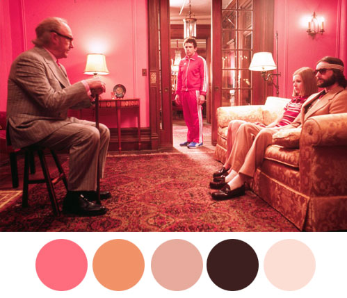
Wes Anderson films deserve a genre of their own. If you’ve had the pleasure of seeing any of his films, you’re likely already a fan. Many artists and designers draw their inspiration from the director’s iconic aesthetics. His movies are about meticulous compositions, impeccable sets and of always a very distinct color scheme.Â
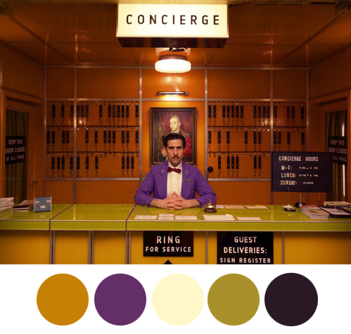
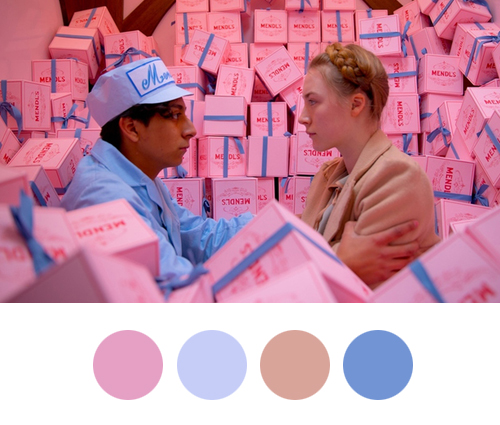
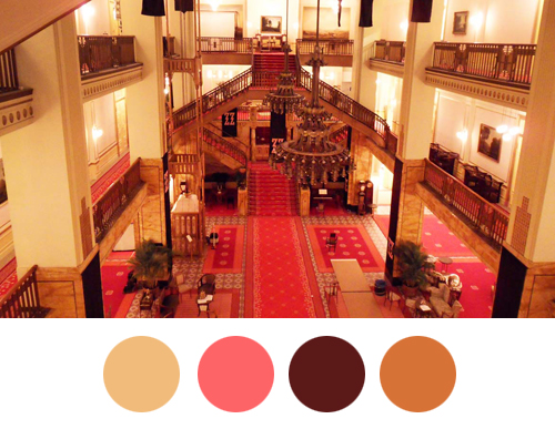
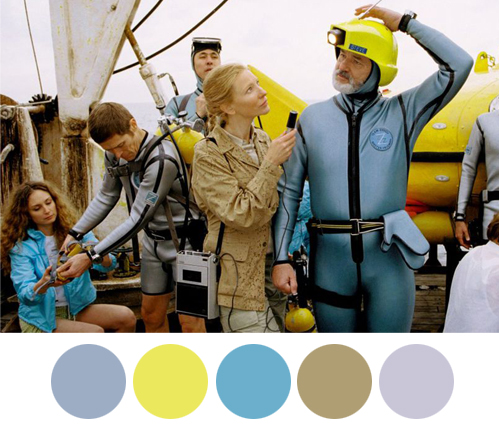
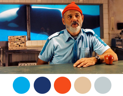
Wes Anderson encourages us to think, to dream and create. One of the elements that make the movies so compelling is the precise colouration. From the pastel-hues that paint the scenery, to the attire of the characters, the color palettes stay true to the dream-like world created by Anderson. No matter what part of the movie you come in on, you’ll always know it’s a Wes Anderson film.
There is also a very simple design lesson behind every film that reflects Anderson’s aesthetics – richly colored scenes paired with an emphasis on symmetry. Note the particular attention to symmetry, composition and detail. We can all learn a lesson or two from one of the most imaginative film directors of all time.
This article can be your source of inspiration for future projects! Nailing that color scheme can be one of the hardest things to tackle.Â
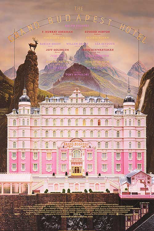
The Grand Budapest Hotel
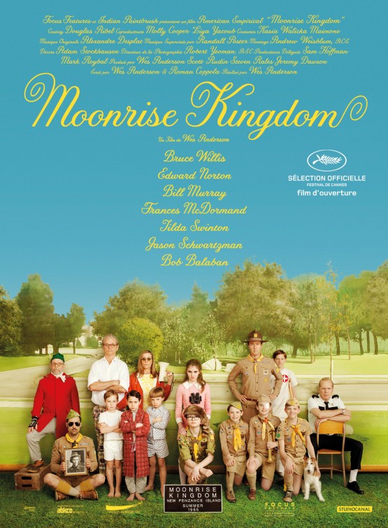
Moonrise Kingdom
Fantastic Mr. Fox
The Darjeeling Limited
The Life Aquatic with Steve Zissou
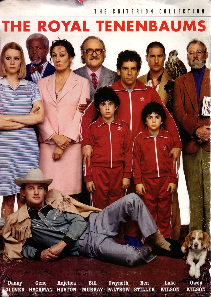
The Royal Tenenbaums
If you ever find yourself in a creative block, get your popcorn out and do a Wes Anderson movie marathon!Â

