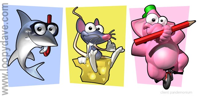
 Thanks to Abduzeedo’s article on graphic designer “Loopy Dave†being featured on Stumble this week, his work has garnered a much wider audience than before. While any designer can look at the stunningly beautiful graphics from Loopy Dave with envy at their success, there are definitely lessons that can be learned from Mr. Dave’s creations. Want to know just why his images are so impressive? Read on for a fuller review of this artist’s successful techniques.
1). Brightness: A quick scroll-through of Loopy Dave’s gallery will show you the importance of keeping the colors vivid when creating eye-catching artwork. Even if a particular picture has predominantly darker shades, all of those colors are still “bright†(not of faded hues) and most pictures always have at least one attention-grabbing color (red, yellow, orange, etc.).
2). Light: Loopy Dave’s illustrations all pay wonderful attention to the importance of accurately portraying light/shadows for “realistic†artwork. Even though all of his graphics are cartoonish in nature, Dave’s choice to adhere to the rules of natural lighting gives all of his designs a more lifelike appearance. The use of light/shadows makes each graphic more real, more believable, and more appealing to the eye; too often many digital graphic designers ignore or overlook this important concept in their artwork. Through observing his work, it becomes obvious that proper use of lighting cannot be overlooked when creating successful artwork–whether cartoonlike or realistic.
3). Humor: Let’s face it—from his art name to his clever designs, Loopy Dave has crafted some pretty funny stuff. His witty take on life and the gamer world is delightfully fresh for the world of graphic design, leaving viewers laughing at his approach to everyday topics. Whether commenting subtly on the ridiculousness of some of the portrayals of heroes and women in video game graphics or placing familiar cartoon characters into absurd situations, our little loopy friend has created art that incites laughter. Perhaps particularly noteworthy are all of the expressions of his characters in his works; perfect for their situations and very successful at extracting laughter from viewers, each character’s expression provides fresh humor to the graphic design world.
4). Detail: Loopy’s brilliant attention to detail is perhaps the greatest thing that sets this artist apart from other designers. The cartoonish characters do not lack any of the real-life details expected in an actual image of said figures; each piece of artwork is full of details that, if not included in the graphic, would have left the piece looking ordinary and bland.


