Simple things can be beautiful. Moreover, simple things can be more successful than complex ones: minimalist websites prove it. Many websites are overloaded with features and information these days: no wonder that people get tired of it and start preferring more simple solutions.
You can follow this trend and create your own minimalist website designs too. If you don’t know how to achieve that simple look, read this article and find out about the main features of minimalist web design.
1. Flat
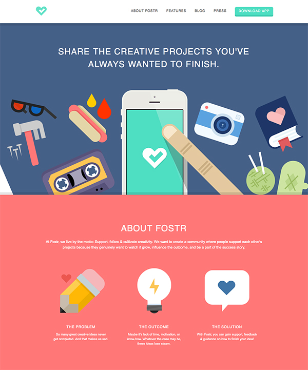
Though it may surprise someone, flat icons and other flat design elements remain on trend for over 5 years already. They are simple, beautiful and serve their purpose without attracting too much attention. When you create minimalist website design, you can use flat icons and elements of a certain color to achieve simple look and to avoid color overload. Â
2. Background photos
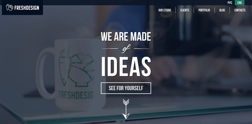
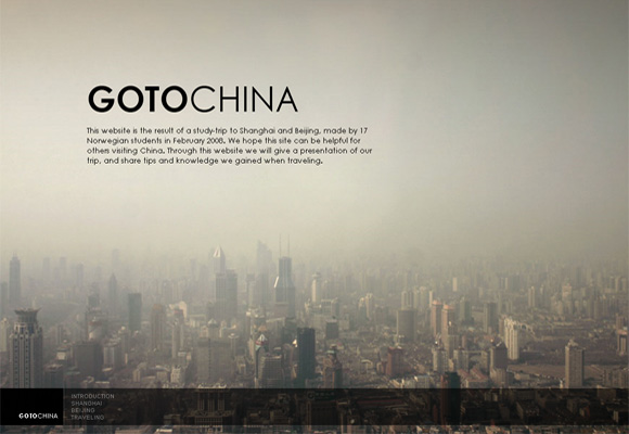
The usage of big photos (blurred or not) for the background is one of the latest trends in minimalist website design. These photos help to create the desirable impression without adding too much details: a photo of a tasty food will look great on a cooking website and a photo of a beach will suit travel company’s website. Though don’t forget about visitors when you’re designing a website with a background photo: the text on it should be easy to read and the photo itself has to be appropriate.
3. Blank space
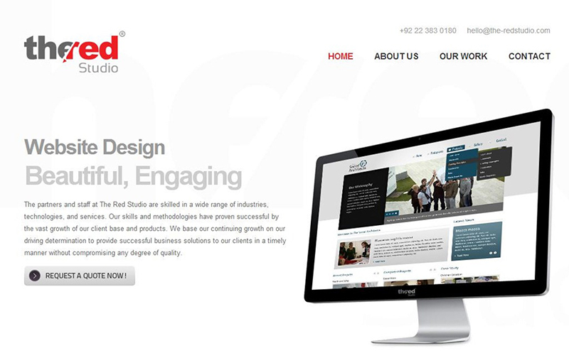
Smart use of blank space can do wonders for your website. You are able to attract visitors’ attention with the help of it, to make an accent on certain parts of the website, to remove secondary elements from main page. Of course, you have to use blank space wisely: otherwise, your website can look empty instead of decluttered.
4. Simple navigation
If your website is overloaded with information and links, it can confuse visitors and scare them away. To avoid this, try making navigation as simple and intuitive is possible. Your visitors have to find all the necessary links easily and to perform all the desired actions without putting too much effort.
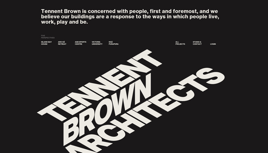
5. Impressive typography
Use of big or original typography is one of the easiest ways to attract visitors’ attention and to make all the necessary accents. Moreover, successful combination of negative space with big typography makes website design more impressive.

