Mobile app design trends for 2018 will amaze you. They are bold and daring but at the same time exquisite and refined. Check out the following trends in mobile app design and get ready to the upcoming changes!
Mobile Apps: On-Demand
This mobile app design trend for 2018 is a pure reflection of the Latin phrase “Carpe Diem†which means you need to seize the day. On-demand mobile apps allow product owners to earn faster than any other apps. What’s more, most on-demand mobile apps belong to marketplaces (which means that a product owner gives a digital place for deals to be made and gets money for this). These on-demand marketplaces have conquered everything, starting with taxi and finishing with laundry. Therefore, designing an on-demand mobile app, you need to stick to the principles of making the app as “fast thinking†as you can. The speed always matters but when it comes to on-demand mobile apps, speed is your everything.
The most famous example of an on-demand app is Uber. This app could be taken as an example while designing an on-demand marketplace. Except for using mobile payments and having a high loading speed, this app also follows the principles of material design. As you see, mobile app design trends for 2018 have a tendency of being combined.
Accelerated pages in trend
The faster, the better. Once again, speed matters. That’s why Google has recently come up with Accelerated Mobile Pages (AMP) that are supposed to help mobile apps load quicker. In this case, such mobile app trend will help apps to increase the number of visitors along with conversion rates. With AMP, your product gets a higher page ranking and gets a proper search engines optimization.
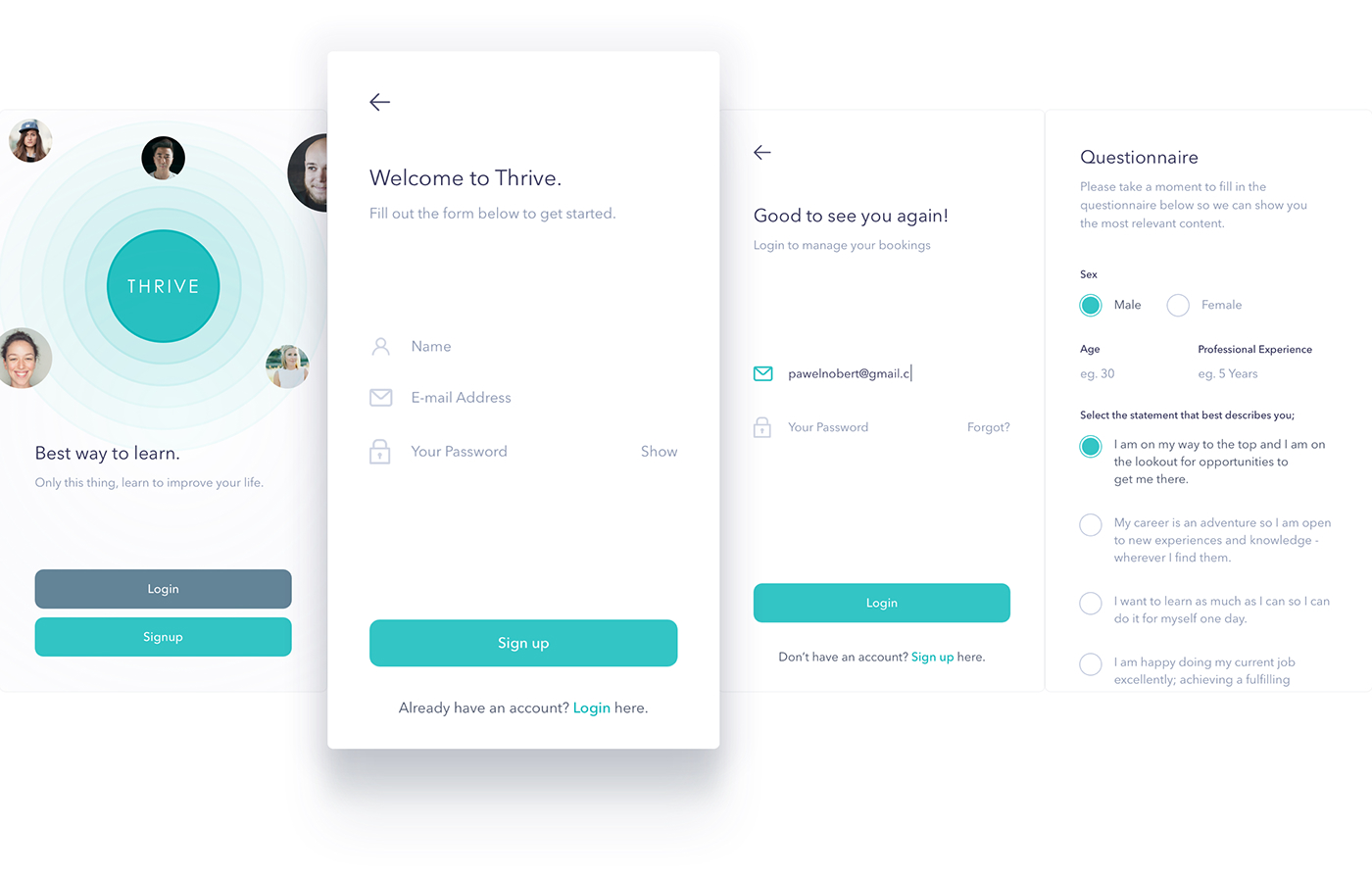
Thrive is an example of a mobile app where speed was taken into account first and foremost. It’s designed following the main rule of the UX design: make everything possible for the user’s convenience. You don’t need to go through dozens of tabs to find the one you need: Thrive magically anticipates your desire.
Mobile Apps And Lazy Loading
Mobile app design trends in 2018 allow developers and designers to get a bit lazy while creating an app. Or when it comes to images, at least. Do you remember the thing with accelerated pages? Lazy loading is a bit similar. It protects your product from losing users who are sick and tired of the images that can be loading for an hour or so. That’s why, with this mobile app design trend for 2018, the images get loaded only when they are needed. This way, you will save your users’ traffic and nerves.
Supporting Different Gadgets
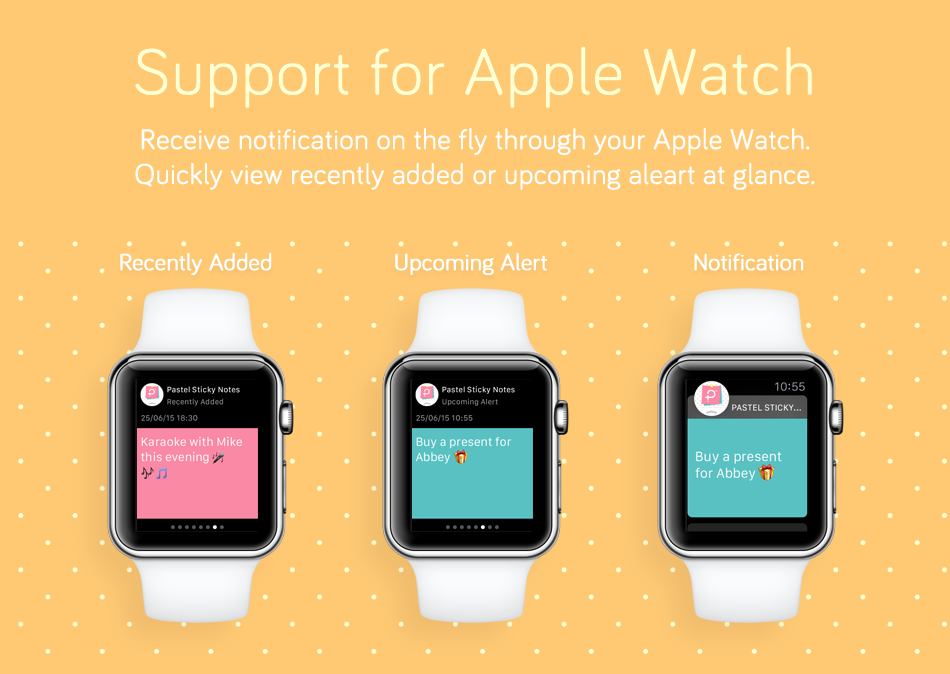
You cannot surprise your clients with owning an Apple Watch. However, you will surprise them if your app isn’t supported on Apple Watch. Trust me, such surprise will be really unpleasant. Making an app work properly on Apple Watch isn’t such an easy thing to do. First and foremost, because developers and designers get limited with screen sizes. You cannot place a call-to-action button and all the UX writing content you need on such a small screen. That’s why you should give up on something.

Take a look at Pastel Sticky Notes. This app is designed to facilitate people’s life a lot. When you need to write something down, you always have this app at hand. The great thing is that you can choose colors (and pastel colors are widely intrend for 2018, btw). What’s more, this mobile app can be used on Apple Watch as well. Using such a limited space, the app doesn’t lose in its style.
Material Design In Mobile Apps
Material design is going to overcome flat design in 2018 for sure. Why? Because it looks as if it was alive. Material design creates an impression of human touch. Sometimes, it seems as if you could grab an icon or a button n the mobile app you’re using. This mobile app design trend for 2018 is crucial to understand: not only should the elements look interactive but also close to life.

RedBus App is an eloquent example of the way material design changes the world of mobile apps. These changes come not gradually but rapidly, replacing our understanding of mobile app design with completely different tendencies. Now, you don’t need to use colorful images to make the design successful. In fact, material design can replace the rest of graphic you have.
A Bright Splash Of Colors
You don’t need to use neon colors to get noticed. Not anymore. In 2018, you can be quite successful with pastel colors if you thin them down with just one bright color to make an accent on. This emphasis can be shown in titles, headings, scrolling etc. The main thing is that this splash of colors helps you to create a frame for your mobile app, making it look stylish.
Bottom Line
Mobile app design trends for 2018 are going to surprise you. They are bold, daring, and refined. Combining these qualities, mobile apps will be even more inventive and striking. Being a mobile app developer or designer, don’t be afraid of thrilling your clients. This way, your mobile app will definitely get remembered.
Launch a mobile app design contest on DesignContest to get a perfect app that will follow trends of 2018 entirely and completely.
*All images and videos found on Behance.


