Trends in design for mobile devices keep changing. Users switch to better, faster and easier devices that need faster and better apps. That is why designers strive to create an absolutely intuitive and comfortable user experience no one had ever seen before.
Nonetheless, if users get lost and confused with website’s look and navigation, it means the UI design has failed to fulfill its main purpose.
We continuously wonder why trends change and what causes the change. Mainly, it’s the progress, the constant transformation and growth of the market of mobile devices.
Numerous mobile apps continue to transform popular features into everyday necessities. Plus, in the modern world people give preference to using their phones to solve everyday tasks. Apart from that, shift in culture, traditions, features of prominent mobile devices also influence how design trends develop.
What should we look for in the upcoming year?
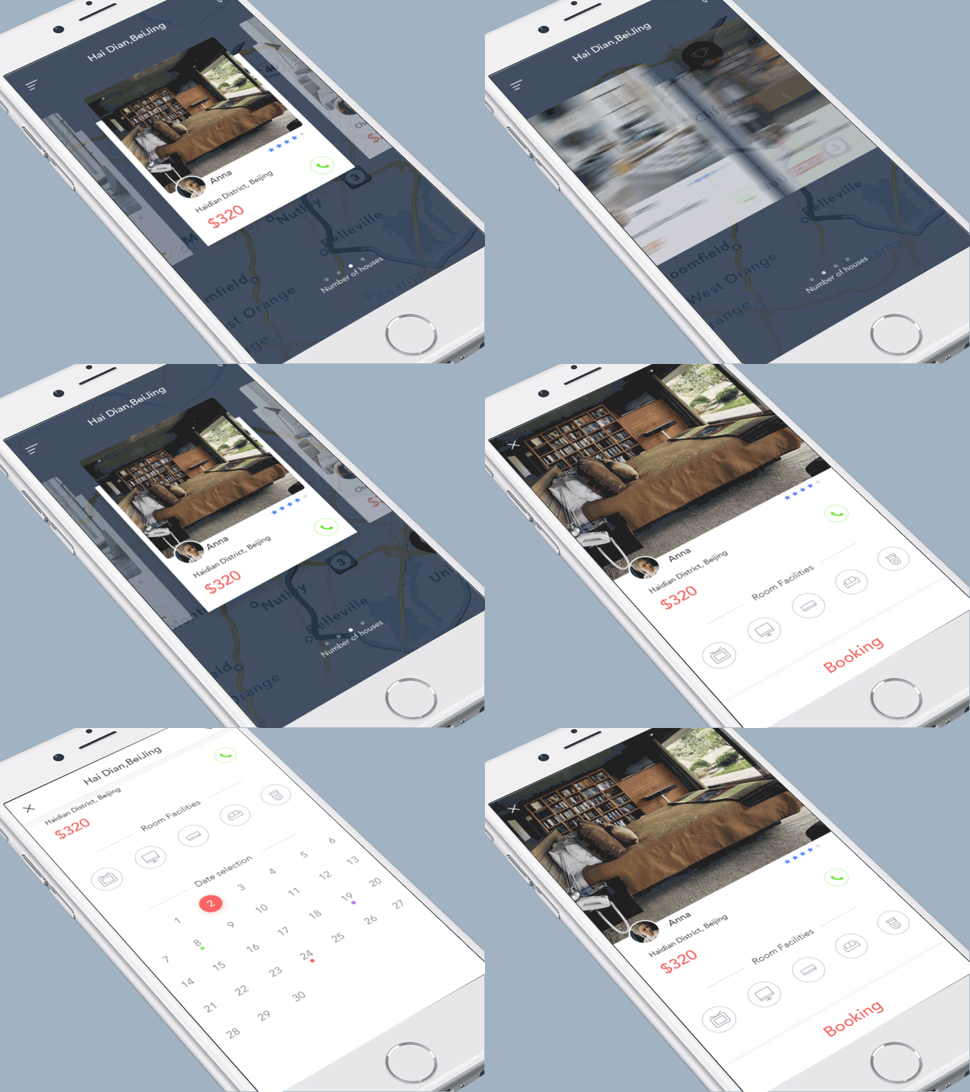
1. Hidden navigation
Hidden navigation is not a recent discovery. However, it has been in the shadow for quite a long time. And, finally, the perfect time has come to introduce this feature. Designers have begun to hide functionality in order to save space for viewers. One of the currently available ways of hiding the navigation is by creating so-called navigation drawer. Basically, menu becomes available only when it’s needed and stays invisible all other time.
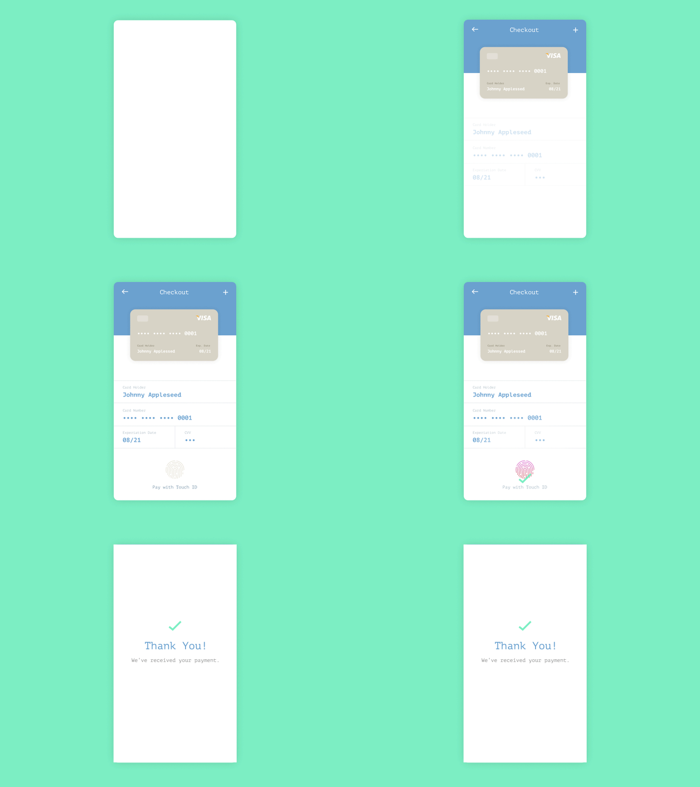
2. Touch ID taking over
At the beginning, Touch ID technology was only used for unlocking devices. Now Touch ID verifies your Dropbox, Apple pay, Amazon account etc., and it has made a process of online verification much easier and safer.
3. Diffused background
Even though mobile devices have small screens, it does not mean designers have stopped creating attractive themes and backgrounds. Today diffused images are used for background to keep user focused on app features.
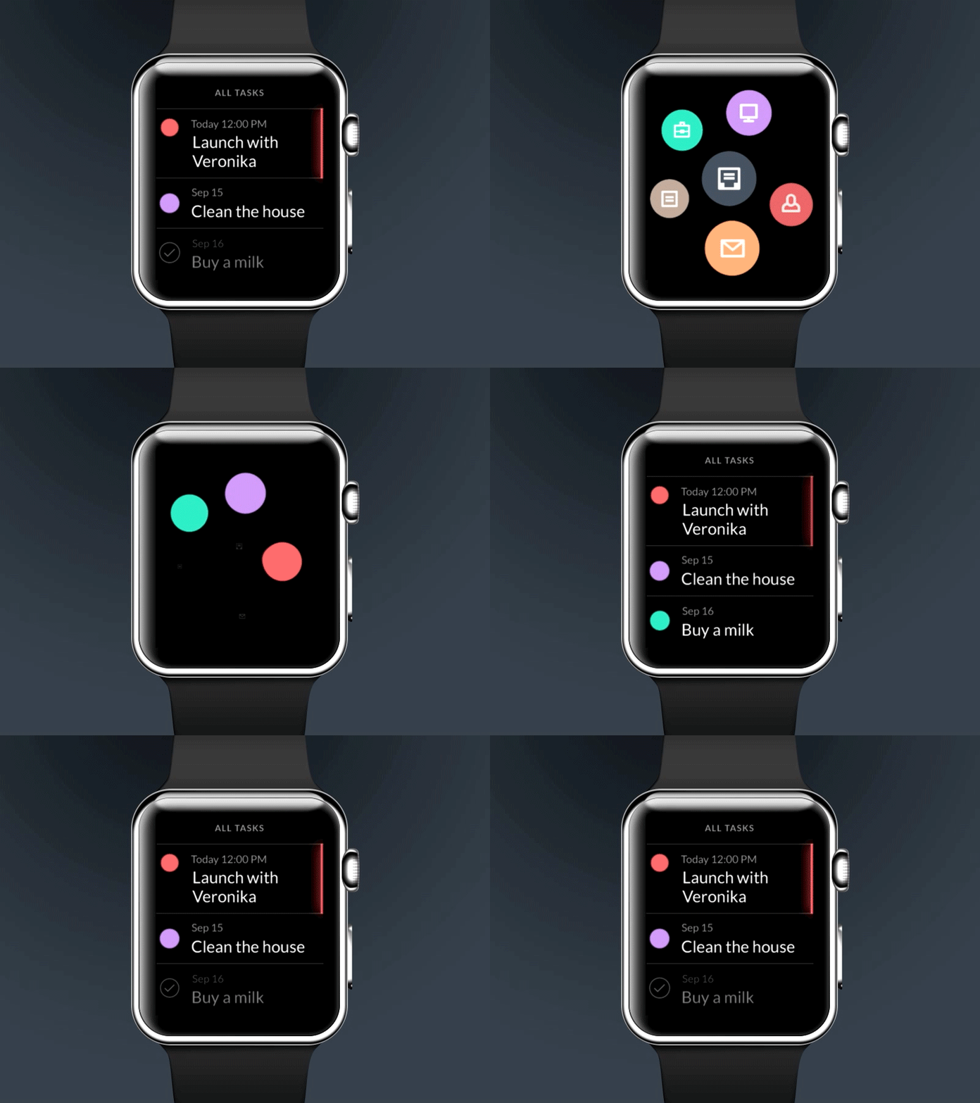
4. Wearing wins over Carrying
Wearable technologies are trending! Apple Watch has already taken our hearts with various compatible apps available, challenging Android Wear to better their performance and compatibility with Play Market. Soon enough people will switch to wearing devices instead of carrying them.
5. Personalization is a Key
Bright colors and playful interfaces create a great user experience. New entertaining designs attract more people to use and customize the apps to suit their needs. Such apps engage users with funny messages and notifications. Apps become our best friends, creating features we cannot live without.
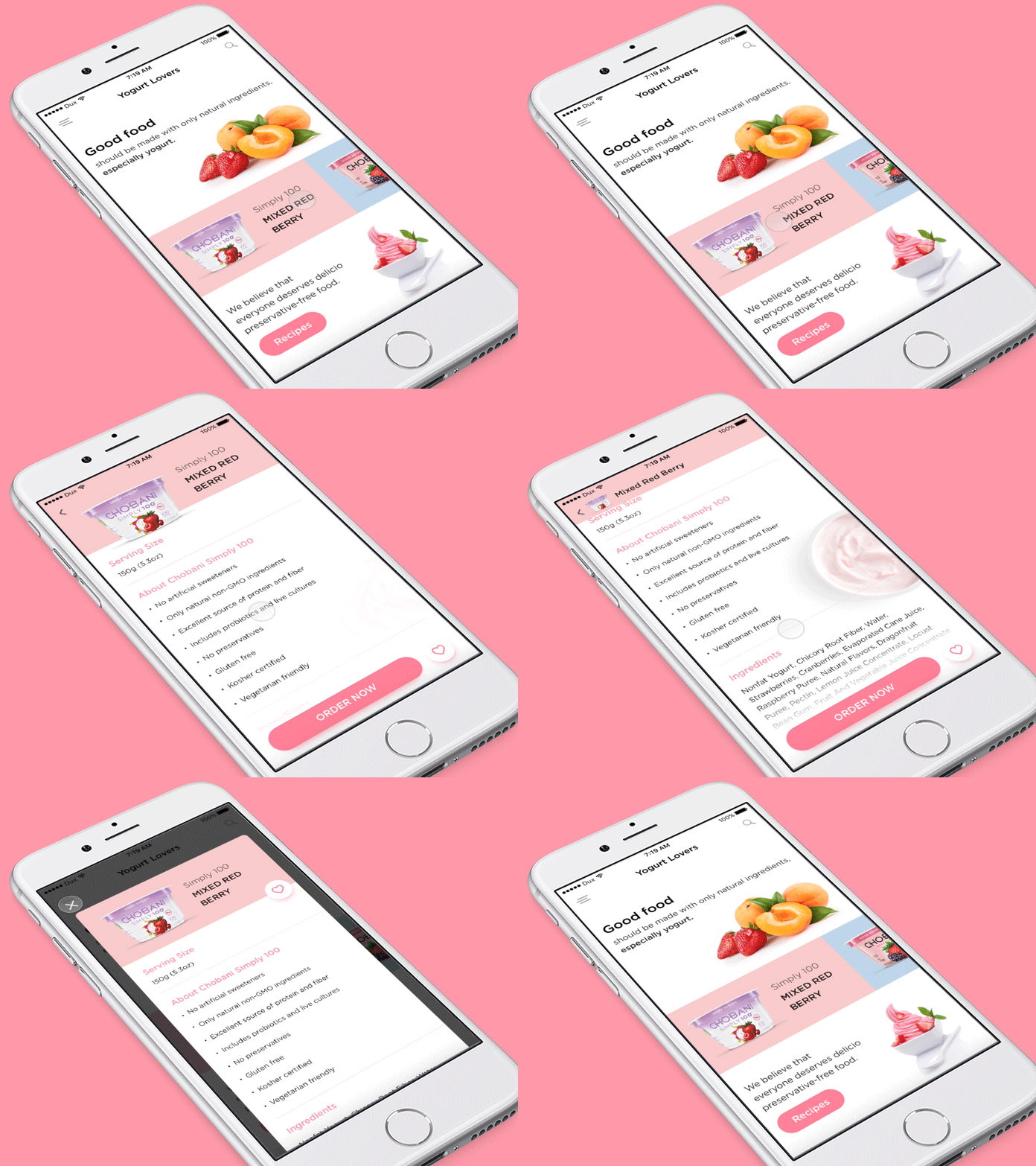
6. Card Design strikes back
Card Design is a useful and effective tool for mobile-friendly websites. Cards help to divide and properly place content on the website. Cards made it possible to download multimedia objects and attract more traffic to the website.
Moreover, they show users they can choose the actions, making design more responsive to their needs.
7. Material design again and again
Material design was introduced to us by Google in 2014. Nowadays a lot of apps and websites use this technology because it provides simplified and fast-loading effects (gradients, layering, and animation). Material design gets associated with card design, so these two are absolutely going to stick around.
8. Calm color pallets
Today “less is moreâ€. Check out popular apps we all use: Tumblr, Pinterest, Facebook etc. They all stick to one color scheme with a few shades. It seems like flash and bold colors are no longer as attractive as pastel and calm ones. However, it does not mean you need to rush in and change colors of your brand. Use the same color, but subtly and elegantly – try not to go overboard.
You think our list is incomplete? Share your thoughts with us in the comment section below.

