Want to catch up with the web design trends? Mission almost impossible. The thing is that trends in web design keep changing rapidly due to the fact that websites are always aimed at surprising users, holding their attention, and making them press the sacred call-to-action button. These spring trends in web design for 2018 will help you to understand what you should be targeted at.
1. Broken grid layouts
Broken grids save lots of space on your webpage, making it well-organized and systematized. It enables you to make an emphasis on several elements instead of just one. As a result, broken grid layouts can present your company in a better light, introducing the products or services you provide to your potential customers online.
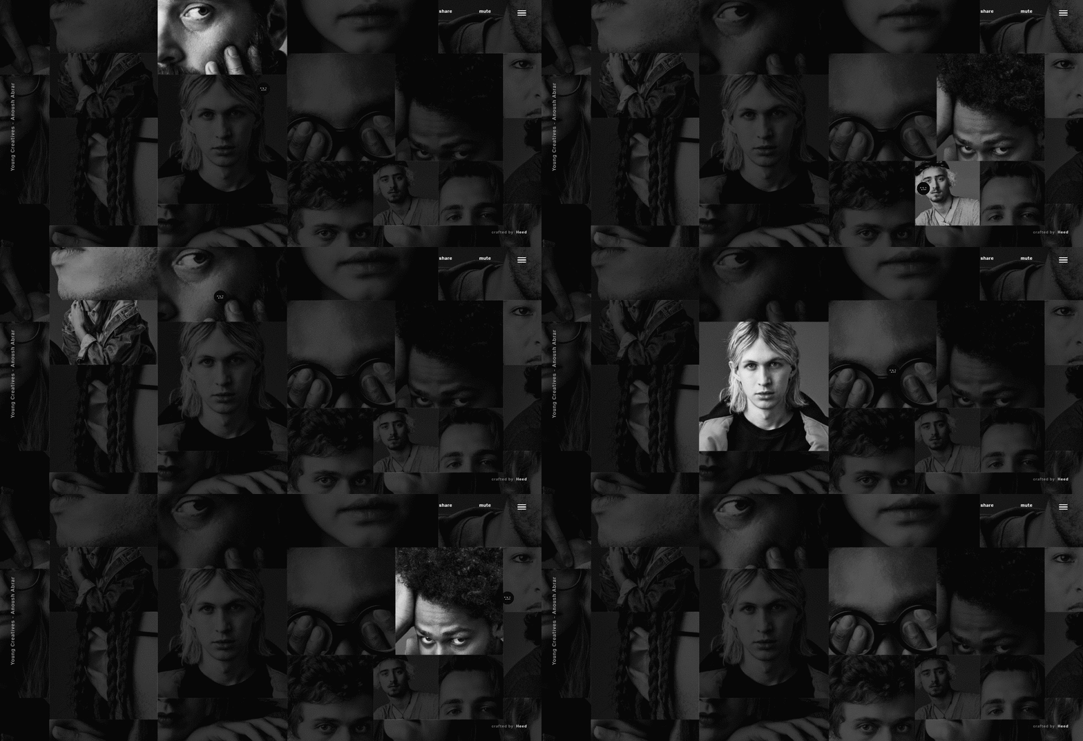
Broken grid by YoungCreatives
The web agency YoungCreatives has interpreted this tendency on their own by turning their website greed in the series of photographic portraits that get highlighted when you point on them with a mouse. Using hoovers, this web design helps the attention to get focused on one piece of the grid, while others simply fade away. That is why the home page looks casual and sophisticated at the same time.
How you can use this idea
If you design to go with grids for your website redesign, think of how many grids you want to implement. If more than 3, using hoovers could be a great solution when making people concentrate on one particular item on your grid.
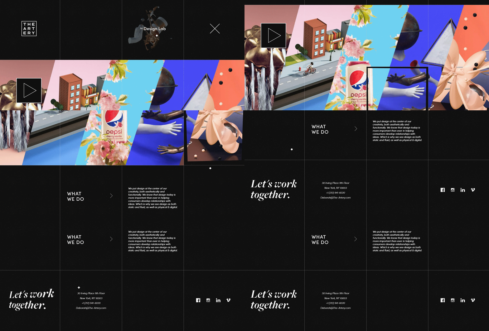
Broken grid by TheArtery
Another website that uses broken grid layout belongs to TheArtery. They have also decided to make their grids interactive, which means that each separate one is responsible for a new detail. The black grid is mixed with colorful boxes which makes the entire design eccentric and widens the boundaries.
2. Web animation
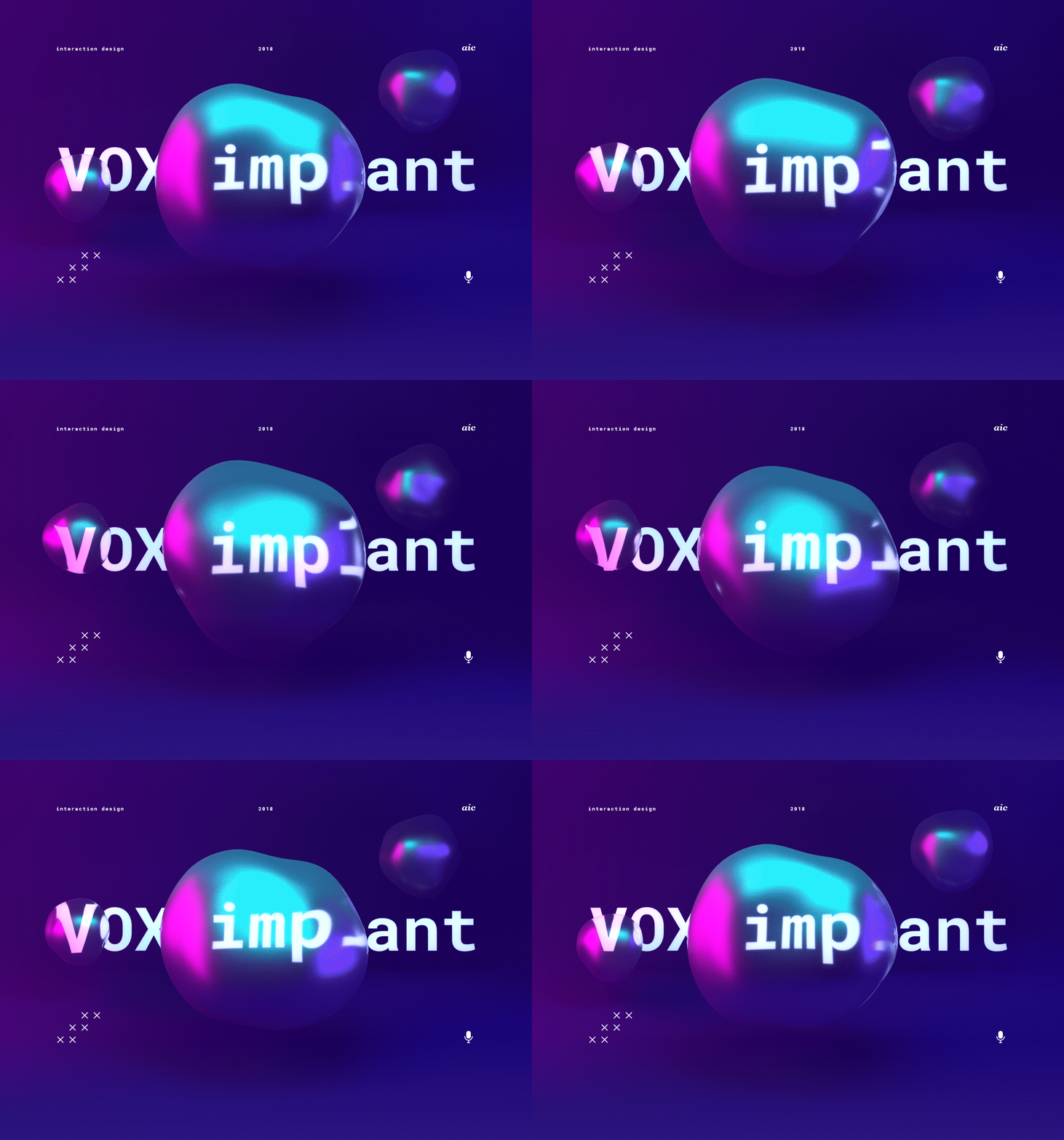
Previously, we have described the main web design trends for 2018, and the website animation was one of them. However, the difference between the web animation in general and the one that is expected to be popular this spring is in colors and special effects.
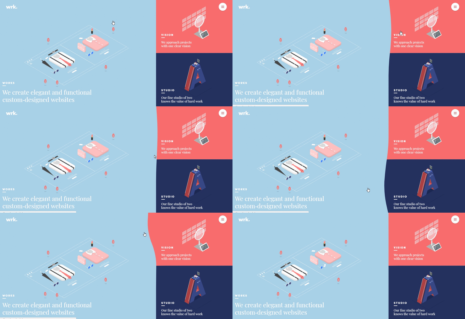
The spring animation should be smooth and steady. What is more, its colors need to be calm and fresh. Though black-and-white websites seem always to be in trend, bright and intense colors popular in spring would look great on any website, not depending on the season itself. You can also choose whether you want to make this animation constant (like the one on the light-blue background above) or temporary (with the help of hoovers or similar).
What is more, don’t forget about the color of the year chosen by Pantone. The Ultraviolet color and its shades create a cosmic impression, which is why the web design animation in these hues will be not less than magnificent.
3. Bold typography
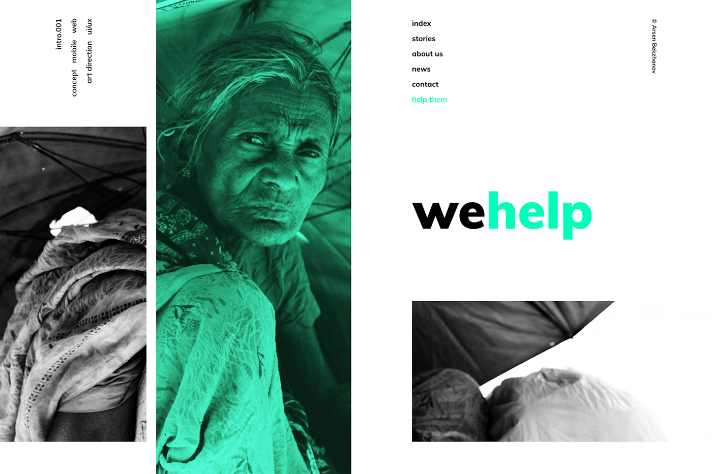
This spring, don’t be afraid of going bold with the typography you choose for your website. Massive letters have never been on demand as much as they are going to be this spring. Such web design solutions always look energetic and refreshing. They seem to be an engine that leads your website and develops it, bringing web design to its next stage.
4. Floating navigation
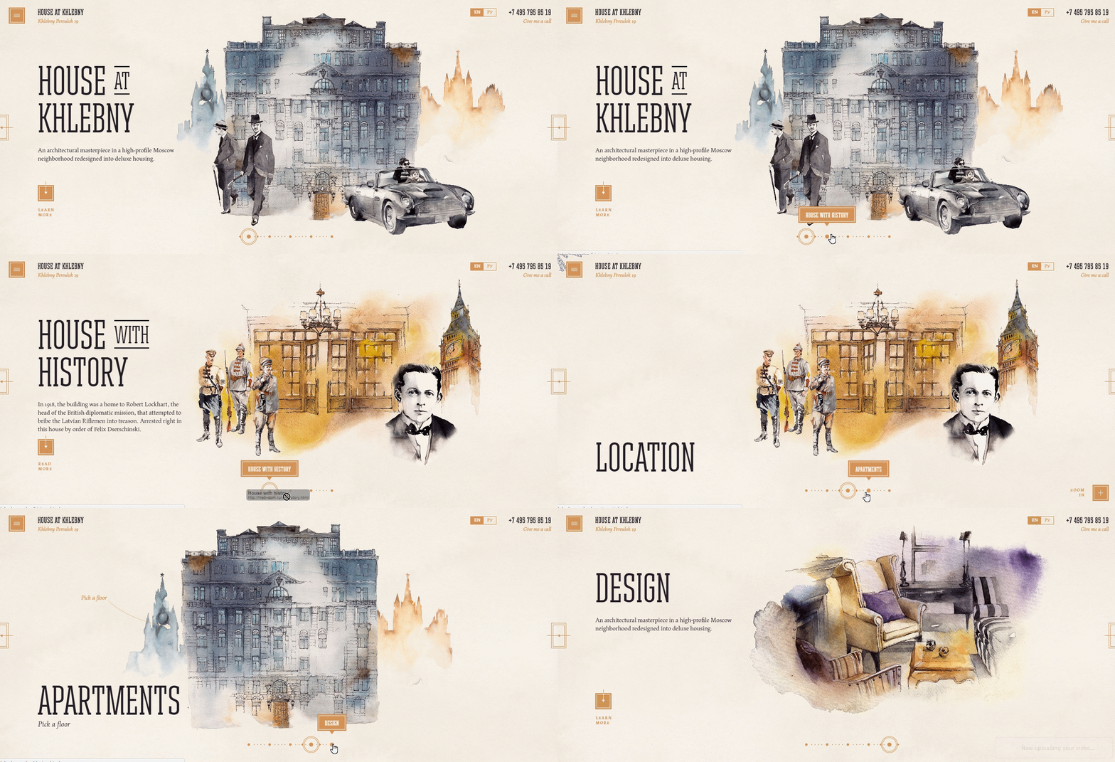
Floating navigation is a special feature on your website that makes it different from your competitors in one more special way. It helps users to explore the website and makes this process interesting, entertaining, and engaging. Due to the fact that there are truly lots of options that distinguish the way users can navigate, its diversity has no limits.
5. Shadows
Why do we need shadows on web design? Especially this spring? Shadows allow you to play on the contrast. What is more, they can get implemented in each and every detail of your design. They make it memorable and increase the visibility. Therefore, using shadows on your web design does make sense. They will add a special zest and make the entire impression better.
Bottom line
Making your web design suit the latest demands of the web design this spring is quite a wise thing to do. You don’t even need to change everything on your website in order to meet all the requirements. As a rule, adding a simple detail or changing a special feature would be just enough. If you need your web design to go just right, click here!

