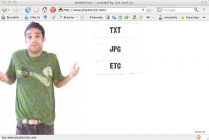
 When website design becomes routine and mundane, the results tend to be less than stellar. In fact, rarely do we ever come across a website where we are blown away by the layout, graphics, and stunning originality and any such website that actually manages to astound the mind is considered a rare gem of a treasure. Fortunately sites like Phatterism.com still exist as proof that personal websites can indeed be creatively inspiring, fun, and (perhaps best of all) very original in concept. Simple graphics and a fun user interface combine to create this website that can inspire any graphic designer/website developer to stay fresh in their concepts. Keep reading for a brief overview of this great site!
1) Sweet tunes: Catchy music greats you upon entering the homepage of this great website, and the upbeat sounds are sure to make any visitor start happily bobbing his head at his computer and subsequently put him in a good mood. Perfectly complementing the fun, original, and quirky design of the entire website, the word-less music is the perfect choice for drawing in visitors without offending them (as certain song lyrics could potentially do).
2) Sparsely Populated: The homepage and the rest of the website is pretty much the same—there’s not too much there. However, instead of being a negative attribute, the abundance of negative space allows the site to have an overall clean feeling to it. The lack of an abundance of navigation options results in a pleasant site where the viewer can focus his attention on easily finding his way around the site without getting confused. Overall, fewer options equate to greater focus—an all around positive aspect to keep in mind for any website’s design.
3) Viewer Interactive: Every commanding click by a viewer of the website results in a fun action/response from the video character (maker) of the site. Fun to watch and “interact†with, this unique approach gives viewers the feeling that they are actually personally engaged with the website’s creator.
4) Details: While not overcrowded with graphics, this website still is jam packed full of the little details that really matter. For example, the handwriting-like font choice for the journal entries attests to a wonderful eye for clever typography and the “hand†holding each journal entry is a brilliant way to keep it all unique. Also, the creator left wonderful little details throughout the videography of the website; through clicking the “home†or “back†options, the actions of “Luis†(the creator of the website, made personal through the site’s video) are essentially reversed. Simple enough in concept but still fresh, this little insight to detail is just another factor that makes this site so much fun.
Even though it’s “just†a personal website, Phatterism succeeds in doing much more than just acting as a little blog for its designer. The site is original enough to act as a great promotional site for its creator as well.


