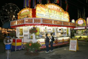
 Sunshine and three-digit temperatures have got us all longing for a swim in a cool river or craving something cold and sweet to munch on. For graphic designers, however, summertime can also mean the need to create some stellar graphics for food stands (or graphics to advertise for food stands, in today’s technologically driven world). Check out these great tips for consideration when designing your stand’s logo, whether it is for a full-season snow cone shack on the side of a country road or a two-week long food booth at your local county fair.
1) Bright: Ask any fast food chain—bright colors attract customers and some argue that bright hues may even make people feel like they are hungrier than they really are. Whether or not that latter claim is true, brighter colors will certainly attract more customers to your food stand. While subdued, faded tones may be popular for “vintage†looking graphics, these shades will not maximize your business’ monetary potential. Stick with colors that are applicable to your specific food stand; for example, if your specialty is lemonade, then a bright yellow theme will be your best option. If you lack a specific specialty item, then choose one or two main colors to be your overall theme and incorporate them into your logo’s design (example: red as a main color can correspond to red in the ketchup on a logo’s hotdog). Try not to use too many colors in your design palette to prevent from appearing too tacky, unless you’re selling rainbow-colored snow cones (in this case, go ahead and use every possible color!).
2) Big: The font on your main sign should be HUGE. This serves a twofold purpose: to bring attention to your stand and to inform people clearly of what you are selling. Choose a bold print and avoid anything too swirly/curvy/cursive-esque. You’re not selling gourmet foods; keep the home-town appeal of your stand by avoiding anything that will make it appear fancy. In many potential customers’ minds, “fancy†equates to “pricey†and drives their business away.
3) Brief: The KISS (Keep It Simple Stupid) principle applies here. Generally customers want to be able to scan a menu within a couple of minutes in order to know if you’re selling what they’re craving. If you have multiple flavors of the same product, then list these. If people want an explanation of a certain flavor/flavor combination, then they can simply ask you. Additionally, if your stand sells more than one type of item, then keep similar items all grouped together under bold printed logical headings. Basically, keeping the menu/options briefly listed will encourage customers because they will be easily able to find whatever they are looking for; detailed explanations can be given in person, or on a hand-held individual menu.
Finally, when choosing graphics/pictures for your stand, stick with one major item for your logo. An easily identifiable logo will be more attractive and memorable than a hap hazardously thrown together collage of photographs, even if all of the said photographs are applicable to your stand.


