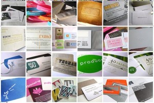
 Growing and sustaining a successful business requires a good network of contacts – and a good way to get your contact information to them! Anywhere you go that you encounter others – conferences, meetings, luncheons, even in line at your local grocery store – can hold the potential to network and make new contacts. Having an effective business card that showcases the right information, can mean the difference between making a new customer or adding to your local landfill. Remember these tips for effective business cards when designing your next business card project.
Consider the Purpose of a Business Card
Remember, a business card is created and used to share your contact information with others. But, it can also be used as a selling or marketing tool, to strengthen brand awareness, to drum up new business, or to share information about you and your company. Before setting out to design your business card (or a business card for your client) determine what your main purpose of the card is and go from there.
Keep Common Business Card Storage Methods in Mind
Business cards are commonly stored a number of ways – in a Rolodex on someone’s desk, in a business card binder or holder, or digitally with the use of a business card scanner. Your business card design should keep these common storage methods in mind. While using an unusual shape or size for your card can be memorable and creative, it can sometimes defeat the purpose of the card itself, by making it impossible to store using common methods.
A card that is oversized, three dimensional, or an unusual shape won’t fit nicely in the rolodex or card holder, and certainly won’t fit through the business card scanner to be stored digitally.
Don’t Forget to Include All of the Basics
Potential customers will look to your business cards for basic information about you, your business, and how to contact you. If the basics they’re looking for aren’t available, or easy to find, they may go elsewhere. Be sure to include a name, title, company name or logo, address, phone number, fax number, email, and web address. A tagline can be another important element to include, but is not always necessary.
Make it Memorable!
Sometimes you only have seconds between meeting someone and handing them your card. You want a card that is memorable, that the recipient can recall in their mind and make a connection to you. Make your business card a conversation starter. Make it interesting to look at. Make them spend a few extra precious seconds looking it over and making those mental connections. Use colors, images, and fonts that are exciting and memorable – all while remaining relevant.
Give Your Design Some Color
With digital printing quickly overshadowing offset printing as the industry norm for business card production, it is now affordable to print full color, double-sided, ultra glossy and attractive cards. But, just because you can go over the top with design and color, doesn’t always mean it’s the right thing to do. Don’t let overly ambitious design get in the way of your business card’s purpose.
Make it Legible
Sometimes a business card contains a lot of information, several phone numbers, long email addresses or URLs, multiple names or addresses. While it may read well on your computer screen, print your new business card design at full size and make sure it reads well in person. Make sure everything is legible and easy to read – you don’t want your customers to need a magnifying glass in order to contact you!
Double – or rather – Triple Check Your Work!
A business card with transposed digits in the phone number is useless. A business card with a misspelled email address can make it impossible for a potential customer to contact you. Once you’ve finished your new business card design, triple check your work for mistakes. Ask another person to check it, too.
Of course, there are always exceptions and rules are meant to be broken, but keeping these tips in mind will make your next business card design project a success!


