The first cryptocurrency transaction occurred in May 2010 using Bitcoin and since then cryptocurrency has become a sensation. The most cutting-edge digital currency has now limitless entries as each cryptocurrency comes with its own purpose and benefits. As much as the specific purpose of that cryptocurrency is critical for it to survive in the market, it is equally important for the cryptocurrency to have an ideal logo to attract buyers. After all, designing is all about creating brand recognition and value. Sometimes, people may be more attracted to a cryptocurrency based on its design and aesthetics.
Read on to learn about the logo designs of top cryptocurrencies and what makes them stand out and communicate their respective benefits.

1. Bitcoin
The first of many, Bitcoin was originated in 2010 and since then has been the crown of the cryptocurrency. The most exclusive cryptocurrency has an iconic logo that has widespread fame. Anyone who sees that logo can recognize who it belongs to and what it represents. The circle with a dollar referenced “B” sign depicts a coin that represents money. A person who doesn’t even know about cryptocurrency can look at the logo and presume that it is all about money. The color choice of the orange coin with “B” dollar in white is a great combination while the simple text ‘bitcoin’ beside the orange coin complements the logo perfectly.

2. Dune Analytics
Dune Analytics is a platform, by the community for the community, that provides data tools for the Ethereum Network. Data can be explored and shared for free from Ethereum Mainnet, Matic, Optimism, and xDai. Dune Analytics’ logo is a quite simple one compared to Bitcoin. The font style is simple and the name itself suggests that it is related to the analysis of something. The circle filled with red and blue colors indicates sharing while equally giving an idea of networking with the entire blockchain community. Although it is simple, it creates a strong brand representation as well.

3. Ripple
Ripple aims to be a frictionless money transit medium through which currency exchange, remittance, and other online transactions can be performed. It acts as a medium for banks, digital asset exchanges and payment provides through RippleNet. Ripple’s logo accurately reflects its purpose. The logo includes a blue jigsaw puzzle piece, a triangle over the puzzle, and the text beside it. The jigsaw puzzle piece is not what it depicts but it represents a connection of three dots all meeting at a common point. The triangle over it represents the connection all three have with each other. The blue shade adds a sense of safety. In short, the logo is a pretty amazing package representing blockchain. Impressive!

4. Flamingo DAO
Flamingo DAO is a nonfungible token (NFT) based Decentralized Autonomous Organization (DAO) that fulfills the purpose of exploring emerging investment opportunities related to ownable, blockchain-based assets. NFTs are getting common day-by-day and with such organizations upfront, in no time they’ll take over the traditional norms. The logo of Flamingo includes text with pixel art of a flamingo in the background. Although it does not give much info about the company itself the choice of colors and the flamingo itself will definitely going to intrigue viewers. The flamingo pixel art gives a slight indication of NFTs in the form of digital assets.

5. Litecoin
After exploring many blockchain technologies, we are back at coin again. Litecoin is another cryptocurrency and open-source software project. It was an early Bitcoin spinoff that originated in 2011; hence the similarity in the names. Not only do the names share the same phonetics but the logo is somehow similar. The Litecoin logo includes a coin topped with a slashed L. It represents a quick and easy theme overall. Similarly, the Litecoin text font is also thin which goes with the name as well.

6. NEM
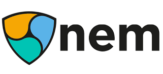
Because together, everything is possible. NEM is a platform through which a seamless interface between public and private blockchains are established. It has been recognized as the first smart asset blockchain in the world. NEM’s logo involves two elements: simple typography and a colorful shield. The tight letters always look good while the colorful shield representing a connection between three different realms is pretty appealing.

7. Dash
As the name suggests, the cryptocurrency is used to make instant, immediate, and private payments digitally through a secured open-source platform. Dash basically is the combination of Digital+Cash. The cryptocurrency’s logo is simple italic typography with a small dynamic angle at the end and a distinctive ‘D’ which indicates something quick or fast.

8. Launchpool
Launchpool adopts an egalitarian approach in the blockchain world. Launchpool advocates connecting various stakeholders in the industry and incentivizing all. It believes that all project stakeholders are as important as each other. All that equality that they are based upon is rightfully reflected on their logo. The logo is a type of a loop with one tangle of the loop represented by a straight fast-paced path. It clearly represents their purpose in the fast-paced egalitarian world of blockchain.

9. ZCash
The low fee cryptocurrency is not only confidential but instant as well. It can fully protect transaction privacy using zero-knowledge of cryptography. It is very much similar to Bitcoin. Even the logo theme is somehow similar to that of Bitcoin. The logo includes a coin with black borders. Inside the coin is a dollar-shaped Z in black colors and beside the coin is simple typography.

10. Monero
Monero aims to be a private, secure, decentralized, and untraceable cryptocurrency that keeps finances confidential. With a Monero account, you are your own bank. The security-focused cryptocurrency has a minimalistic logo that includes a circle and a styled “M” embedded in it. It is pretty creative since it shows the security that Monero emphasizes.
Which logo inspires you the most? Do comment below if there are more of the impressive cryptocurrency logos that weren’t mentioned in the list.


