There is no design without a proper movement. To turn your product into a client-oriented interactive unite, use the one kind of design that is all about engagement: motion design. DesignContest offers you to cast a glance at those motion trends that are appreciated this year the most.
1. Continuous animation
2018 just loves it when your animation design is logical. However, we love it even more when it mesmerizes and fascinates us. That is why, while thinking over your future motion design, try to follow the main principles of those shapes you choose.
For example, when it comes to the most popular figure, a circle, you have an unlimited range of opportunities. Sweeping, bursting, revolving, fading circles are just several initial options you may choose. The main thing is to pay attention to the way these shapes get reflected and make them not to lose their initial forms.
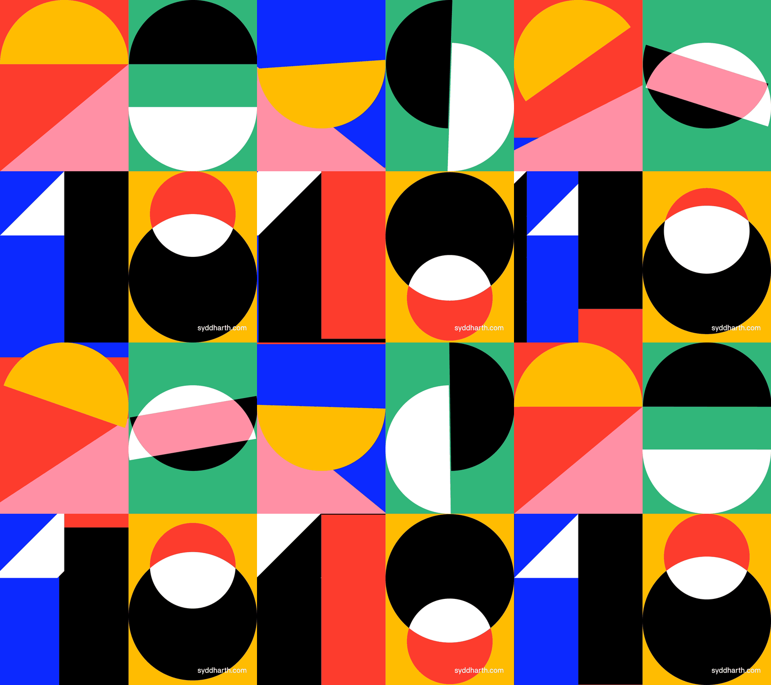
What is more, try making such animation continuous, mixing several shapes and referring to the discreet motion tweens. A beautiful example would be the kinetic poster created by Syddharth Mate. This design highlights all the beauty of the continuous animation.
2. Matching the movements
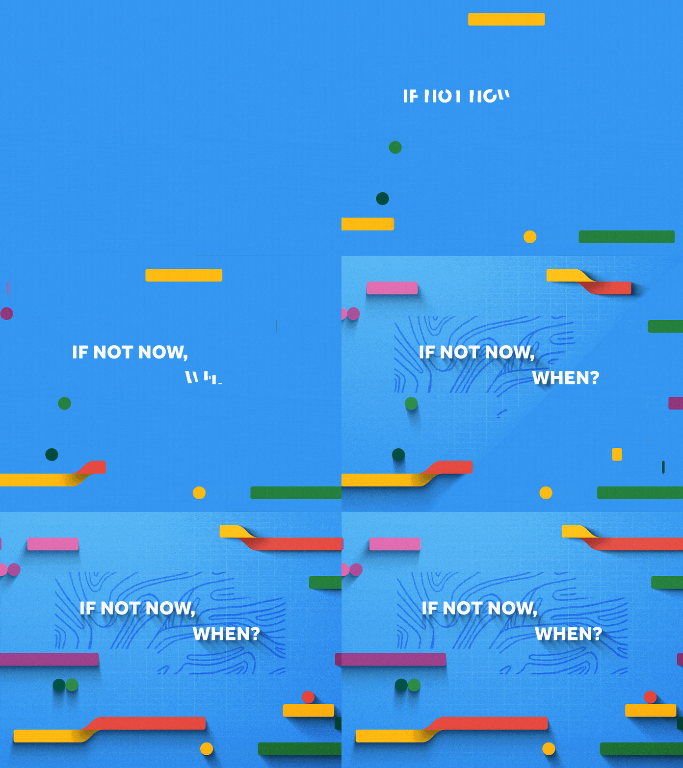
Simultaneous movements of both images and texts will make your motion design look harmonious. This creates the impression of dancing which leads to the growing anticipation of something bigger. The bright advertising project by Tomasz Czajka can serve as a great example of this motion design trend. Everything, from the colorful shapes to the doodles and words, is moving in one common direction, with one speed, and sharing the common course.
3. Liquid structures
Your brain is 80% of water. Up to 60% of a human adult body is also water. Water is everywhere. No wonder that this tendency was intercepted by the motion design as well. Liquid structures are becoming more and more popular in 2018. The inventive flows designed in Adobe After Effects allow you to capture users’ attention and mesmerize them with the brilliance of the motion effects chosen by you. Take a look at the design video created by Vladislav Solovjov. The golden waves opalesce in different shades and look as if they were videotaped and not created in graphic design editors.
4. Space in motion design
Perhaps, the unbelievable interest towards space in the motion design is connected to the recent achievement of Elon Musk who launched the car into it. Despite the initial reason, none can deny the fact that motion design and space should be kind of best friends. The reason is that planets, stars, nebulosities, and galaxies look tremendous when created in Adobe After Effects. The example provided by Davy Evans is just one of the hundreds brilliant solutions space brings to the motion design.
5. Inspired by nature
When your design is inspired by nature, it looks twice more amazing. Flowers, animals, and other natural elements look great when you add some unexpected effects to them. Look at the creative work designed by Thomas Blanchard. Here, plants get influenced by the natural elements and this strikes to the marrow. Try combining several graphic effects like ice, smoke etc. to achieve a better result.
6. Cinemagraphs as a part of your motion design
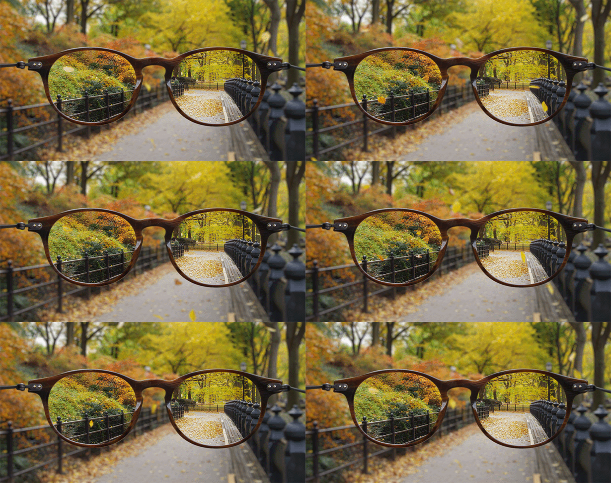
Cinemagraphs have turned into a major trend in motion design. The fuss-free animation looks great for any modern website, which is why they are more widely used than ordinary gif-images. Due to the fact that the movement on cinemagraphs is quite rare, they don’t look too intrusive and look just right among the rest of the website content. These motion images will help you to highlight the most important things your website brings but not to deflect the users’ attention.
Bottom Line
Motion design allows your customers to see behind the curtain of your business. Make sure that this business backstage will be captivating for them!


