It is not already a secret for everyone that well-designed logo has power to distinguish your brand among competitors and make it more catchy for public attention. In daily life we usually come across with thousands of different logos. Logotype is always associated with particular company, it is integral part of company’s image and brand name.
Creation of logo design is an inception of development new firm brand style. So it is hard task for designer to create logo, which doesn’t run to extremes and noways looks too fussy or too primitive.
Let me give you short overview of key tendencies in logo design which can be used by designers. The winner trend of 2014 is mobile-friendly labels. This fact pushes logo design to simplicity and airiness. The most popular themes are hand-writing, flatness, clarity, closeness to nature, symbolism… And also bees, pompons, acorns, badges and so on 🙂
I would like to remind that these trends do not bind designers to follow them blindly. It’s just a few guiding rules to be aware of in order to reach new level in logo creation. Let us look at each of them in details.
Â
2 colors, please
This year minimalistic trends continue to be in top. Bicolor logos keep viewer attention and don’t bother eyes. As good as it gets.
Design by bjbdesignergrp
Design by YAD
Design by liquid88
Â
Geometry shapes
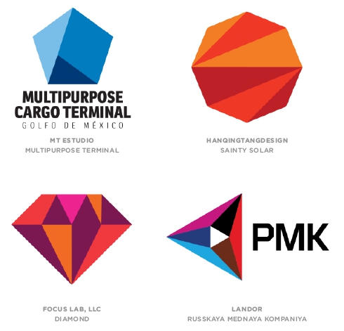
Striving for simplicity through figures is obvious. Designers still manage to create a stylish and at the same time unique artworks using symmetrical and asymmetrical shapes as well as short texts. Moreover, geometrical forms are proved to be grasped faster by human eyes and brains than other images.
Design by FEMAE
Design by tonyol2014
Design by oceandeep
Â
Mono line & hand writing
Cross-lines, crests, flags and ribbons have received completely new look due to using of mono-weight line writing. To achieve maximum contrast logos are often composed with black and white. It is commonly agreed that thin line is an attribute to both sophistication and versatility.
Design by liolp
Design by abdalla
Design by RobMcCoy33
Â
Logo in hand typing looks as 100% original masterpiece. This trend has strong background to stay in the next few years.
Design by MnS
Design by sawsan
Design by lizonil
Design by Guibasto
Flat Facets & Animals
Since an eagerness to create volume effect for the viewer left for nothingness, designers began to play fair. Facets constructed of several transparent layers tend to be one of the most popular pattern.
So do animals. Animals of different continents, geometric forms and colors are welcomed in 2014.
Design by Adair4
Design by RAMcreative
Design by shyjaldesign
Â
Letters
If you are tired of struggling with placement of long words or you don’t know how to use a hyphen, don’t worry about it anymore. Designers have found solution, which removes your stumbling-stone. Just put letters of the same case in rows of the same length. Simple things will save the world.
Design by operhal
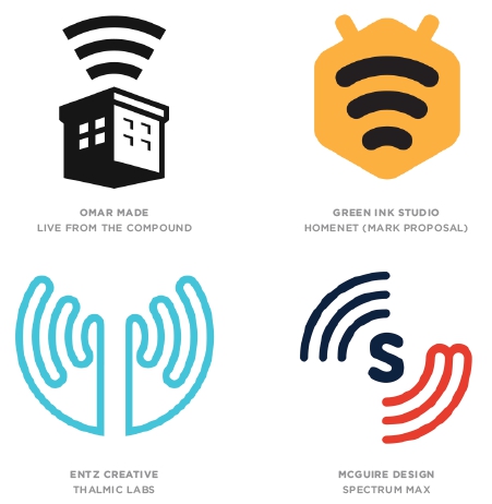
Waves
We are humans of digital age… Look at the picture below. What was your first thought? Free WiFi? 😉
3 Hooped lines don’t stand only for wireless connection. But association sent out by this image subconsciously makes viewer to think about accessibility, comfort and desire to make a contact.
Design by RarefiedAlien
Design by nvillegas
Round badges
Circle is the most important and widely spreaded geometry form. It has neither beginning nor end, as well as direction and orientation. Hence, it is often associated with both infinity and completeness. As you may see, logo badge always stays winning.
Design by trebz
Design by graphman
Design by sikdesigns
Â
We have looked through the key tendencies of logo design in 2014. Now it is your turn to make right decision. But remember: the only way to predict the future trend – is to create one! If you agree – follow DesignContest and become a founder of next logo tendency!

