When working with designers and other creative professionals – from the people who build websites to those who put together business cards – it is important to understand and be able to speak the language of type.
Typography has a set of jargon that is all its own and understanding what the terms mean can go a long way to helping you establish a good relationship with designers and better communicate what you want to see during the creative process.
Here is a glossary containing the most common words and phrases used to define and describe type.
Alignment
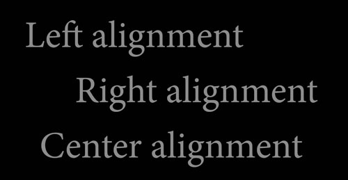
The space where text falls within the page (print of digital) margin. Text can be aligned to the left, right, center or fully justified from edge to edge in a column. Left-justified text is often called ragged right and right-justified text is often called ragged left because text aligns neatly on one side of the column and not on the other.
Ascender
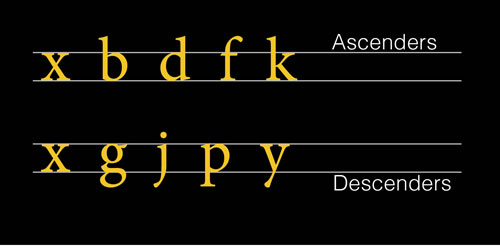
The part of a lowercase letter that rests above the x-height of a letter is called an ascender. Think of the extending strokes on letters such as b, d, f and k.
Baseline
The imaginary line that the bottoms of most letters of a typeface rest on and basis for type alignment between columns is the baseline.
Body Text (Body Copy)
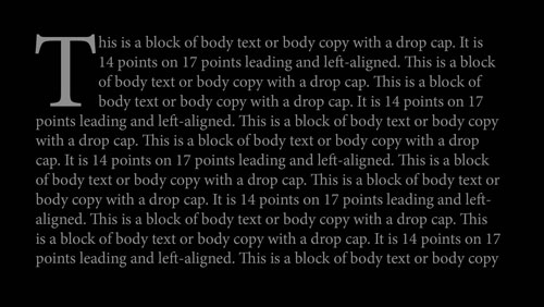
Body text, or body copy, is the text that makes up most of a document. Body text can be structured as small groups of paragraphs, long flowing text or short bits of copy. Body text needs to be set in a very readable typeface and typically is between 10 and 16 points in size depending on usage and medium.
Bold (Boldface)
Any typeface that is altered to have thicker strokes, making it heavier and darker than standard lettering is bold or boldface.
Cap Height
The distance from the baseline to the tops of uppercase letters is the cap height. In some instances it is the same height as ascenders, but this is not always the case.
Character
Any letter, number, glyph, mark or symbol included in a typeface is a character.
Condensed Type
Condensed type is narrower than the regular size of a typeface. Most condensed typefaces are noted with “condensed†or “cond†in the name. These typefaces are often used as space savers but should be avoided for body copy because they can often be difficult to read in large blocks of text.
Descender
The part of a lowercase letter that rests below the baseline is called a descender. Think of the extending strokes on letters such as g, j, p and y.
Drop Cap
The stylized letter at the start of a paragraph is called a drop cap – some also refer to it as an initial cap or big cap. The letter usually drops down into several lines of the copy.
Display Type
Typefaces that are used for headlines, big text or decorative purposes are called display typefaces. These styles are designed for use at large sizes, often 40 points or more.
Em-dash
The long dash used between thoughts in a sentence is called an em-dash. The name comes from the amount of space the dash occupies; it is equal to that of a lowercase “m†in the same typeface.
En-dash
The dash used to denote words such as to or through. The name comes from the amount of space the dash occupies; it is equal to that of a lowercase “n†in the same typeface. An en-dash is half the width of an em-dash.
Fleuron
A decorative letter, often in the shape of a leaf or flower, is called a fleuron. They are most commonly used as the start of a block of text.
Font
A set of all the characters in a typeface. While font and typeface are used interchangeably, a font is the actual thing created with a typeface – such as a certain set of letters of a certain size in a computer file or the metal pieces used to set type on paper.
Furniture
All of the text used to support the body copy is called furniture. Most of this type is set in a different size than the body text and includes things such as headlines, subheads, captions and navigational tools.
Glyph
In computer language, every character is represented by a glyph. But in terms of typography, glyphs refer to foreign characters outside the normal set of letters, numbers and punctuation.
Italic
Any typeface that is altered to have slanted strokes, making appear more script-like than standard lettering is italic.
Kerning
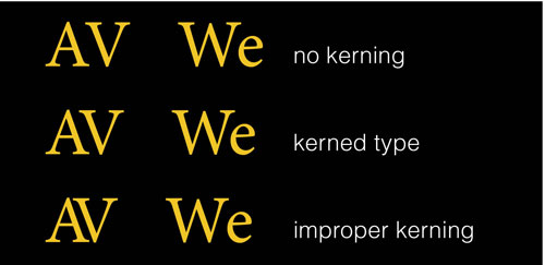
The horizontal space between a pair of letters (kerning pair) and change of that space is kerning. Pairs are kerned to add or remove space so that letters look evenly spaced despite their shapes. AV is a common kerning pair. Properly kerned type will not have large or unusual gaps between letters, with even spacing throughout.
Leading
Leading (pronounced ledding) refers to the space from baseline to baseline between lines of text. It can also be called linespacing. Standard leading specifications are typically based on the point size used to type but can be changed based on use.
Ligature
When two or more letters touch or are tied together to form a single letter, it is called a ligature. Ligatures can be created intentionally or unintentionally.
Logotype
A combination of letters or characters that are combined to create a single object, such as a logo or symbol are called logotype. They often use variants of standard typefaces or custom lettering.
Point (Point Size)
The measurement used for typography is called a point. There are roughly 72 points per inch and 12 points per pica. In reference to type size, point size is the distance from the top of the highest ascender to the bottom of the lowest descender. (Type is measured somewhat differently in Europe, where type is measured in millimeters by cap-height.)
Sans Serif
A type style without serifs, or small strokes that extend from the main strokes each letter, is considered a sans serif. Fonts of this style, such as the common Helvetica, are popular for web body text.
Script
Any typeface that is based on or made to look like handwriting is a script.
Serif
A type style with serifs, or small strokes that extend from the main strokes each letter, is considered a serif. Fonts of this style, such as the common Times New Roman, are popular for print publishing.
Stroke
The main diagonal part of a letterform is the stroke. Stroke can also refer to each line created in a letter; each stroke theoretically represents each line a pen would draw on paper to create the letter.
Tail
Any decorate stroke that falls below the baseline is a tail. Tails can be found on both upper- and lowercase letters.
Tracking
Tracking is the spacing between characters in a text block. Unlike kerning, it refers to the entirety of paragraphs.
Typeface
All of the letters, numbers, symbols, punctuation and glyphs that make up one type design. Typefaces typically have names and multiple typefaces with the same name and slight alterations to the overall design are a type family. All of the typefaces in a type family are intended to be used together and are often sold in packages that contain multiple typefaces.
Weight
The thickness and “darkness†of a typeface refers to its weight. Typefaces are also named by the depth and design of these strokes using terms such as thin, light, bold and black.
X-height
The x-height is the height of a lowercase x in a type family. Most lowercase letters in a typeface (minus ascenders and descenders) are equal to the x-height. There is not a set x-height size and it can vary by typeface. Fonts with larger x-heights appear larger than those with smaller x-heights.


