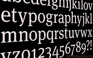
 As a designer, you aren’t just working with graphics, day in day out. As much as you may love illustration, sooner or later you’re going to have to bite the bullet and get your hands dirty with a bit typography. The mark of a truly successful graphic designer is excellent typography choice, and the decisions you make with your projects’ copy says a lot about you knowledge of the field.
With that in mind, don’t be afraid if you’re just starting out. Learning about typography doesn’t have to be a painful procedure. In fact, it’s often times easier than you might think. With that in mind, take a gander at our short introduction below to common typesetting terms, as well as what they mean for your font choices.
Structure of Type: When talking about typography, it’s important to understand that letters themselves come with a whole new retinue of terminology. Each individual unit is constructed of many different parts. The difference between these parts determines what family the font belongs to, as well as what kind of type it is. For example, when talking about typography, you’ll often here designers reference “serif†versus “sans serif.â€
Serif versus Sans Serif: A serif is essentially a small structural difference between the way various letters are constructed. These differences come in the form of small tips at the end of a letter’s stroke. For example, the GAP uses a serifed font in its logo, where as the modern Walmart logo does not. Serif is often considered easier to read, as it guides the eye, but a sans serif font is considered equally as business-minded, and much cleaner. When choosing a typeset for your designs, choosing between serif or sans serif is one of the first things you’ll want to consider.
When designers talk about typography, they also like to talk a lot about kerning. as a concept, kerning is a lot simpler to understand: It’s simply the amount of space between each letter with a word. This is important, because putting your letters too close together may make your copy hard to read. Likewise, putting them too far apart is equally as unpleasant on the eyes. Similarly, the column width of your copy is the space between lines, as well as the length of each entry. The ideal column width is 12 words per line, with space of two points higher than your font size between lines.


![RGB vs CMYK [Infographics]](https://dc-prod-blog.sfo2.digitaloceanspaces.com/uploads/2015/10/featuredimage.jpg)
