Web design influences the visual part of our perception; therefore it is rarely thought that design can impact other 5 senses. Surprisingly, it can, and the closest connection appears to be in terms of music.
Who runs the world? – Websites
Web design starts with your website. The most creative websites belong to music bands that compete with each other for their fans’ attention. Performing great music and amusing concerts may not be enough in the era of advertising that runs people’s lives. In this case, website design does its encore and is much more efficient than one could ever imagine.
Red Hot Chili Peppers
This band was a real sensation when it appeared on stage for the first time. Its website is not less splashy. The beehive you see when you open their webpage for the first time makes you even cringe from the screen. It’s hard to surprise people with the website animation but those fussy bees mesmerize you indeed. The one bee running all over the page looks so real your eyes unconsciously keep following it. Everything, from a hamburger menu in a shape of a bee’s cell to the impression of the shaking screen, created with the help of this dazzling animation, makes you spend most of your time on the page, just out of curiosity. Â
Linkin Park
The website faces all the requirements that modern web design sets. What’s more, it satisfies them completely. Its video background, playing one of the most famous band’s songs, the layout, its logo along with hamburger menu, calm and hypnotizing shades and many other tiny elements complete the beauty and freshness of this entire picture.
Highway to a package design
CDs, T-shirts, flyers and posters – every single item helps the bands spread their identity and become more and more recognized.
CDs
It’s Time is one of the recent examples of CD covers, released by DesignContest. Its design is reflected with the help of yin-yang, being rather symbolical: it stands for balance and equity, sealing the beauty inside. If people haven’t heard the band but happen to come to a music store (real or online), they are most likely to be lured by a beautiful packaging, in terms of music – a catchy CD.
T-shirts
T-shirts can be your free advertisements if you succeed in making their design worth admiring. Getting distinguished by wearing cool things is no longer a trend: it’s a lifestyle. That’s why you’ll hardly find a person who can refuse from a stylish T-shirt design. Everyone wears ACDC and Nirvana but only those who managed to find the one and only thing can be called truly lucky. That’s why, designing a T-shirt, try to think out of limits: making it stylish is not so difficult; a question is how to make it unique.
Posters
Posters are probably most crucial to design, as far as they need to attract people to the event you throw. Which is why even a single mistake in a poster design can ruin the day. We asked Selma Operhal, one of the most talented and active designers on DesignContest who has created dozens of original and inspiring posters, about the most common mistakes one can face in a poster design and how they can be avoided.
“The most common mistake in is using low res photos. Most of the time, clients don’t understand the importance of providing quality images (if they want to have an actual photo on a poster). But of course, poster design can be beautifully done with illustrations or just with typography. That depends on the designer’s idea and the client’s vision. The second most common mistake is preparation for printing.  I have noticed that designers don’t use bleed and crop marks and when a poster is printed you can see that there is not enough space and often the important text is not readable. Any professional designer knows this, so this advice is for newbies.”
We will, we will… play it hard
One of the most prominent trends in web design is a video background, mostly with music. Some say that music is not the best option for your landing page. It’s true, in case you choose a totally wrong accompaniment. Don’t make it too loud and try to fit it into the concept of the company a music is chosen for and you’ll hit the target. By means of music, you influence people three times more: a beautiful design in front of them impacts their visual perception; a suitable music facilitates the process of implementing their imagination; video shows them a vivid example of what the company is capable of.
Coz the logo’s way too damn good
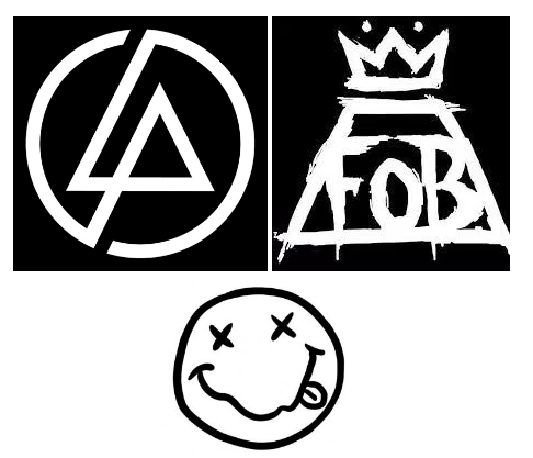
Every music band has its logo. Some of them are great, others are much better. The truth is that a creative logo can become viral: sometimes a single symbol can introduce the band better than any words.


