We’ve recently had the pleasure of reviewing the current trends for website design with our DesignContest team. Enjoy scrolling through, we hope you get inspired. There are dozens of articles on a similar topic and to be honest they’re all unecessarily boring.
Without further ado, here are DesignContest’s super fun web design trends for 2015.
1. Tell-a-Story Design
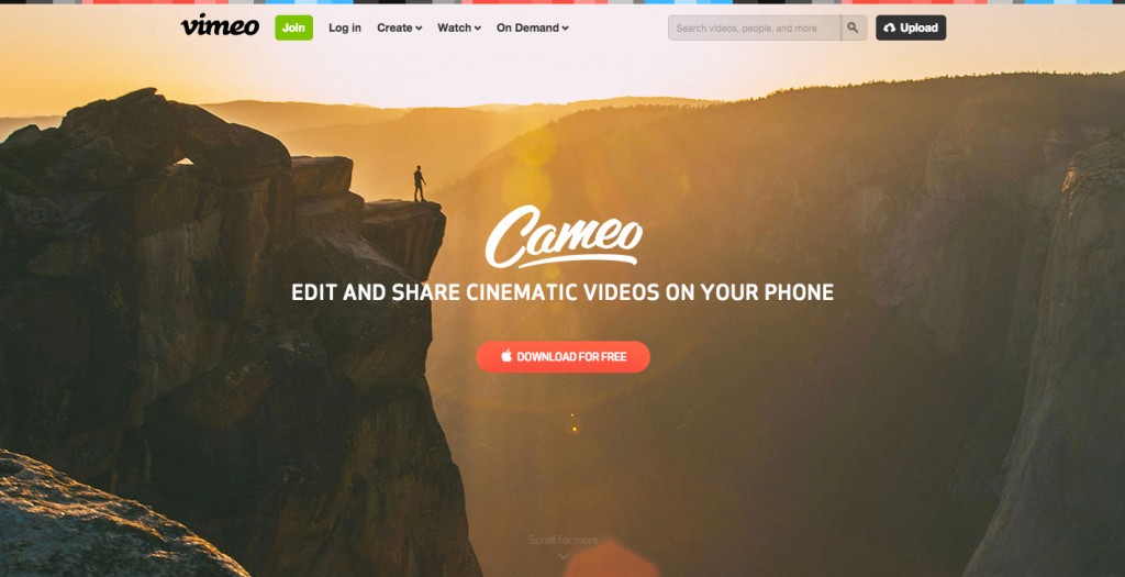
Visuals are key. A website design pleasurable to the eye consists of a. a great image and b. good copywriting. There is no need to hire expensive designers to come up with a killer design so complicated that it baffles your viewers. Choose wisely. Choose an image that will resonate with your audience. An image can be really simple, but it will speak volumes if you have a true artist in you.
So here is your equation.
Powerful image + Effective copywriting = Memorable website design.
You might as well stop reading here because it is all you need to acquire an audience, but we know you can’t resist.
2. Engaging Design
Or engaging multimedia design.
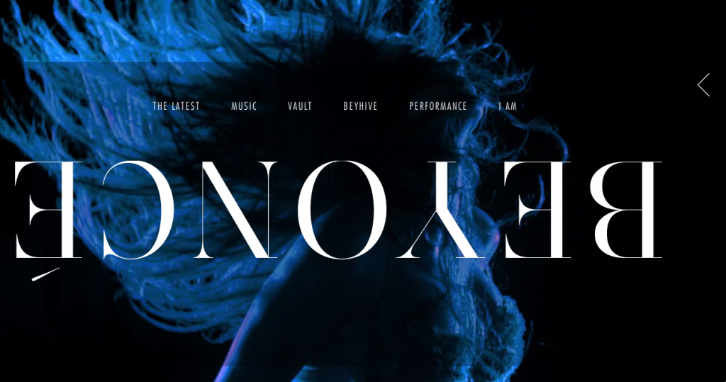
It is all about our interaction with technology. Don’t you love a good webpage that allows you to explore it’s multiple layers of information through fun gadgets? It’s all about the user experience. A concept we, at DesignContest, have mastered. It’s also hard to resist featuring Queen B.
3. The Navigate-Yourself Webpage
Commonly known as the Paraxall scrolling. We all know that feeling, the thrill of scrolling through interactive pages without having to wait for the next webpage to buffer. A continuous, flowing design arises enthusiasm even in the darkest of days. We hope you agree. The interactive scrolling
Here is an example:
4. Animation Design
This is very 2010. Sorry guys, #4 isn’t even a trend anymore but we wanted to inlude it because it’s going to be around for a long time.
5. Dead-pan or ‘Flat’ Design
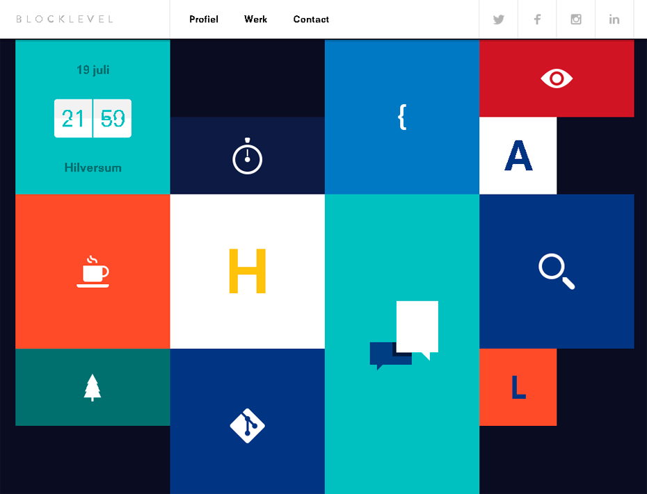
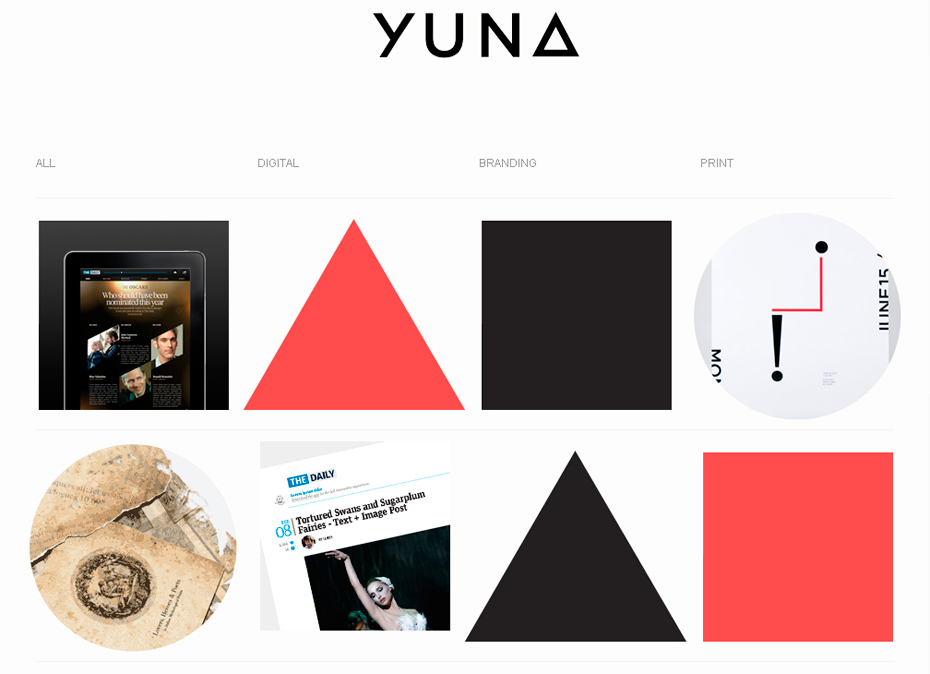
It is unfortunate one should call artwork flat. A more accurate description of this web design trend is solid colors, or dead-pan style design. It is about keeping it simple and edgy, to prove a point. It applies to a certain type of context where information is key. You don’t want to be distracted by awe-inspiring images. A simple, and clean design is the way to go, see example below.
6. Curvy Design
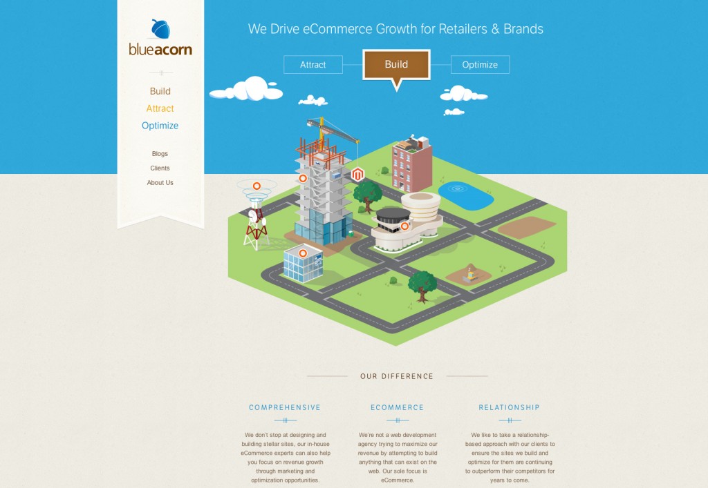
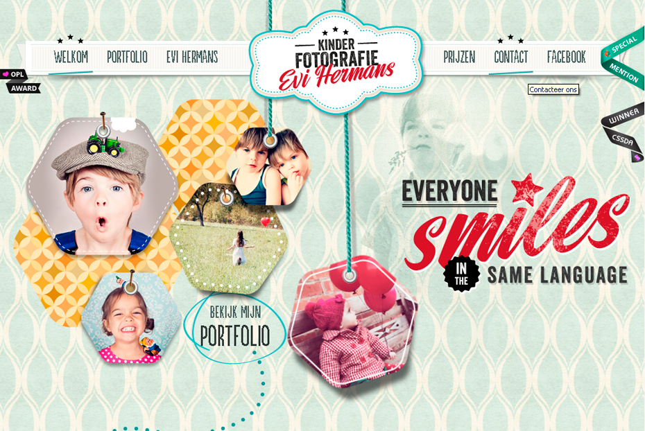
We all appreciate good symmetry, proportional geometric design with edges. But who can resist the curves? Here is what we mean:
7. Design with Tiles
This is not a trend either. It is called – design with rectangles.
8. Navigation Widgets
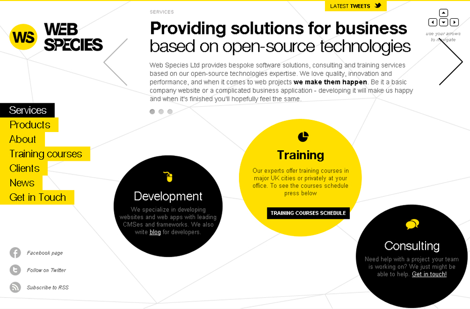
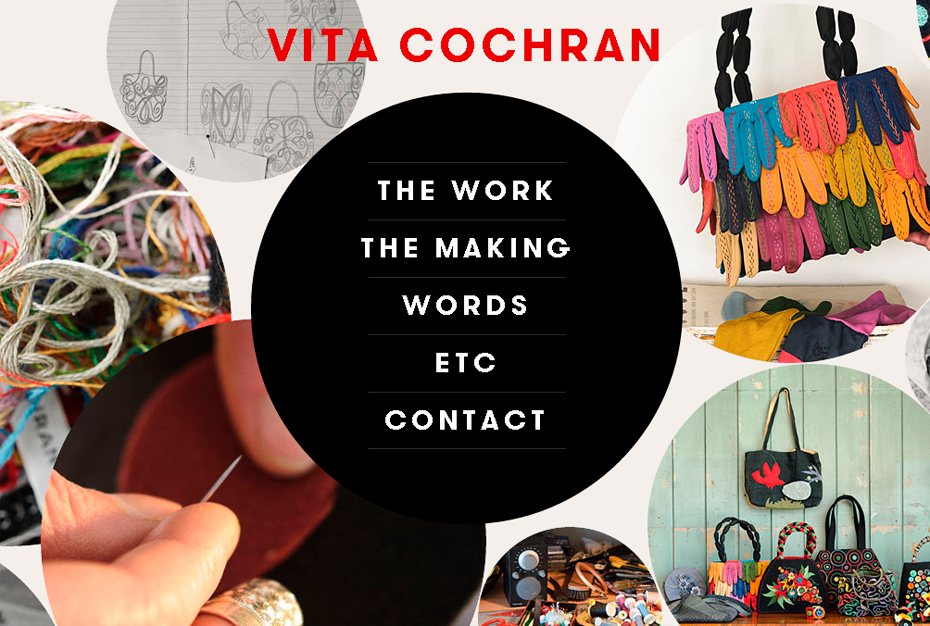
Explore the multilayered websites! A fresh approach to navigating around websites packed with information. 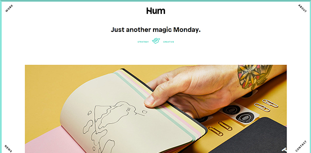
9. Multi-layered Design
Functionality is a must. Only the most talented of designers manage to pack information, in this way, on a single webpage.Â
10. Minimalistic
Minimalism never goes out of style. The world implies little, but delivers a great deal more. There is something very elegant and satisfying about a design that can get it’s point across with just a few tricks up their sleeve.
11. Illustrations
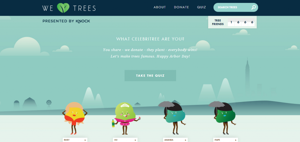
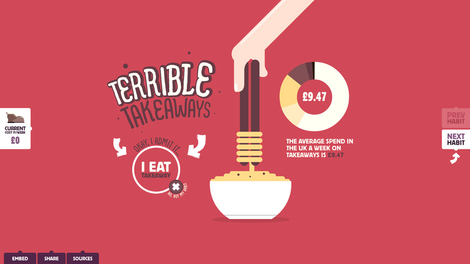
A very feature within webpage design. Not new, by far, but very trendy. Quirky web pages that include drawings as if done by hand. The doodles are always a fun way to grab your attention!
Some says there are 13 trends, and we disagree. Here is what we have to say.
This year is going to be all about the aesthetics. Although we may or may not see these exact trends being implemented in the near future, it is not a must-follow. Stay creative and open to new ideas, keep your eyes open to new possibilities. We will continue to lead with our innovations and inspirations. It is about thinking outside the box, beyond doing thorough research. Rest assured, DesignContest will be staying ahead of the game.

