We always keep an eye on different websites to see how they cope with holidays. Customers are looking for special offers therefore the companies should be ready to stand out with their proposals. Among various methods to grab clients’ attention with your offer,  landing page is the strongest tool. Created to complete economic goals landing page can combine both business and entertainment components. Benefits from the landing page with great design, clear idea and attractive offer are undeniable.
Today we are going to point out main features, goals, methods and ideas that might help you with creating a great Valentine’s Day landing page.
St. Valentine’s Day is a great occasion to build positive communication with your customers showing them your loyalty and your wish to create special terms and conditions for them. We have checked many landing pages and articles and are happy to share the results with you.
Less is more
There should be no unnecessary images, links and navigation on your Valentine’s landing page. Remove everything that might draw your customers away from your offer. Nevertheless, there should be enough text to deliver the main idea to your visitors. They have to realize their advantages before scrolling down.
Ideas for your landing
Your landing page content will depend on the goals you want to achieve. What do you want to get as a result? More conversions? Good PR occasion? Positive communication with your clients?
Gift card. This option can stimulate your clients to make more orders. Note that your gift should be really useful or helpful, think what your customers might need.
Discount offer. Your landing page can be used for proposing special discounts and offers to your customers. This option can bring you new clients and make your current clients loyal as well.
Contest or quiz. This option is now directly connected with conversions. It is rather a creative tool for PR aimed to entertain and build good relations with your customers.
Become St. Valentine. Sometimes the whole process of getting a present can be messy. So make it easy and let you customers know that it is not a headache anymore. Offer your clients a simple way to congratulate their beloved. Think of unique goods, amazing packaging or fast delivery.
One page – one offer – one goal
Don’t forget about simple success formula. There is absolutely no need to make a dump on your landing page posting there ALL your offers and ideas.
Drive traffic to your landing page
Let more people know about your activity on Valentine’s Day. Most popular ways to do that are:
– attractive advertisement or creative posts on your company social pages;
– remarketing banners;
– e-mail marketing.
Common mistakes
ClickThroo has an exceptional experience of checking landing pages dedicated to Valentine’s Day Promotions for typical mistakes. Here are some brilliant examples you can learn from.
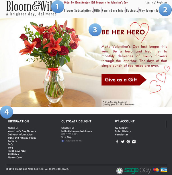
Example #1
1. Time limits should be more notable
2. Links that are conversion killers
3. Incomplete headline
4. More conversion killers
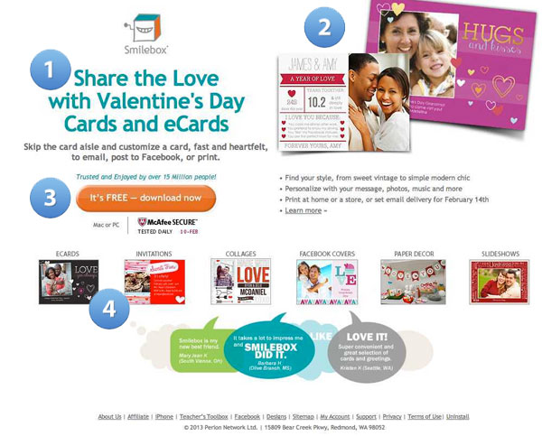
Example #2
1. Well, this is straight to the point 🙂
2. Image is uneven
3. CTA button should stand out!
4. Unnecessary images
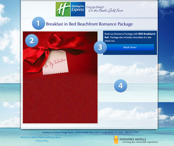
Example #3
1. Boring headline
2. Boring image
3. CTA button should stand out!
4. Waste of space
Keep mobile in mind
Don’t forget that people can use different gadgets to look through your page. Mobile version of your landing page should also look great.
Now when you know all secrets of the efficient Valentine’s Day landing page we hope you will get a great result. And if you feel you need such a page to be designed for you we can help you for sure. You can start a landing page design contest and dozens of designers will compete for you.
![What Is Essential In Valentine’s Day Landing Page [Infographics]?](https://dc-prod-blog.sfo2.digitaloceanspaces.com/uploads/2016/01/valentines-day-landing-pages-featured.jpg)
