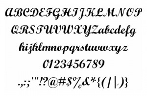
 If there’s any adage more popular than “The client isn’t always right, but their money is,†we have a feeling it’s: “Don’t use script fonts.†And typically, this pithy piece of advice is rather informative. It’s true, after all, that no matter how you slice it, script fonts are simply hard to work into a piece. However, that doesn’t mean that including a nice, hand-drawn lettering typeset to a design is never warranted. In fact, with the proper knowledge and a little bit of tasteful execution, a script font may be exactly what your project was lacking. To help you along, we’ve compiled this short guide to help you know when a script font is appropriate, as well as how to actually use it once in place.
- Keep it Short: First and foremost, the use of script fonts is typically very narrow in spread. What we mean is, there are very few places where these typesets come across as professional, and a key part of this is copy length. Never use a script font for more than a few lines, or even just a few words. Putting your clients product information in a fancy cursive script will do no good at all, as these font families are extremely difficult to read over time, especially when crammed together with several lines of copy.
- Reduce the Load: Another thing to be considered is the number of script fonts you’ll actually be using. Though we’re giving you license to try one of these fonts in your project, we do believe very fervently in never using more than one script font. Mixed typography works well in some cases, such as slab serif styles, or other letterhead families. However, there’s almost never a good way to make multiple script fonts jive together, and more often than not, you’ll just be creating an ungodly mess by adding too many.
- Add Some Extra Breathing Room: Lastly, when including a script font in your design, be sure to include more space than you think you need. Increase the leading between lines, as well as the kerning wherever possible. Because of their cursive appeal, script fonts are typically much harder to read than other trees, requiring much more space than is typically needed. Don’t think about this too much: When in doubt, take a step back and ask yourself, “Can I read this?â€


