Jump to content

  • Free consultations and support
  • Live chatClick Here for Live Chat
  • Call ico 1888-906-1888
    Phone support: Open

    Ready for your call :)

    Our business hours:

    Mon — Fri, 2am — 8pm (EST)

    US & EU support teams

    Phone support: Closed

    We are back in: 1h 20m

    Our business hours:

    Mon — Fri, 2am — 8pm (EST)

    US & EU support teams


Wacom Logo RE-redesign. Deadline January 1, 2008


  • This topic is locked This topic is locked
&nsbp;

#61 rankovich

rankovich

    Apprentice Designer

  • Designer
  • 4 posts

Posted 22 December 2007 - 10:39 AM

I just had a thought... you should try making the straight lines or the 'C' more rounded and ending closer to each other. If that makes any sense w/out me sketching it.

#62 Chung Dha

Chung Dha

    Guru

  • Designer
  • 1439 posts

Posted 22 December 2007 - 12:19 PM

It is a cool concept but proper for people not knowing the brand they can't reed it. Readability is a big issue making the logo work. What I see is Wa=Dm.

#63 Chung Dha

Chung Dha

    Guru

  • Designer
  • 1439 posts

Posted 22 December 2007 - 05:00 PM

My entry cause I use a tablet pc I get this view in my head and see it on the screen too. The arrow always under the pen, and the pen is the arrow. So the shadow of the pens is the arrow.

#64 zooley

zooley

    Senior Member

  • Designer
  • 117 posts

Posted 22 December 2007 - 07:35 PM

Looking back for feedbacks on my entry so i can improve it.

#65 aurellius

aurellius

    Elite Designer

  • Designer
  • 51 posts

Posted 22 December 2007 - 07:59 PM

It is a cool concept but proper for people not knowing the brand they can't reed it. Readability is a big issue making the logo work. What I see is Wa=Dm.


"C" is a hard one to do an amalgram of itself. More so than an equal sign, I was thinking of ways to represent the sound itself in other languages which is where I decided to use that. It's more a representation of the japanese sound for "ko" which takes on the symbol "こ". I'll think of some more ideas and see if I can get that readability level up for ya. ;)

#66 Chung Dha

Chung Dha

    Guru

  • Designer
  • 1439 posts

Posted 22 December 2007 - 08:06 PM

Stroking or outlining text is a big no no unless you make the stroke very big,because when you scale the size smaller the outline could disappear. The pen and brush look odd, the brush is sheered a bit and the brush shape need to look at what people generally does illustrating a brush head.

#67 psy lollipop

psy lollipop

    Apprentice Designer

  • Designer
  • 3 posts

Posted 22 December 2007 - 10:29 PM

well,... this is how my contribution looks like

I thought I leave them their pink if they like it that much.
by the way - this is my first trial on logo design so give me lots of feedback please!

thx
Psychedelic Lollipop

#68 Chung Dha

Chung Dha

    Guru

  • Designer
  • 1439 posts

Posted 22 December 2007 - 10:47 PM

It is actually a bit reddish magenta.
C0M100Y43K19
Pantone 207

Not a bad logo but still need to have the name added. Maybe some playing around more with the colors. The pink and beige isn't much of a good combination.

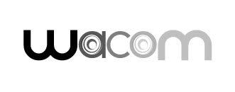
Revised my first design the font want really that good. The W and the A in it were not that good aligned with each other. Now choose a font that bit close to the new logo made by Wolf Olins. And the colors were bit dark and kind of negative. Now it is brighter in a light gray and small detail the ® added.

#69 iTwin

iTwin

    Apprentice Designer

  • Designer
  • 25 posts

Posted 23 December 2007 - 12:14 AM

i like the lighter version of this better - and definitely a good choice changing the fonts, its a smoother looking logo now.

#70 punkerella

punkerella

    Apprentice Designer

  • Designer
  • 43 posts

Posted 23 December 2007 - 02:37 AM

Color:
Posted Image
Black and White:
Posted Image

Comments and critiques welcomed.

#71 hackdesign

hackdesign

    Apprentice Designer

  • Designer
  • 95 posts

Posted 23 December 2007 - 05:08 AM

I am impressed with a lot of these logos, more so than any contest I have seen. Too bad it isn't for big money, or being used for real. I went to wacom's website, that logo bounces all over the screen. It is terrible in my opinion, what were they thinking? Great contest. It would be great if wacom's people got to look at all of these logos. They won't keep that new one forever, why would they?

#72 iTwin

iTwin

    Apprentice Designer

  • Designer
  • 25 posts

Posted 23 December 2007 - 05:49 AM

at first I didn't know that the thing bouncing around was their "logo" until browsing the site some more. I thought it was going to have some spotlights coming out of it or something.

#73 ~V~

~V~

    Apprentice Designer

  • Designer
  • 96 posts

Posted 23 December 2007 - 06:33 AM

...I went to wacom's website, that logo bounces all over the screen. It is terrible in my opinion, what were they thinking? Great contest. It would be great if wacom's people got to look at all of these logos. They won't keep that new one forever, why would they?


Their logo bouncing around on their website reminded me of one of those really old school screensavers, the colors and the movement are so similar.

Wacom probably paid a lot for the redesign, so it'll stick around for awhile.
"Why?"
-------------------------
http://vdesigns.livejournal.com/

#74

  • Guests

Posted 23 December 2007 - 10:28 AM

zooley, the perspective is a bit weird. And the gray gradient + outlines are not very strong points too. Well, the only thing I can say is that this requires more work...

aurellius, though we don't see it if we don't think about it, but I think the hidden "ko" is a good idea. But I agree that "C" is very hard to make an ambigram of. However, try to play some more with the concept, maybe you will come up with ways to make the "C" more readable.

#75 ~V~

~V~

    Apprentice Designer

  • Designer
  • 96 posts

Posted 23 December 2007 - 11:35 AM

@ aurellius, I think the idea of using the japanese characters is interesting as well. However, I think you have to make it more recognizable as the character こ. At the moment it looks a more like kana character ni, ニ .
"Why?"
-------------------------
http://vdesigns.livejournal.com/

#76 hackdesign

hackdesign

    Apprentice Designer

  • Designer
  • 95 posts

Posted 23 December 2007 - 03:53 PM

I love that logo aurellius
could be an equal sign
or the chinese for 2, er =
but it's not
obvious what it is
once you know what it is
a logo that questions things are good
obvious logos not as fun
if that makes sense


@ aurellius, I think the idea of using the japanese characters is interesting as well. However, I think you have to make it more recognizable as the character こ. At the moment it looks a more like kana character ni, ニ .


#77 hackdesign

hackdesign

    Apprentice Designer

  • Designer
  • 95 posts

Posted 23 December 2007 - 06:01 PM

my idea, is rough vs. refine
like when you draw on the Wacom pad
it looks like the word Wacom in the logo
when you clean it up it looks like the shadow
there are other ways to do this idea
this is one

#78 Chung Dha

Chung Dha

    Guru

  • Designer
  • 1439 posts

Posted 23 December 2007 - 06:22 PM

I am not sure if it is intentional to make the W standalone but it make people to read W Acom. Making the W standalone in the name it self isn't that good idea, it is better to make a logo of the W next to the name like M of mcdonald. Only few it works but not all, mostly depends on readability of the logo.

It is funny idea but don't think it help making the reflection to be straight and the normal be rough drawn helps. And the rough font is bit childish looking font or company. I think Wacom should be less on textual only but more on graphical need a graphic element in the form of a illustration.

And Anyone got comment on my design? I keep commenting other though what could be improved.

#79 White_tiher

White_tiher

    Apprentice Designer

  • Designer
  • 6 posts

Posted 23 December 2007 - 07:08 PM

Sorry if it doesnt live up to wat is called a logo
but since i a 3d and vfx artist its difficult for me to thing logish if that makes any sense
anyways
here it is
the first attemp
Wasif Hyder
AKA
White Tiger
Spelling mistake in username

#80 punkerella

punkerella

    Apprentice Designer

  • Designer
  • 43 posts

Posted 23 December 2007 - 07:39 PM

It is actually a bit reddish magenta.
C0M100Y43K19
Pantone 207

Not a bad logo but still need to have the name added. Maybe some playing around more with the colors. The pink and beige isn't much of a good combination.

Revised my first design the font want really that good. The W and the A in it were not that good aligned with each other. Now choose a font that bit close to the new logo made by Wolf Olins. And the colors were bit dark and kind of negative. Now it is brighter in a light gray and small detail the ® added.


I like your logo, but I think just like my logo it misses some ZING. I just cant place it.. My favorite part is where the cursor arrow is below the pen mirror style. I dig that alot. Maybe a bolder type color?


1 user(s) are reading this topic

0 members, 1 guests, 0 anonymous users