Jump to content

  • Free consultations and support
  • Live chatClick Here for Live Chat
  • Call ico 1888-906-1888
    Phone support: Open

    Ready for your call :)

    Our business hours:

    Mon — Fri, 2am — 8pm (EST)

    US & EU support teams

    Phone support: Closed

    We are back in: 1h 20m

    Our business hours:

    Mon — Fri, 2am — 8pm (EST)

    US & EU support teams


Wacom Logo RE-redesign. Deadline January 1, 2008


  • This topic is locked This topic is locked
&nsbp;

#101 Chung Dha

Chung Dha

    Guru

  • Designer
  • 1439 posts

Posted 26 December 2007 - 12:48 AM

both because you can not use photoshop filters or effects to design a logo. Because they are bitmap based and not vectors. Logo need to be resizeable without loosing details or getting pixelated. Vectors can be resized without loosing details.

2nd design i can see several layers effect, bevel/embossing , glowing edge, drop down shadow.

If you want to make a logo you need to learn a vector based program like Illustrator.

#102 ePAD Studio

ePAD Studio

    Apprentice Designer

  • Designer
  • 2 posts

Posted 26 December 2007 - 02:43 AM

No one ever commented on my designs?

Everything for Your Design Needs! Design Bounty Hunter! Unconventional!

http://epadstudio.com
http://joinmichigan.com/epadstudio


#103 SteveOrM3L

SteveOrM3L

    Senior Member

  • Designer
  • 119 posts

Posted 26 December 2007 - 04:34 AM

i spent a half hour the other day trying to find the cartoon character that looks like the new wacom logo, i couldn't find it. i thought it was in Labrynth, but didnt see it, maybe it is from fraggle rock or seasme street. It is a red fuzzy thing with horns for ears. Anyone know?


http://www.youtube.c...feature=related

Check that for them, i can only find the plush dolls for a image.
Part of Design Team Since January 21, 2008 :cool:

#104 _Redrum

_Redrum

    Retired Admin

  • Designer
  • 1957 posts

Posted 26 December 2007 - 06:16 AM

Inspiration:

Wa - Japanese word for "harmony".

Com - Computer.

#105 zooley

zooley

    Senior Member

  • Designer
  • 117 posts

Posted 26 December 2007 - 06:51 AM

Here is the 2nd revision. Thanx again for the feedback.

#106 Chung Dha

Chung Dha

    Guru

  • Designer
  • 1439 posts

Posted 26 December 2007 - 10:37 AM

@ ePad Studio - The illustrations are too much in design #1. 2nd design and 3rd are more about a robot where you draw things on the belly. Both that got nothing to do with Wacom. The man, pen and talblet looks too much like icons/clip art. Also the font could be improve with a much more straight and smooth font like the original wacom design and also more color could be used.

@ steve - Posted Image
The dancing IZ toy think resembles it allot.

or this bouncy toy for dogs.
Posted Image

#107 dinu25

dinu25

    Junior Member

  • Designer
  • 2 posts

Posted 26 December 2007 - 01:43 PM

Thanks for the feedback..
As suggested by Chung Dha, I have removed the photoshop effects and introduced a designer font to give it a more designer kind of look...
I was not sure whether to use a thick pen line or a thin one or not use it at all...so I am attaching all attempts here..plz do give feedback which one is better..

Please keep attachments from stretching the forum layout. Resized by _Redrum.

#108 iTwin

iTwin

    Apprentice Designer

  • Designer
  • 25 posts

Posted 27 December 2007 - 04:29 AM

2nd entry
went with a more earthy look to it -
feedback would be much appreciated

#109 andrendhiq

andrendhiq

    Apprentice Designer

  • Designer
  • 28 posts

Posted 27 December 2007 - 07:25 AM

here, my attempt.I think wacom don't need symbol as logo. i try here to design only with logotype in custom typeface, with 2 solid color,easy to applied. Easy to identified in dark and small area.in "O" letter i customize so it feel "digitized", also if you see more clearly, there is "cross mark" in white area, as a cross in coordinat.Feedback appreciated.thanks

#110 andrendhiq

andrendhiq

    Apprentice Designer

  • Designer
  • 28 posts

Posted 27 December 2007 - 09:22 AM

my 2nd attemp.:)

#111 Chung Dha

Chung Dha

    Guru

  • Designer
  • 1439 posts

Posted 27 December 2007 - 05:53 PM

@ Itwin - your logo looks too much like a supermarkt logo but inverted shapes.
Posted Image

@andrendhiq - is not but I think more graphics logo should fit more with Wacom not only textual. Both don't really have a element that got to do with tablets. 1rst design I see a + inside the red thingy that could cause a problem or more fitter with a health company.

@dinu25 - There is not such things as designer font. And the new font is not that real great. If you look everything is not on the same line and your still using photoshop while you should be working with illustrator or an other vector based program. The colors should be more bright and green is not a great color to represent designers. Green is more health , advocate more serious business.

#112 iTwin

iTwin

    Apprentice Designer

  • Designer
  • 25 posts

Posted 27 December 2007 - 09:32 PM

hah - never heard of a Plus supermarket. Guess i'll come up with new design. ( maybe they'll like the inverted symbols)

#113 punkerella

punkerella

    Apprentice Designer

  • Designer
  • 43 posts

Posted 28 December 2007 - 12:12 AM

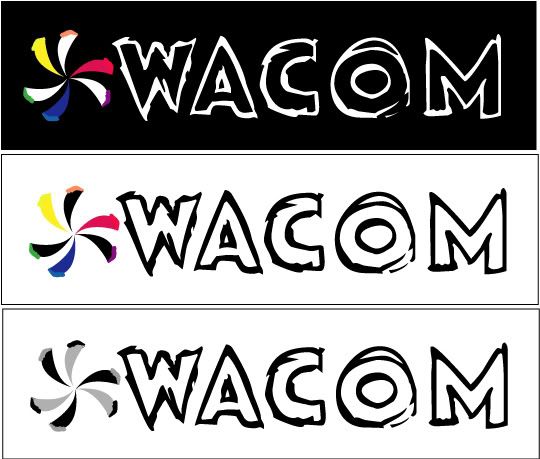
Here is my second attempt at this wacom contest.
I decided to do examples of possible variations of the logo.
each box is a different version of the same logo.
one on black. one in color regular, as I intended in the first place, and the other a black and white and gray version.
Posted Image

Feedback and critiques welcomed....


#114 jarguez82

jarguez82

    Apprentice Designer

  • Designer
  • 24 posts

Posted 28 December 2007 - 12:22 AM

2nd entry
went with a more earthy look to it -
feedback would be much appreciated


Hi iTwin,

I dig this alot, my only criticism would be that logo looks like a flower and doesn't relate to the product. If only wacom was a online florist!

I would toy with it a bit, try different orientation of the shapes, appropriate some of the ideas you've seen posted thus far.

#115 punkerella

punkerella

    Apprentice Designer

  • Designer
  • 43 posts

Posted 28 December 2007 - 12:51 AM

This is my first ever design contest entry and post. I hope you like my designs. Any color can be added to the design and text can be changed.
Design 1
Posted Image

Design 2
Posted Image

Design 3
http://pics.epadstud...acom-Logo-2.png


I think your designs are a little bulky.
I like the robot one but I don't see it being practical.
Maybe simplify?
but then.. maybe you should just try a whole new approach.

#116 iTwin

iTwin

    Apprentice Designer

  • Designer
  • 25 posts

Posted 28 December 2007 - 06:31 AM

thank you for the suggestion -
revised it a little bit.

#117 Chung Dha

Chung Dha

    Guru

  • Designer
  • 1439 posts

Posted 28 December 2007 - 09:51 AM

@Itwin- you should look at other colors. Because the tablets are mostly used by designers and should be more bright. And step away from making flowers and think more about designers,art,tablets or tablet pens.

#118 iTwin

iTwin

    Apprentice Designer

  • Designer
  • 25 posts

Posted 28 December 2007 - 03:41 PM

i feel like using the tablet or a pen in the logo would be over using it when applying that logo on the tablet, or pen

#119 Chung Dha

Chung Dha

    Guru

  • Designer
  • 1439 posts

Posted 28 December 2007 - 04:42 PM

There are plenty ways to show tablets or something to do with design without actually showing it. But also avoid things that got totally nothing to do with the company. You should search things for inspirations. Go thru flickr and watch photo for inspirations.

#120 mroedel82

mroedel82

    Apprentice Designer

  • Designer
  • 7 posts

Posted 28 December 2007 - 07:32 PM

Thanks for the opportunity to enter. Great contest and several awesome ideas!


1 user(s) are reading this topic

0 members, 1 guests, 0 anonymous users