Jump to content

  • Free consultations and support
  • Live chatClick Here for Live Chat
  • Call ico 1888-906-1888
    Phone support: Open

    Ready for your call :)

    Our business hours:

    Mon — Fri, 2am — 8pm (EST)

    US & EU support teams

    Phone support: Closed

    We are back in: 1h 20m

    Our business hours:

    Mon — Fri, 2am — 8pm (EST)

    US & EU support teams


Wacom Logo RE-redesign. Deadline January 1, 2008


  • This topic is locked This topic is locked
&nsbp;

#141 Chung Dha

Chung Dha

    Guru

  • Designer
  • 1439 posts

Posted 31 December 2007 - 12:15 PM

Samisad0rk- I see the WM combination but notsure why used the M because the initials of wacom is only the W. Also not sure what the meaning about the geometric shapes.

Donskut - both your entries looks too much like the previous entered logo by Phy loppyipop and beanhead logos. You should always read and watch all post to see what is already submitted to avoid plagiarisms.

ADD - I can see you want a bit techy font face , but I think Wacom want a illustration logo instead of text only. Because they went from text only logo to a illustrated logo.

#142 piast

piast

    Apprentice Designer

  • Designer
  • 2 posts

Posted 31 December 2007 - 01:46 PM

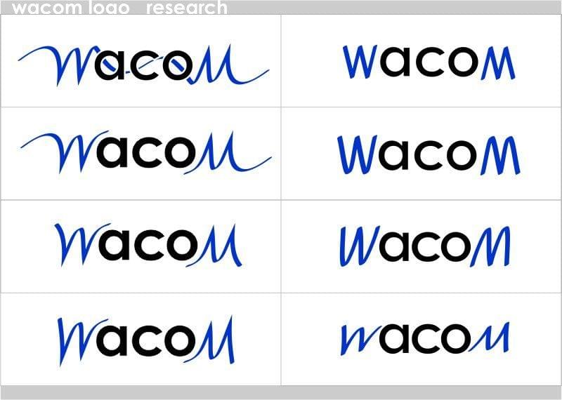
Chung Dha, Hackdesign, thanks for your answers. Following them I've prepared redesigned version.
W,M, are still"hand-made", but there's more letter, less decoration.
After a few of tries...

Posted Image

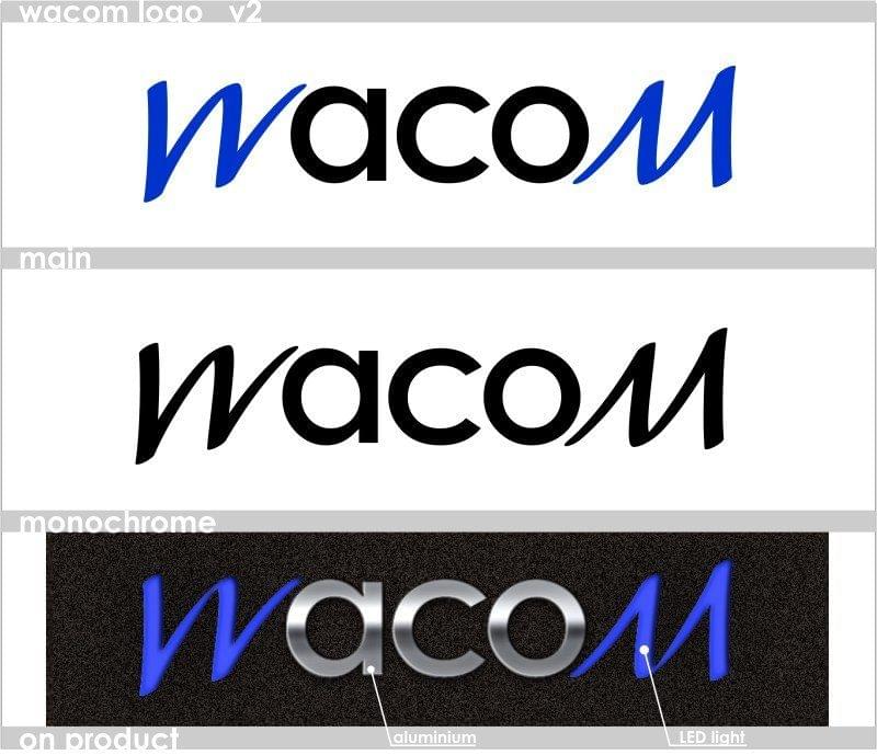
...I decided for one of them:

Posted Image

Is it better?
Thanks for opinions.

#143 cirosouza

cirosouza

    Apprentice Designer

  • Designer
  • 2 posts

Posted 31 December 2007 - 02:06 PM

Hi, all!
This is the second try. You can see that this is a simple variation on the W and M connection.
Looking after comments.
Thanks!

Please keep attachments from stretching the forum layout. Resized by _Redrum.
Ciro Souza
Arte DIGITAL

#144 ADD

ADD

    Apprentice Designer

  • Designer
  • 29 posts

Posted 31 December 2007 - 02:29 PM

Hi Chugdha,
Perhaps, if your idea/message gets conveyed through logo (text/font)
In my opinion, it think it should be fine.

#145 Chung Dha

Chung Dha

    Guru

  • Designer
  • 1439 posts

Posted 31 December 2007 - 03:10 PM

Piast - I think you should try something to make the W and M stand even more out and aco be less active. You should probably make it other way around. That the W and M are made of a normal font and Aco be less active. And dividing them from silver and blue light makes them separate too much from each other. Blue is a soft neutral cold color and it often don't stand out from other colors. You should try a brighter color bright red, orange or yellow.

#146 mroedel82

mroedel82

    Apprentice Designer

  • Designer
  • 7 posts

Posted 31 December 2007 - 07:36 PM

Comments and suggestions for improvement welcome.

#147 samisad0rk

samisad0rk

    Apprentice Designer

  • Designer
  • 64 posts

Posted 31 December 2007 - 07:45 PM

Samisad0rk- I see the WM combination but notsure why used the M because the initials of wacom is only the W. Also not sure what the meaning about the geometric shapes.


I used both the W and M because wacom is known for having the w and m being inverses of each other. It has become a way of identifying them in the past, and is something I think they will hold on to. The geometric shapes represent both the sleekness and stylishness of the brand, and the potential to create objects that are sleek and stylish. Thanks for your comments :)

#148 donskut

donskut

    Apprentice Designer

  • Designer
  • 7 posts

Posted 01 January 2008 - 05:27 AM

thanks chung da, i dont realize that :o

sry for that

#149 cincytodd

cincytodd

    Junior Guru

  • Designer
  • 426 posts

Posted 01 January 2008 - 12:19 PM

I look forward to any and all feedback.
"Simplicity is not the goal. It is the by-product of a good idea and modest expectations." —Paul Rand

www.deteringdesign.com

#150

  • Guests

Posted 01 January 2008 - 01:53 PM

ok, a few hours to go and we'll be closing the contest for submissions

#151 _Redrum

_Redrum

    Retired Admin

  • Designer
  • 1957 posts

Posted 05 January 2008 - 06:49 PM

Serjio7777 - a good attempt, but the contest deadline was January 1st.

#152 ~V~

~V~

    Apprentice Designer

  • Designer
  • 96 posts

Posted 07 January 2008 - 04:23 AM

wow, just got back from vacation and had a chance to check up on the contest. It had such a good turn out, and there are a lot of nice designs. Reckon it'll be a toughie for the admins to choose. Good luck everyone! ;)
"Why?"
-------------------------
http://vdesigns.livejournal.com/

#153 zooley

zooley

    Senior Member

  • Designer
  • 117 posts

Posted 07 January 2008 - 07:54 AM

We are all very excited about what will happen at the end with this contest and with the submissions.

#154

  • Guests

Posted 07 January 2008 - 06:02 PM

We are trying to organize all the submissions in one place. Please, help me check if we are missing something in this album

#155 zooley

zooley

    Senior Member

  • Designer
  • 117 posts

Posted 07 January 2008 - 06:30 PM

Great collection, it looks it is right on!

#156 ADD

ADD

    Apprentice Designer

  • Designer
  • 29 posts

Posted 07 January 2008 - 08:01 PM

#140 is missing.

All of them look great.....

#157

  • Guests

Posted 07 January 2008 - 09:34 PM

#140 is missing.

All of them look great.....


Thanks added it!

#158 Chung Dha

Chung Dha

    Guru

  • Designer
  • 1439 posts

Posted 07 January 2008 - 10:48 PM

#87 - 68 - 59 - 39 these are missing too.

#159 up_n_rising

up_n_rising

    Apprentice Designer

  • Designer
  • 7 posts

Posted 08 January 2008 - 02:05 AM

missing 99... :)

#87 - 68 - 59 - 39 these are missing too.


#160 serafima

serafima

    Apprentice Designer

  • Designer
  • 19 posts

Posted 08 January 2008 - 07:41 AM

please change my work from post #7 on work from post #12 (that terrible white peace under W exasperates me :-))


1 user(s) are reading this topic

0 members, 1 guests, 0 anonymous users