Nickelodeon cleans up!
#1

Posted 01 October 2009 - 08:50 PM
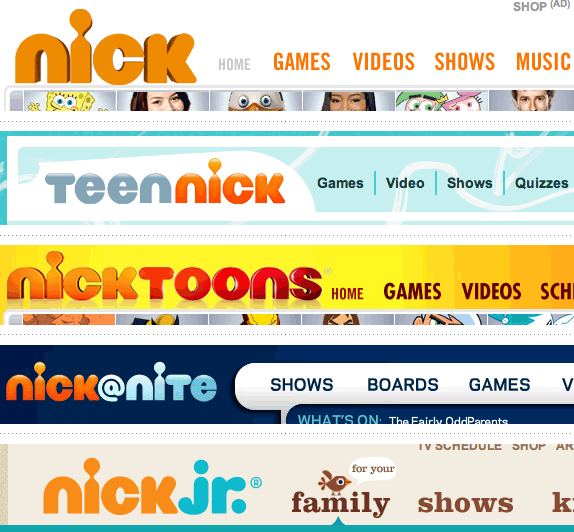
I was watching nick with my daughter and noticed the lack of slime and a new logo design. Nickelodeon would be a true designer's dream for branding!
You can check out the newest nick brand design here:
Nickelodeon cleans up: idsgn (a design blog)
I need some time to decide what I think. Perhaps some rainy days on the weekend with my daughter will help shape my opinion. But, my daughter likes the old logo better and I am not the target audience, right?
Cheers,
Brett
#2

Posted 02 October 2009 - 09:38 PM
#3

Posted 02 October 2009 - 09:42 PM
I don't like/dislike it I'm kinda neutral. The kids really didn't notice though, untill I pointed it out. Now if spongbob turns green or something they'll think something is wrong with the tv. hahaha
I remember the first one that had the rainbow colors.. dang I'm old.
#4

Posted 06 October 2009 - 05:24 AM
Love the color since im a orange fan
#8

Posted 12 October 2009 - 11:39 AM
look at this http://www.idsgn.org...sisters-new.png
the only problem i see is that it doesn't look good on small size
#9

Posted 22 October 2009 - 12:30 AM
J
Edited by jmillgraphics, 22 October 2009 - 12:32 AM.
forgot to add something
#10

Posted 23 October 2009 - 10:57 PM

The Brand name is too long and 1 long word.. It needs a logo rather than a logotype.. old one's splash was not unique but it also was a logo.
And the result its nickelodeon.com goes to nick.com :

Ok, here is the idea, they gonna cut the name to "Nick" .. how creative ... :|
#11

Posted 24 October 2009 - 09:40 PM
Design Intervention: Freelance graphic and web design
Technicolor Carnival: One-of-a-kind handmade jewelry and gifts
#16

Posted 09 August 2010 - 08:56 AM
And I'd also never associate the i with the outline of a child (which is written in the article)... Our perception is so conditioned to look at letterforms that a small change in a letter just doesn't have enough strenght to be seen as something different. At first I thought it was a reference to the old logo because it looks like the point of the i drops of the stem.
#17

Posted 09 August 2010 - 11:49 PM
(I think this is also the case with others)
If something "must" be changed, possibly I changed the interior of the logo. Maybe just a short name?... (As someone already said)
Splash would certainly kept!
For example, McDonalds. There are a hundred variations, but one distinctive thing never changes.
(Maybe not a good comparison but now it's my thought)
Please consider, not twice ... many times before you decide.
Regards
2 user(s) are reading this topic
0 members, 2 guests, 0 anonymous users


