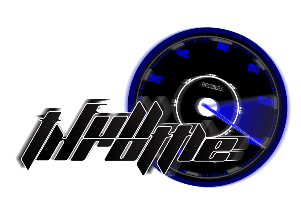
Full-Throttle Concept
#1

Posted 14 May 2010 - 04:41 PM

#2

Posted 14 May 2010 - 04:52 PM
#4

Posted 14 May 2010 - 05:05 PM
I would also agree with awwdude... The speedometer is nicely illustrated, however it just seems like too much. Maybe you would incorporate the meter parts into the "O" of throttle. Or something like that...
And maybe there is a way you can mix your speedometer idea with something that has to do with audio? Not that I think every logo has to come out and say what kind of company they represent, but to me this looks like a racing logo, even though you have the word decibel (which is spelled with an el, not an le.)
Just some thoughts... It is a nicely composed logo.
#10

Posted 04 June 2010 - 07:41 PM
But no logo is perfect the first time it's designed. It takes revisions and changes, to come up with a final version.
#12

Posted 22 June 2010 - 04:08 PM
#13

Posted 24 June 2010 - 01:09 AM
I would start with the lettering, it is apparent that everyone here is having the same disconnect with the font, but I feel with a little tweaking you can make this work.
First, take the "T" and make it like a capital letter. I would just make the top of the "T" the same width as the ascender and continue it up to the "F" in "Full"
Second, take the angle off the T"h"rottle and drop the middle to be in the center of the other letters. The extender that makes the "F" can then be extended out further for the forks. I would just extend them (a little thicker of course also) to the "ll" in "full". This will help with legibility I believe.
My last suggestions would be to thicken the white stroke where it all goes into eachother, and at another smaller black/blue stroke around it. (offset path is the tool to use in illustrator, instead of stroke). I would also add some contrast in your color palette to make the letters stick off the "decibelometer"
Just some suggestions I feel will greatly enhance the logo.
#14

Posted 24 June 2010 - 07:42 AM
but why don't you try with flat colors first (even black and white) and no effects (shadows, blur, glow...), and then upgrade with colors and effects, step by step... in this way you will see what to keep and what to remove...
every logo should work evenly in B/W and color.
another thing is mixing symbol with letters. you should either incorporate decibelometer in letters or make it separately. this way is little bit hard to read, especially with this font type (which i like very much).
anyway, good concept...
#16

Posted 29 July 2010 - 08:32 AM
This is for a audio device company, they do headsets and speakers and such. They are having a branding redesign contest and this is my concept. I realize the name might be hard to read and i'm redoing it now with a different font, but i just wanted to see what everyone thought of it =) The name of the company is "Full Throttle".
The font is unique but not readable
1 user(s) are reading this topic
0 members, 1 guests, 0 anonymous users


