Jump to content

  • Free consultations and support
  • Live chatClick Here for Live Chat
  • Call ico 1888-906-1888
    Phone support: Open

    Ready for your call :)

    Our business hours:

    Mon — Fri, 2am — 8pm (EST)

    US & EU support teams

    Phone support: Closed

    We are back in: 1h 20m

    Our business hours:

    Mon — Fri, 2am — 8pm (EST)

    US & EU support teams


Producing font using CorelDraw and High Logic Font Creator

waterfalls

  • Please log in to reply
&nsbp;

#1 morabira

morabira

  • Designer
  • 1008 posts

Posted 06 August 2012 - 09:18 AM

How to design our own font or typography / typeface?


Before we begin, for your info, here you can get bestselling fonts.


bestselling-fonts.png


Basically, these are the steps to design our own font:


1) Design all of the characters in CorelDraw or similar vector program..like AI
2) Export the characters as eps. Import it in High-Logic Font Creator program (for font naming, kerning & kerning pair setting etc)


Before I continue to the process details, one thing for sure, throughout this tutorial, you'll find that I'm using broken english... :)

image.jpg


Edited by morabira , 09 February 2024 - 12:12 AM.

  • lizonil likes this

#2

  • Guests

Posted 06 August 2012 - 09:24 AM

Looking forward to reading about the detailed process. Even though I don't use CorelDraw, I enjoy typography and reading about font creation.

And broken English is not a problem :)

#3 morabira

morabira

  • Designer
  • 1008 posts

Posted 06 August 2012 - 10:20 AM

1) The Design Process.

I'm not going to show how to shape your characters/symbol...your own font right?...not mine...:)
For CorelDraw user, if you want tutorial there is a thread here by our Jiyepez.
http://www.designcon...-tutorials.html
Anyone interested to try freehand style calligraphy, also is provided there...plus, technique of gaining the bolder version for our font design...

Ok..
For this process, what we should have at the end of our design process in our CorelDraw or AI is something like this.

http://layarbahtera....iredoomsday.png

Means, they are characters that need to be designed for one set of a basic commercial font (single weight)...
To get the name of each character/glyphs, you can refer here (Point your mouse at each glyph):

Fire Doomsday - Glyphs � MyFonts


Don't worry, we don't have to remember their names, that won't be asked in our final exam.

If we compare them, some characters are not being designed in our CorelDraw/AI canvas, for example, � � etc.. why?
because we will generate them automatically in HighLogic program...


Some important things/tips to be followed when designing our characters......

Edited by morabira, 05 September 2012 - 06:57 PM.


#4 morabira

morabira

  • Designer
  • 1008 posts

Posted 06 August 2012 - 12:01 PM

First..

Most important thing, in CorelDraw or AI, the characters must be arranged horizontally (exactly how if they are typed)...We don't have to worry about the white space between each characters (which is called kerning...will be set in HighLogic)

For example, we can type each characters using any font like arial, din, futura or anything...made comparison...so we can get the idea on how each symbol is placed horizontally (it doesn't has to be the same.....it is up to us/depend on our design)


Use this file. All that symbols have been typed here:
http://www.layarbahtera.com/symbol.doc


How big our design should be?............

Edited by morabira, 10 August 2012 - 03:57 PM.


#5 morabira

morabira

  • Designer
  • 1008 posts

Posted 06 August 2012 - 01:12 PM

up to us, as long as no character is outside of our pc monitor


How to determine the thickness?............

Edited by morabira, 06 August 2012 - 01:19 PM.


#6 morabira

morabira

  • Designer
  • 1008 posts

Posted 06 August 2012 - 01:45 PM

It depends...
Let say we want to create a regular weight font, which is suitable for document text...we type the "h" and "H" and "z" of known document font like Helvetica Neue regular or anything to get estimation of the horizontal and vertical stroke thickness and height for our font....we can follow their same thickness for our capital and small letter...(just thickness and height ok, do not trace the shape).....or we can take it just for a rough estimation, should be ok....


Posted Image


That is for document font,
other kind of font...it is full freedom


Other important aspect in font designing.....

Edited by morabira, 12 August 2012 - 02:32 PM.


#7 morabira

morabira

  • Designer
  • 1008 posts

Posted 07 August 2012 - 02:57 AM

When come to font design, our most important weapon is our eyes.
Character with rounded top or bottom like an "o" need to be designed a bit lower from the baseline and higher from the height line. This rule is applied for both small and capital letter. The offset amount, depend on our eye...no rule here....(as long as they do not look smaller in height)
This also occur to w, v, A etc if your design for them is not flat at the bottom or the top. (sharp or rounded....the offset amount normally a bit less than the o...)...
This rule is also applied for character which has both flat and round bottom/top like an "a", "n" etc.


Posted Image


BUT...afterall, it depend on our design...if our font is a flat bottom and top style, like that Fire Doomsday font(sample attached at the beginning of this tutorial)...we won't need this rule for most of the character including the "o"


Other important aspect.....

Edited by morabira, 14 August 2012 - 05:06 PM.


#8 morabira

morabira

  • Designer
  • 1008 posts

Posted 07 August 2012 - 03:21 AM

In font design, what we need to achieve is, all of the characters need to look uniform in their boldness appearance...This is a bit hard to explain in word...Wait..I'll do some sketching....

#9 jjyepez

jjyepez

    Guru

  • Designer
  • 955 posts

Posted 07 August 2012 - 05:48 AM

Hello Mohd,

I've been waiting for this tut since you mentioned it :D !!
I will enjoy it a lot!

Many thanks for sharing your font-creation knowledge (and all the hard work this implies).

Best regards,
--
jjy

Edited by jjyepez, 07 August 2012 - 05:51 AM.


#10 morabira

morabira

  • Designer
  • 1008 posts

Posted 07 August 2012 - 07:02 AM

anytime Julio...Hope it can be understood....


Continue....


As an example:

Based on technical aspect, a font should be like this...

Posted Image

if we zoom it out, as letter "e" is a compact letter with a horizontal middle line, it looks bolder than other letter.
We need to avoid this....


So, if this happened, what can we do is... we need to just ignore the technical aspect of our design...we fully depend on our eyes...for example, in this case we can just make the middle line of the e thinner...so, the zoom out look a bit uniform between each characters...

Posted Image


Depend on design, this normally occurred on letters e, a, v, y, w, M, V, W, A, x, X, y, Y, Z, z, K, k....


Another important aspect....

Edited by morabira, 07 August 2012 - 08:35 AM.


#11 morabira

morabira

  • Designer
  • 1008 posts

Posted 07 August 2012 - 07:59 AM

Sorry, continue with the boldness uniformity...

Certain parts where lines met (shown by the arrows) in our design also offer this boldness uniformity problem...So they needs to be watched carefully while designing and solved immediately.....
As an example, for this font, it is solved by thinning and rounding.....How to solve them is up to us....full freedom...as long as it doesn't look too annoying bold at that part when zoomed out.

Posted Image


Last aspect.......

Edited by morabira, 07 August 2012 - 02:00 PM.


#12 morabira

morabira

  • Designer
  • 1008 posts

Posted 08 August 2012 - 04:03 AM

The width...
This one is appropriate if we want to create font with uniform look in width of each character like Arial...(not like Futura or Trajan..it is their styling that they don't look uniform in width...that's different case)


Example:
Let say we play around with tools in CorelDraw or AI...,and form an "o" shape by accident. Then, we want to form a "d" from it, So we copy the "o", draw rectangle pillar, align the pillar at the edge of the "o"....trim...bla..bla...bla...and get a "d"...

Posted Image

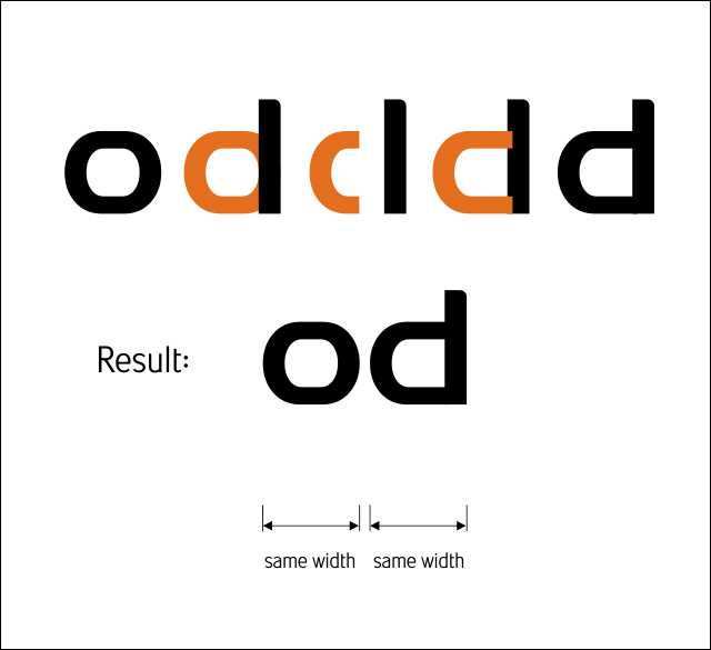
Yup, we have a "d" and really confident that people will read it as a "d"...Perfectly same width as our "o".

Don't get over excited yet....
Take a look carefully...
Even though it is similar width with the "o", our "d" actually look wider...(optical illusion)...
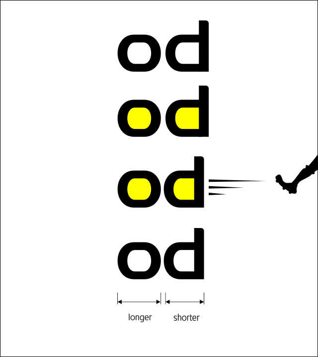
This need to be repaired...As a guideline, we can always focus on the middle empty space within them (highlighted in yellow as shown below)...Make the "square feet" of their empty space almost identical...Just a rough estimation is ok, so that we don't have to call any land survey engineer...


Posted Image

Posted Image

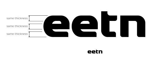
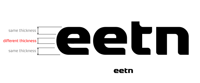
This o and d is just an example, we need to take a look carefully at most of letters (when designing small letter or capital letter).. Use their middle empty space as our guideline to determine character width brilliantly. (U, V, H, D, O, v, u, K, X etc.........)...

Another example, u and v (v need to be a bit wider than u...so the narrow middle space of the v can be made bigger, thus, it doesn't look too smaller than u)...in this case, of course we can't make their square feet identical due to the shape...just to achieve balance is ok...

Not just u and v, make also a comparison between u and o.........etc...etc...etc

Edited by morabira, 14 August 2012 - 11:25 PM.


#13 morabira

morabira

  • Designer
  • 1008 posts

Posted 08 August 2012 - 04:13 AM

Which character to begin when designing?...

Up to us...No rules here...based on idea....


Where to gain idea?


Built a spaceship...Go to the moon...Take a look around...Come back to earth...:)

Edited by morabira, 08 August 2012 - 05:20 AM.


#14 morabira

morabira

  • Designer
  • 1008 posts

Posted 08 August 2012 - 04:17 AM

Right now, I look at my pc mouse, I see a nice unique "D" shape....

One more thing, normally the stroke thickness of capital letter need to be a bit bigger than small letter...

From time to time while designing, try to build words by using your characters...so that you know if there's anything need to be revised....

Not to forget, at the end, each character need to be weld/merge nicely ok...(weld in coreldraw=merge in AI)


...........End of design process...........


BEWARE...HERE COME THE BORING PART IN FONT PRODUCING...........


bestselling-fonts.png


Edited by morabira , 09 February 2024 - 12:15 AM.


#15 jjyepez

jjyepez

    Guru

  • Designer
  • 955 posts

Posted 08 August 2012 - 05:31 AM

Hahaha ... kerning?
I'm getting excited in creating my own font after this.

:)

#16 morabira

morabira

  • Designer
  • 1008 posts

Posted 08 August 2012 - 05:45 AM

Yup......it is quite long explanation I guess...With screenshot here and there....Let me think how to begin first.........Anybody who want to start, actually can start the design...Julio, I reupload a new sample there (first attached sample)...Just noticed that I've missed 3 simple symbol before...The underscore line, em dash, & en dash....Sorry for that guys...

Edited by morabira, 08 August 2012 - 01:35 PM.


#17 morabira

morabira

  • Designer
  • 1008 posts

Posted 08 August 2012 - 09:23 AM

2) Transfering our design to begin working in High-Logic Font Creator program


First thing to do before we export our eps, to be imported in High Logic font Creator program is....we need to provide a guideline rectangle pillar in our CorelDraw/AI...something like this...

Posted Image


Means, we should have something like this now...

Posted Image


Make sure none of our character is higher or lower than that rectangle guideline (normally there's none ...but there's probability if we're creating calligraphy font or high stem font)....In case there is any, you need to use capital letter I to make that rectangle guideline....

Edited by morabira, 08 August 2012 - 01:36 PM.


#18 morabira

morabira

  • Designer
  • 1008 posts

Posted 08 August 2012 - 12:26 PM

Next, we select our characters...from a to n (including the rectangle guide)...Then export selected, to eps
So that we have eps something like this attached file....

http://layarbahtera.com/fireeps.eps

I provide a sample so that in case you already have the High logic Font Creator software, trial maybe...you can try it yourself throughout the next step....

#19 morabira

morabira

  • Designer
  • 1008 posts

Posted 08 August 2012 - 12:53 PM

Now what we have to do is, grab our batch and punch card as we're becoming a production operator...Here is our factory....

Posted Image

As we can see, there are boxes there...Each box representing a glyph/character/symbol..To edit certain glyph, all we need to do is double click its box, new window for that glyph will be appeared. After editing it, we close its window...So our factory will be back to its current stage as shown above.


to be continued.....

Edited by morabira, 08 August 2012 - 01:19 PM.


#20 jjyepez

jjyepez

    Guru

  • Designer
  • 955 posts

Posted 08 August 2012 - 02:16 PM

Hey morabira,
I have started to create my font ... :-) .. It is a simple sans-serif .. I'm trying to follow your advices carefully.
Posted Image
This is only lowercases so far ... what do you think?

I like trebuchet's "g" pretty much .. :-) so I took good care on my "g" giving a little of the feeling of trebuchet's "g" ..
the other ones are just based on plain san-serif with a personal touch.

Your feedback is very appreciated.
Regards, and thanks for sharing your knowledge.
--
jjy

Oh, btw: I was thinking that it would be very cool if there were sort of a magic pattern that could by applied to create any letters, something like this:
Posted Image
hehe :) nah ... that would be too much and a waste of time.

I look forward to your comments.
Cheers,
--
jjy

Edited by jjyepez, 08 August 2012 - 02:29 PM.


Also tagged with one or more of these keywords: waterfalls

0 user(s) are reading this topic

0 members, 0 guests, 0 anonymous users