Jump to content

  • Free consultations and support
  • Live chatClick Here for Live Chat
  • Call ico 1888-906-1888
    Phone support: Open

    Ready for your call :)

    Our business hours:

    Mon — Fri, 2am — 8pm (EST)

    US & EU support teams

    Phone support: Closed

    We are back in: 1h 20m

    Our business hours:

    Mon — Fri, 2am — 8pm (EST)

    US & EU support teams


Producing font using CorelDraw and High Logic Font Creator

waterfalls

  • Please log in to reply
&nsbp;

#61 morabira

morabira

  • Designer
  • 1008 posts

Posted 01 September 2012 - 08:51 PM

section 2, 3, 4.........:

Just repeat what we've done in section 1 to do autocomplete for the rest of the sections.

When do the autocomplete for C cedilla or c cedilla....


Posted Image

Edited by morabira, 02 September 2012 - 02:03 AM.


#62 morabira

morabira

  • Designer
  • 1008 posts

Posted 05 September 2012 - 06:19 PM

4) Completing "Right Double Quote"


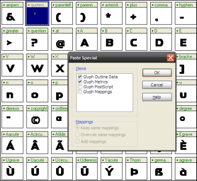
Select "Double Quote" glyph. Go to "Edit>Copy" (or hit "ctrl C")


Posted Image


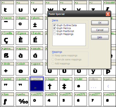
Select "Right Double Quote" glyph. Go to "Edit>Paste Special" (or hit "ctrl E"). Make sure the "glyph outline data" and "glyph metrics" checkbox are ticked (which means we're pasting the character including its kerning setting). Hit "OK". DONE.


Posted Image


Type the "Right Double Quote" in font test preview (in between double I) to avoid mistake

Edited by morabira, 07 September 2012 - 07:29 PM.


#63 morabira

morabira

  • Designer
  • 1008 posts

Posted 05 September 2012 - 06:23 PM

5) Completing "Base Double Quote"


Select "Double Quote" glyph. Go to "Edit>Copy" (or hit "ctrl C")


Posted Image


Select "Base Double Quote" glyph. Go to "Edit>Paste Special" (or hit "ctrl E"). Make sure the "glyph outline data" and "glyph metrics" checkbox are ticked (which means we're pasting the character including its kerning setting). Hit "OK".


Posted Image


Open the "Base Double Quote" window. In transform box, use our "comma" value for "y position" to reposition the character to the baseline. Apply. DONE


Posted Image

Edited by morabira, 05 September 2012 - 08:46 PM.


#64 morabira

morabira

  • Designer
  • 1008 posts

Posted 05 September 2012 - 08:45 PM

6) Completing "Single Quote" glyph


Select "Double Quote" glyph. Go to "Edit>Copy" (or hit "ctrl C")


Posted Image


Select "Single Quote" glyph. Go to "Edit>Paste Special" (or hit "ctrl E"). Make sure the "glyph outline data" and "glyph metrics" checkbox are ticked (which means we're pasting the character including its kerning setting). Hit "OK".
"Double Quote" will be pasted in the "Single quote' glyph.


Posted Image


Open the "Single Quote" window. Delete the right "double quote" shape to make it a "single quote".
In the "transform box", adjust the value of "right side bearing" (follow double quote right side bearing value).
Apply. Done


Posted Image


Type the "single quote" in font test preview as before.


After this, we should can complete the "left single quote", 'right single quote", "base single quote", "guil single right" & "guil single left" (by copying an appropriate resource glyph)

Edited by morabira, 06 September 2012 - 02:39 AM.


#65 morabira

morabira

  • Designer
  • 1008 posts

Posted 06 September 2012 - 02:38 AM

By now, we should have only 3 uncompleted glyphs.

Before continue, we need to do another setting to our font file.


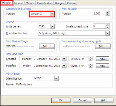
Go to "Format > Setting" ,a popup window will appear.
On Header section, change content layout version to version 2.


Posted Image


On Metrics section, hit all three "calculate" buttons to calculate our font metrics automatically. Then, OK.


Posted Image

Edited by morabira, 07 September 2012 - 07:43 PM.


#66 morabira

morabira

  • Designer
  • 1008 posts

Posted 07 September 2012 - 07:42 PM

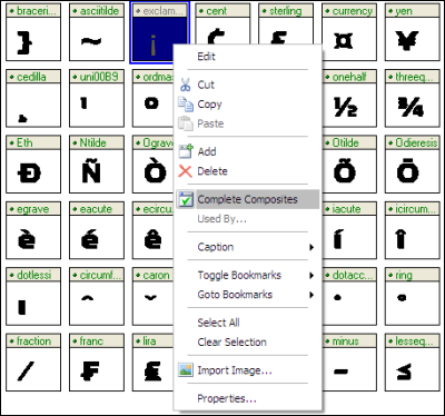
7) Completing "exclamation down" glyph by using autocomplete


Select "exclamation down" glyph. On mouse right click, select "complete composite".


Posted Image


With the "exclamation down" glyph is still selected, click "make simple" button on tool bar (to break the link of "exclamation down" to the "exclamation" glyph)


Posted Image


Open font test preview, type the "exclamation down" in between double "I" to avoid mistake. Repair the kerning etc if necessary.


For our remaining 2 glyphs ("question mark down" and "ellipsis"), do this same method as "exclamation down" to complete them.

DONE WITH THE GLYPHS COMPLETING PROCESS!!

#67 morabira

morabira

  • Designer
  • 1008 posts

Posted 07 September 2012 - 07:44 PM

KERNING PAIR SETTING


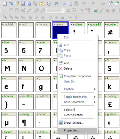
Before we continue with kerning pair setting, we need to set our font "spacing between words" which is called space. For the space value, we can simply use our letter "n" width. Open the "n" glyph window, check it width in the transform box (size section). Remember the value.

Now on "space" glyph, right click, select Properties..


Posted Image


A properties box will be appeared. Put in the "n" width value in the "Advanced Width" box. Done


Posted Image


Test build sentences in our "font test preview" or simply choose "Lorem Ipsum..." as the "Sample text" provided there.
Done.
If we think we need to use different space value, just adjust the value in "space" properties box (reduce a bit or increase a bit as we wish..but don't go too far)

Edited by morabira, 12 September 2012 - 01:35 AM.


#68 morabira

morabira

  • Designer
  • 1008 posts

Posted 12 September 2012 - 01:36 AM

What is "kerning pair"?....is it a bird, is it a plane, or is it a superman?
Nope.

Edited by morabira, 14 September 2012 - 04:40 AM.


#69 morabira

morabira

  • Designer
  • 1008 posts

Posted 14 September 2012 - 04:38 AM

Even though we have successfully set the kerning of our font, actually several pair of characters (when certain character meet certain character) still not look good in our font. Most case, that problem pair need to be made closer in their distance. Few others need to be made otherwise. That distance is what we will repair when setting the kerning pair.

Kerning pair setting is not compulsory.
BUT, if we want our font looks better, we need to do as much kerning pair as we can especially to commonly used character pairs (letter, number or common symbol).

These samples show what is kerning pair.
When design logo, I believe we will always adjust the kerning/gap of certain characters to make the word looks better. For logo, that shouldn't be any problem, we can just simply bring the problem pair closer, but what if the font is used in document which has many words? Who is crazy enough to repair them?


Posted Image


Basically, kerning pair problem produces by character which has great amount of side empty space due to its shape ( A, F, L, V, W, T, K, X, Y, Z, f, t, r, x, k, v, w, r, y, z, 7, /, etc...depend on design)...
The problem occurs when this kerning pair problem producer meets another character with certain side shape, or vice versa.
The problem also occurs when this kerning pair problem producer meets another kerning pair problem producer.

Edited by morabira, 14 September 2012 - 08:20 AM.


#70 morabira

morabira

  • Designer
  • 1008 posts

Posted 14 September 2012 - 06:13 AM

How to set kerning pairs in High Logic Font Creator?...

Go to Format > Kerning.
A new kerning pair popup window will be appeared.
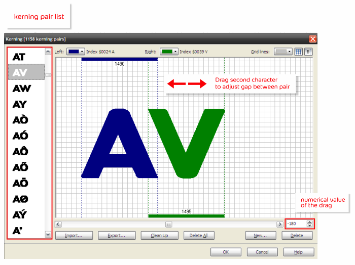
In the window, we will see list of kerning pair on left side, and larger view of selected pair on right side.
What we need to do is selecting pair by pair throughout the pair list and drag the second character in the larger view section to repair the gap. When we drag it, the numerical value of the gap will be adjusted automatically.


Posted Image


How can we know the amount of dragging? For this purpose, we need to close the kerning pair window.
Go to View > Toolbars > Preview (or hit keyboard F8).
"Preview" window will be appeared. Let say, we want to check the AV kerning pair. We type a word that contain AV in the preview window as in this example "AVENO". Make sure we check the "Kerning" checkbox.
Without closing the "Preview" we open the "Kerning Pair" window again, start drag the V to bring it closer to the A or vice versa. Hit "OK". After that, we close the "Kerning Pair" window. Look at the sample word that we have typed before in the "Preview" window to check whether the AV gap in the word is perfect or need further adjustment. If need adjustment, we open the "Kerning Pair" window again and adjust the gap again. Do these steps until we're satisfied. Repeat this process for other pair.


Posted Image

Edited by morabira, 22 September 2012 - 10:59 AM.


#71 morabira

morabira

  • Designer
  • 1008 posts

Posted 20 September 2012 - 02:36 PM

Some important notes when do kerning pair:

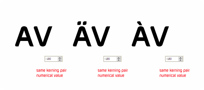
1) Let say we have done the kerning pair for AV, we can use its "numerical value of the drag" for similar shape pair like [A accent + V]. Means, we don't have to use dragging, just put the AV numerical value in the box to set their kerning pair. Example:

Posted Image


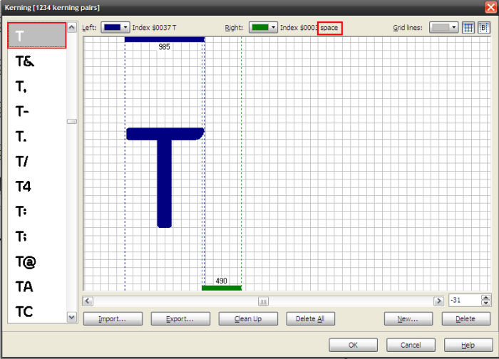
2) Space (gap between) word is treated as a character. You'll see in the kerning pair list, there seems to be lists with only single letter, in fact, they are a "character plus space" or "space plus character" kerning pairs. As an example "T Space"


Posted Image


When do kerning pair for them, we can type 3 words in preview window for comparison to determine the kerning pair gap setting. As an example for "T Space", we can type something like this.


Posted Image

Edited by morabira, 21 September 2012 - 03:02 AM.


#72 morabira

morabira

  • Designer
  • 1008 posts

Posted 21 September 2012 - 02:58 AM

3) "Certain character + Certain similar left side shape character" or "Certain similar right side shape character + Certain character" means same kerning pair numerical value. As examples, xo, xd, xc...(as basically we set same kerning left side bearing for o, d and c during the kerning process due to they have similar left side shape).


Posted Image

#73 morabira

morabira

  • Designer
  • 1008 posts

Posted 21 September 2012 - 03:13 AM

4) We can add new kerning pair as we wish by clicking the "New..." button in kerning pair window. In the new popup window that appeared, select left and right character from the list, OK


Posted Image


5) We can also delete any unnecessary pair from "Kerning Pair " list in "Kerning Pair" window by selecting the kerning, and hit "delete" button.


6) We can also export our kerning pair setting so that we can import it later to be used for other weight (bold, medium, black etc). Before import, make sure hit to "Clean Up" to clear current list.


DONE WITH KERNING PAIR

Edited by morabira, 21 September 2012 - 10:17 AM.


#74 morabira

morabira

  • Designer
  • 1008 posts

Posted 21 September 2012 - 03:20 AM

The last process before we finish our font is doing some final setting.

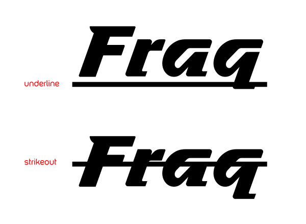
1) Setting underline and strikeout thickness and position


Posted Image


Firstly, open our "underline" glyph window. Select the shape. In the transform box, take a look at its height (size section). Remember the value.


Posted Image


Take a look also at its Y-position (position section). Remember the value. Close the "underline" glyph window


Posted Image


Secondly, go to Format > Setting. In the General section, do setting as shown below:


Posted Image


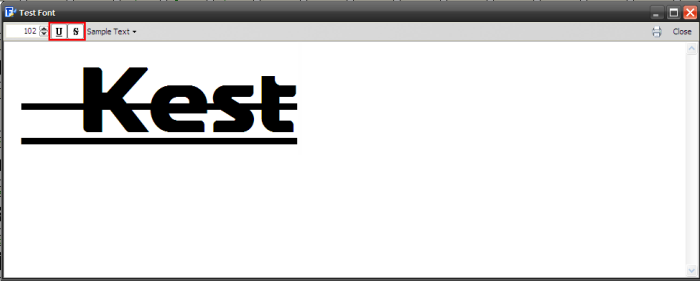
Lastly, go to Font > Test to open font test window. Type "_Kest" (or any word).


Posted Image


Click the underline and strikeout (red highlighted). We should can see that the automatic underline is nicely aligned and has similar thickness as our "underline" glyph. If we're not satisfied of the strikeout position, change the value as we wish in "Font Settings" window.


Posted Image

Edited by morabira, 21 September 2012 - 05:38 AM.


#75 morabira

morabira

  • Designer
  • 1008 posts

Posted 21 September 2012 - 05:14 AM

2) Some other setting in "Font Settings".
Go to Format > Settings to open the "Font Settings" window again.


On "Header" section, change back our font version to Version 1.


Posted Image


On "General" section, hit the calculate button.


Posted Image


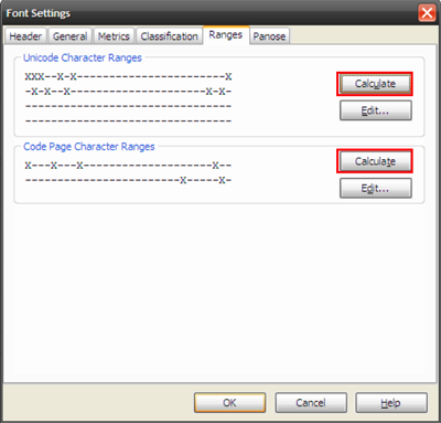
On "Ranges" section, hit both calculate buttons.


Posted Image

Edited by morabira, 21 September 2012 - 09:44 AM.


#76 morabira

morabira

  • Designer
  • 1008 posts

Posted 21 September 2012 - 10:00 AM

3) Copyright Notice etc.
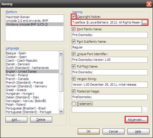
Go to Format > Naming to open "Naming" window.


Type your foundry name that you want to use in "Copyright Notice" box. Then click the "Advanced" button.


Posted Image


In the "Advanced Naming" window, fill in any section that you wish like Font Designer & Description (not necessary all sections need to be filled).


Posted Image


SAVE & DONE...YOUR FONT ARE READY TO BE INSTALLED AND USED.

Edited by morabira, 21 September 2012 - 10:03 AM.


#77 morabira

morabira

  • Designer
  • 1008 posts

Posted 21 September 2012 - 10:05 AM

ADDITIONAL IMPORTANT INFO:

1) For other weight (bold, medium, black etc), use same value when importing EPS into High Logic (when resizing and positioning our imported eps). Each weight need to use their own i-based guideline for eps exporting purpose.

2) As an extra step, if we want to convert our font to other format (OTF etc), we can use program like "TransType Pro" by Fontlab. We can rent their online service to use the converter for one day for USD9.00++ to convert all of our font. It just took less than 5 minutes to convert a single font.

3) If we want to sell our font, just go to any font marketplace like www.myfonts.com, www.fonts.com and many more...contact their email. Normally they'll email us "Contract Agreement" to be filled and email back to them together with our fonts files.


4) If you give up designing your own font, just save some money and purchase our foundry fonts here :)


https://www.myfonts....bahtera-foundry


bestselling-fonts.png


THE END


Edited by morabira , 09 February 2024 - 12:08 AM.


#78 jjyepez

jjyepez

    Guru

  • Designer
  • 955 posts

Posted 21 September 2012 - 12:54 PM

ADDITIONAL IMPORTANT INFO:

1) For other weight (bold, medium, black etc), use same value when importing EPS into High Logic (when resizing and positioning our imported eps). Each weight need to use their own i-based guideline for eps exporting purpose.

2) As an extra step, if we want to convert our font to other format (OTF etc), we can use program like "TransType Pro" by Fontlab. We can rent their online service to use the converter for one day for USD9.00++ to convert all of our font. It just took less than 5 minutes to convert a single font.

3) If we want to sell our font, just go to any font marketplace like MyFonts: Webfonts & Desktop Fonts, Fonts.com and many more...contact their email. Normally they'll email us "Contract Agreement" to be filled and email back to them together with our fonts files.

THE END


Now that this so very detailed tutorial is completed, we thank you
for sharing all this knowledge about font creation with DC community!

Nicely done!
All the Best,
--
jjy

#79 mazyo2x

mazyo2x

    Member

  • Designer
  • 31 posts

Posted 29 September 2012 - 03:32 AM

Thanks, very useful. I think we need to have our own fonts.

#80 morabira

morabira

  • Designer
  • 1008 posts

Posted 29 September 2012 - 02:51 PM

You're welcome guys/girls.


Also tagged with one or more of these keywords: waterfalls

2 user(s) are reading this topic

0 members, 2 guests, 0 anonymous users