Feelings - Photo manipulation. Deadline: January 31
#22

Posted 19 January 2006 - 10:40 PM
#24

Posted 20 January 2006 - 12:52 AM

Used images:
http://www.stockvaul...cat=24&pic=1822
http://www.stockvaul...cat=23&pic=2875
http://www.stockvaul...cat=63&pic=2442
#25

Posted 20 January 2006 - 12:54 AM
Here is my second entry: devART page
Feeling:
Lost; Confused; Afraid
Images Used:
Young Woman
ID Plate
Factory
#27

Posted 20 January 2006 - 08:04 AM
i have e question...
is possible insert personal stock inside the artwork???
personal stock + 2 stockvalut image??
excuse for my bad english!
regards
#28

Posted 20 January 2006 - 08:28 AM
Manoloweb: Your images are'nt working atm, but I remember the first one from the day before yesterday. Pretty funny manip, and the "cutting out" is good. It feels a little unfinished, mainly the background.
Uniment1: The idea is good, but I think the wind effect is a bit overused and the image could be more contrasted. Good work nevertheless.
ssdesign: I like the idea, but the blending of the head needs more work. There's a white outline in the hair that can easily be brushed away, and the colors of both images need to be adjusted for them to fit better together.
rinaldidesigns: Nice grunge effect, but the typography needs some addjustments. It's not benefitting the image in any way. Would be better without it.
Elshou04: Good blending, I would have liked to see it bigger though. I love details
Max: Hehe, very good. The upper lip is excellent, but the lower lip still needs some work.
big-ah: Nice idea, but I dont understaind why you used the wind filter on the birds. Would have been a much stronger piece if the birds had looked more realistic.
gnr: Nice blending. One of my favorites so far. A shadow reflection of the horses on the grass would make it even better.
Memorex: Nice image, blending is good. Only thing is that I feel that the skull is a tad too big compared to the torso.
bjrucker: Strong image indeed. The girls outline is a bit rough, would be better if she didnt look too "cut-out".
Keep up the good work!
#29

Posted 20 January 2006 - 10:59 AM
If I have time I'll make one more entry till the deadline.
Good luck to all, nice works
#30

Posted 20 January 2006 - 03:13 PM

Used images:
http://www.stockvaul...cat=21&pic=2255
http://www.stockvaul...cat=12&pic=1198
http://www.stockvaul...&cat=12&pic=594
http://www.sxc.hu/br...nload&id=381627
Feedbacks wanted
#33

Posted 20 January 2006 - 05:26 PM
thank u for feedback:)....the type will be removed...(I choose this type/font to balance/contrast the grunginess)....I think it would be helpful to have entries state which/feeling they are trying to convey,invoke through their montages...:)off to work on another 'feeling'
#34

Posted 20 January 2006 - 07:01 PM

links:
http://www.stockvaul...&cat=22&pic=793
http://www.stockvaul...cat=24&pic=1821
http://www.stockvaul...cat=26&pic=2208
#35

Posted 20 January 2006 - 11:53 PM
#36

Posted 21 January 2006 - 11:09 AM
#37

Posted 21 January 2006 - 01:45 PM

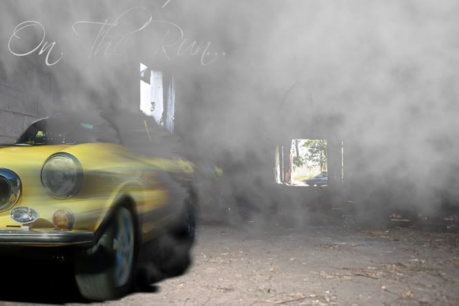
Feeling: desperation and determination, at least thats what i was aiming for, trying to escape from impossible odds or situations using methods you wouldnt normally use,
i was going to use a black blackground with a dark creature looming behind, but the abandoned warehouse seemed a little better
links:
http://www.stockvaul...cat=73&pic=2854
http://www.stockvaul...cat=21&pic=1943
http://www.stockvaul...cat=21&pic=1413
http://www.stockvaul...cat=66&pic=2126
#38

Posted 21 January 2006 - 04:55 PM

links:
http://www.stockvaul...c&cat=48&pic=58
http://www.stockvaul...cat=73&pic=2863
http://www.stockvaul...&cat=29&pic=836
http://www.stockvaul...cat=74&pic=1204
#39

Posted 21 January 2006 - 06:27 PM

http://www.stockvaul...&cat=21&pic=787
http://www.stockvaul...cat=26&pic=2207
http://www.stockvaul...cat=26&pic=2206
http://www.stockvaul...cat=59&pic=1873
0 user(s) are reading this topic
0 members, 0 guests, 0 anonymous users


