
Contest Title:Summertime Postcard Design
Description: Create a Summertime postcard using Illustrations, text, photos,color......be unique, creative, make your postcard SCREAM its' summer!
The fine print...RULES
The dimensions of the card are 4x6 inches...front only
You may enter up to 3 times.
The contest will end 6/7/07
If you use photos, art, illustrations that are not your own.... give credit.
Please use tags to upload your card.
Keep it clean...no nudity, Religious subject matter that could be offensive....etc.....
Most importantly....HAVE FUN...this is a piece you can use in your portfolio, so even if you don't win, it'll be a great piece to show off!
I will give regular feed back to guide the designs along.
5•28•07 Summertime Postcard Design
Contest Title:Summertime Postcard DesignDescription: Create a Summertime postcard using Illustrations,...
-
 This topic is locked
&nsbp;
#1

rinaldidesigns
-

- Designer
- 2258 posts
Elite Designer
#2
Create This
-

- Guests
- 53 posts
Registered User
Posted 28 May 2007 - 03:41 PM
Hey Rinal,
does it have to be a vertical 4x6 or can it also be a horizontal 6x4??
does it have to be a vertical 4x6 or can it also be a horizontal 6x4??
Check Out My Portfolio @ www.avisualidentity.com
#3
rinaldidesigns
-
- Designer
- 2258 posts
Elite Designer
#4
Create This
-
- Guests
- 53 posts
Registered User
Posted 28 May 2007 - 07:30 PM
Ok, I hate being first to post I really do but since i have today off for memorial day i thought id get a jump start and have some fun. This is my first post, and depending how busy i am the next couple weeks i will try to do 2 more.
This really puzzled me at first and i thought i was going to have a major episode with creative block. I do live in Arizona so its spring/summer year round. but once i started working at it ideas started flowing, so here it is and hopefully it fits the theme well.
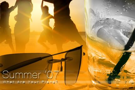
Used 3 photos,
one from some guy in Japan 油姬's was his name
sunglasses were courtesy of Oakly.com
and the water i had on a stock disk.
And of course all editing and creativity was my own. Hope you enjoy!
This really puzzled me at first and i thought i was going to have a major episode with creative block. I do live in Arizona so its spring/summer year round. but once i started working at it ideas started flowing, so here it is and hopefully it fits the theme well.
Used 3 photos,
one from some guy in Japan
油姬's was his name sunglasses were courtesy of Oakly.com
and the water i had on a stock disk.
And of course all editing and creativity was my own. Hope you enjoy!
Check Out My Portfolio @ www.avisualidentity.com
#5
rinaldidesigns
-
- Designer
- 2258 posts
Elite Designer
Posted 29 May 2007 - 12:32 PM
Nice first entry:)........I'd make the text stand out more....bolder font?....
Summertime means...no school(for some), vacation, beach, fun, relaxtion, warmer temps........its a feeling, and I think your postcard conveys that.....
Summertime means...no school(for some), vacation, beach, fun, relaxtion, warmer temps........its a feeling, and I think your postcard conveys that.....
#6
Create This
-
- Guests
- 53 posts
Registered User
Posted 29 May 2007 - 02:15 PM
Thank You Rinal,
Do you suggest just a bolder variation of the same font? Or completely different font?
I thought a thin font might work better for summer, and a thicker font better for winter, you know more padding in the winter is always good and less padding is better in the summer
Although i must admit, i am a huge fan of the thin type faces these days, i see them being used EVERYWHERE and they really make the design cleaner. Let me know your thoughts.
Check Out My Portfolio @ www.avisualidentity.com
#7
Nicholas
-

- Designer
- 164 posts
Apprentice Designer
Posted 29 May 2007 - 05:52 PM
Thank You Rinal,
Do you suggest just a bolder variation of the same font? Or completely different font?
I thought a thin font might work better for summer, and a thicker font better for winter, you know more padding in the winter is always good and less padding is better in the summer
Although i must admit, i am a huge fan of the thin type faces these days, i see them being used EVERYWHERE and they really make the design cleaner. Let me know your thoughts.
I agree with the thin font face in the summer unless you're on a billboard and saying GOT MILK? lol just my 0.02c
#8
rinaldidesigns
-
- Designer
- 2258 posts
Elite Designer
Posted 29 May 2007 - 05:57 PM
Maybe a variation of the font? It just gets lost (maybe without the drop shadow, if it was a tad thicker)......
#9
Create This
-
- Guests
- 53 posts
Registered User
Posted 29 May 2007 - 06:04 PM
Ok, i hear what you're saying, Ill repost it tonight, i have some ideas in mind!
Thanks for the feedback!
Thanks for the feedback!
Check Out My Portfolio @ www.avisualidentity.com

#11
Create This
-
- Guests
- 53 posts
Registered User
Posted 29 May 2007 - 07:28 PM
Hey Paul, Converting a photo to vector can be very tedious. If you are familiar with the pen tool you can try using the technique used in this tutorial.
The live trace feature in illustrator CS2 works occasionally for me but i find the best way to convert the photo is a keen eye, steady hand, and alot of patience. Even then i still dont always get the look i wanted. here is a link to that tutorial i told you about it may or may not help.
http://www.ndesign-s.../tracing-photo/
Keep working at it still have a couple days left, youve got a great idea just tweak it out some!
Check Out My Portfolio @ www.avisualidentity.com
#12
designer3d712
-

- Designer
- 15 posts
Apprentice Designer
Posted 29 May 2007 - 08:15 PM
First try..
Background is 3 images chopped..
Mts. - Beach Town Press
Palms - brainybetty.com - free graphics

Background is 3 images chopped..
Mts. - Beach Town Press
Palms - brainybetty.com - free graphics
#13
rinaldidesigns
-
- Designer
- 2258 posts
Elite Designer
Posted 29 May 2007 - 08:44 PM
Feed back....
harrisp9
concept wise..Love it! I'd play around with the livetrace tools settings, and Create This is right, sometimes the best way is with the pen tool AND alot of patience.....
I suggest stronger colors, variations of blue for the wave, this could make it work as is(right now the colors blend, too close).....I like that the font stands out.....how about a edgier font?
designer3d712
I like the color, the contrast in the orange/blue....nice:) The font looks overly distorted(summer 2007)....maybe less? I also like the shadows(palms, trees) I'm not a fan of alot of drop shadows, but these are well done....
Thank you for your entries, very nice:)
#14
Nicholas
-
- Designer
- 164 posts
Apprentice Designer
Posted 30 May 2007 - 01:22 AM
*harris do you have illustrator cs3 yet?
this tutorial video will help ALOT! with colorizing your artwork ect (live color ect)
Color Tutorial CS3
hope it helps * ill have my post up soon
love the work so far everyone!
this tutorial video will help ALOT! with colorizing your artwork ect (live color ect)
Color Tutorial CS3
hope it helps * ill have my post up soon
love the work so far everyone!
#15
Create This
-
- Guests
- 53 posts
Registered User
Posted 30 May 2007 - 04:03 AM
Ok, i made some changes to my first concept so im now posting my second attempt. The font was an easy choice, I like it better than the first. So thanks for the feedback on my first concept! Hopefully this one is better.
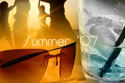
I changed the liquid color to a subtle blue, i thought it may have blended too much with the background. Now all i need to do is try to do something with those glasses! So yes my third and final concept will be posted in the next few days.
I changed the liquid color to a subtle blue, i thought it may have blended too much with the background. Now all i need to do is try to do something with those glasses! So yes my third and final concept will be posted in the next few days.
Check Out My Portfolio @ www.avisualidentity.com
#16
harrisp9
-

- Designer
- 54 posts
Apprentice Designer
Posted 30 May 2007 - 04:34 AM
Thanks everyone for the ideas!
Nicholas - unfortunately I haven't upgraded to CS3 yet, is it worth it? I have seen that video before, but thank you for the link (it looks VERY cool, not to mention easy).
CT - great second draft, the new text, colors, and tint on the sunglasses look great!
designer3d712 - way to start! I want to go there...
Now to draw water with the pen tool...
#17
McGrattan
-
- Designer
- 16 posts
Apprentice Designer
Posted 30 May 2007 - 04:40 AM
Just playing around,looking for a laugh. I hope to have something a little more "on-task" done in the next day or two...

dude - blog.theage.com
gnome - chazography.com
burger - marion-kochbuch.com
in line with no nudity I added a subtle lens flare to block a nipple.
dude - blog.theage.com
gnome - chazography.com
burger - marion-kochbuch.com
in line with no nudity I added a subtle lens flare to block a nipple.
Laid on a Mac
#18
designer3d712
-
- Designer
- 15 posts
Apprentice Designer
Posted 30 May 2007 - 01:20 PM
Feed back....
designer3d712
I like the color, the contrast in the orange/blue....nice:) The font looks overly distorted(summer 2007)....maybe less? I also like the shadows(palms, trees) I'm not a fan of alot of drop shadows, but these are well done....
Thanks for the feedback. Yeah when I first did the distortion, I thought the same thing, but when I kept looking at it, it kind of looked like a surf board so I kept it. I'll try tweaking it slightly so it's less distorted.
#19
Create This
-
- Guests
- 53 posts
Registered User
Posted 30 May 2007 - 02:02 PM
Paul ~ Thanks for the feedback! CS3 is a memory HOG!!!! my memory has run as high as 200k.
One thing to consider before spending the money is that you need at least 1 gb memory on your machine. If you do not it will not let you install!!! So be warned! I would recommend this only on dual core / multiple processor systems. Im running a brand enw pentium Viiv with 2gb memory at work, and photoshop cs3 still crashes from time to time!
Is it worth it?? id stick with CS2, especially if you have an older machine. I would not recommend upgrading your hardware just for these programs to run. Id save up, and wait for the next edition to come out.
Dont get me wrong, Im a huge fan of new software, but im not a fan of spending cash i dont have, on programs that have a few changes to the interface and a couple extra options.
just my .02
Check Out My Portfolio @ www.avisualidentity.com
#20
harrisp9
-
- Designer
- 54 posts
Apprentice Designer
Posted 30 May 2007 - 03:24 PM
CT - Yeah for what I would get for upgrading, I don't think it's worth the $$. I would still like to play around with live paint though... I'm running a Macbook Pro 17" with 1 gb of memory, I've considered upgrading to two since I run multiple programs alot, but for the most part my computer runs great!


2 user(s) are reading this topic
0 members, 2 guests, 0 anonymous users
